Can someone please help me to solve those errors 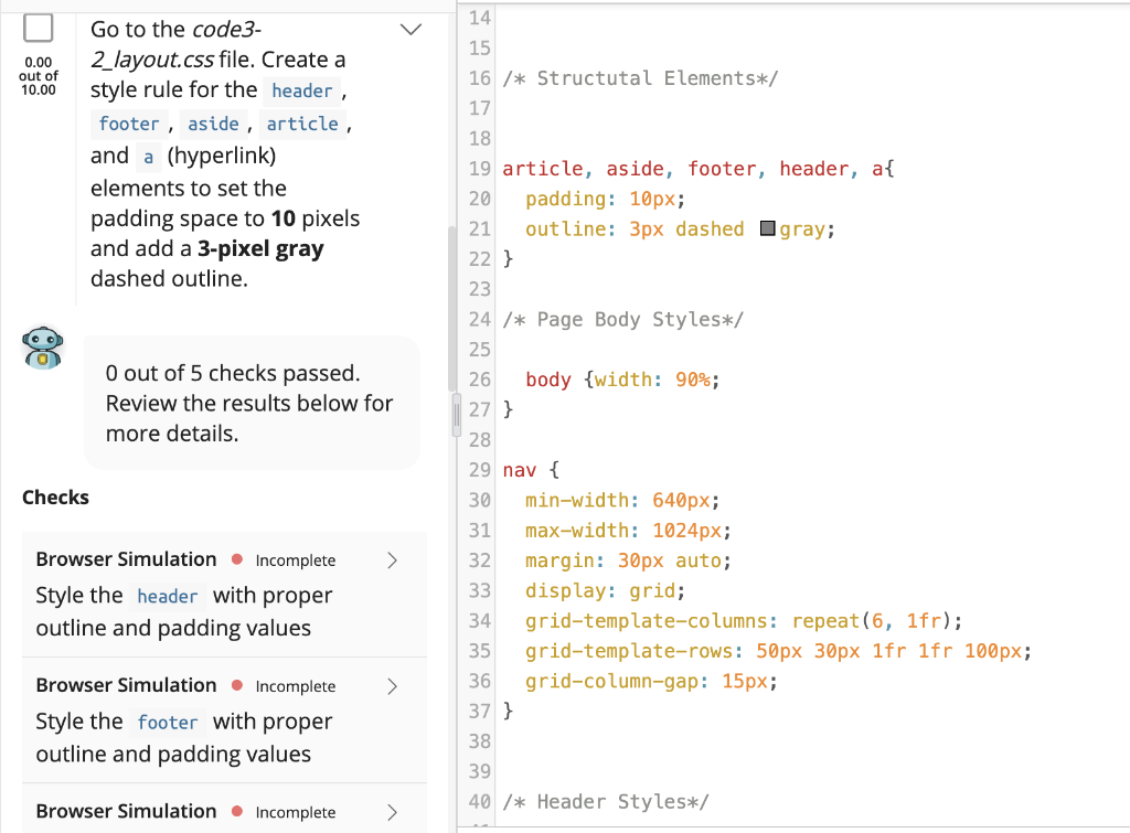
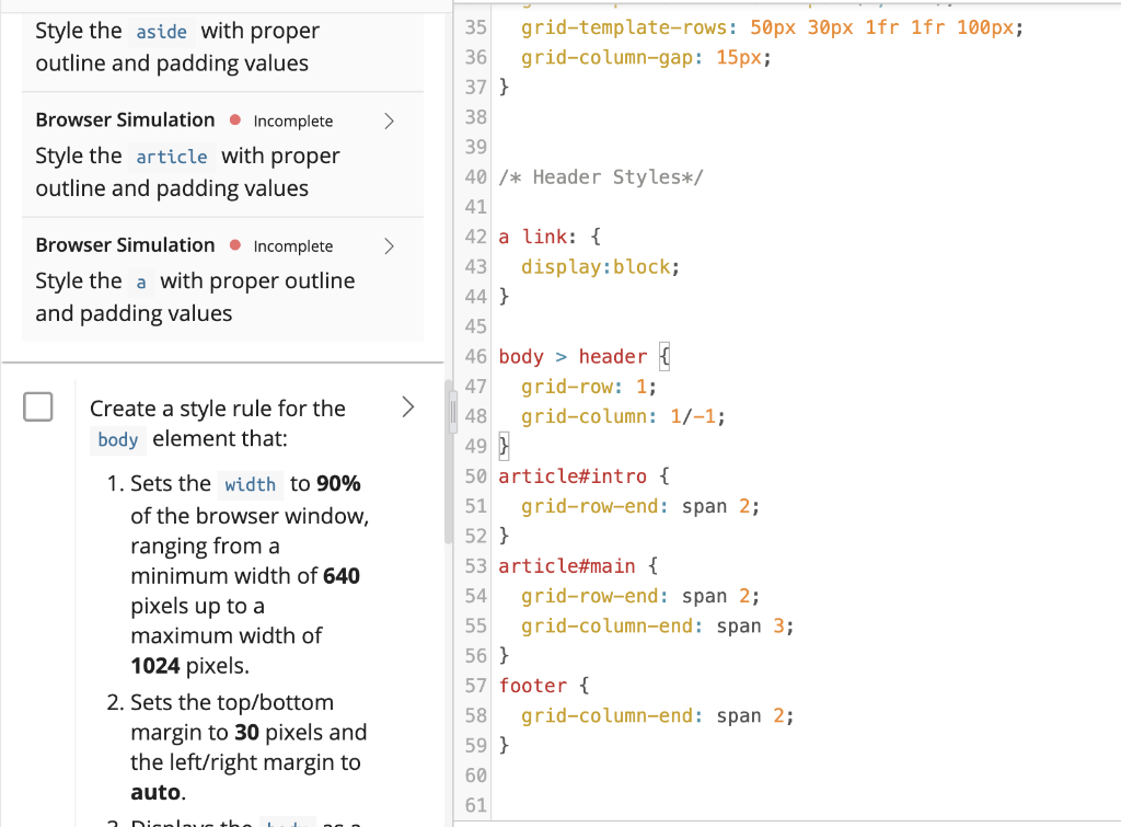
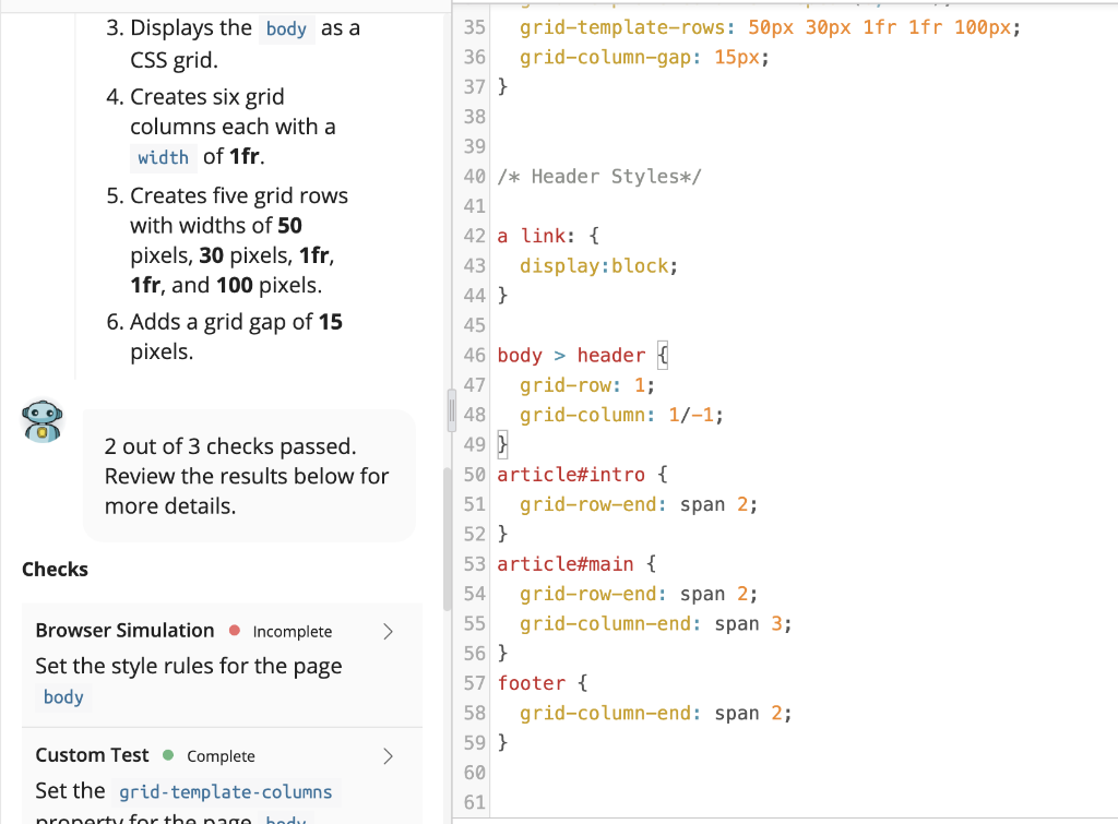
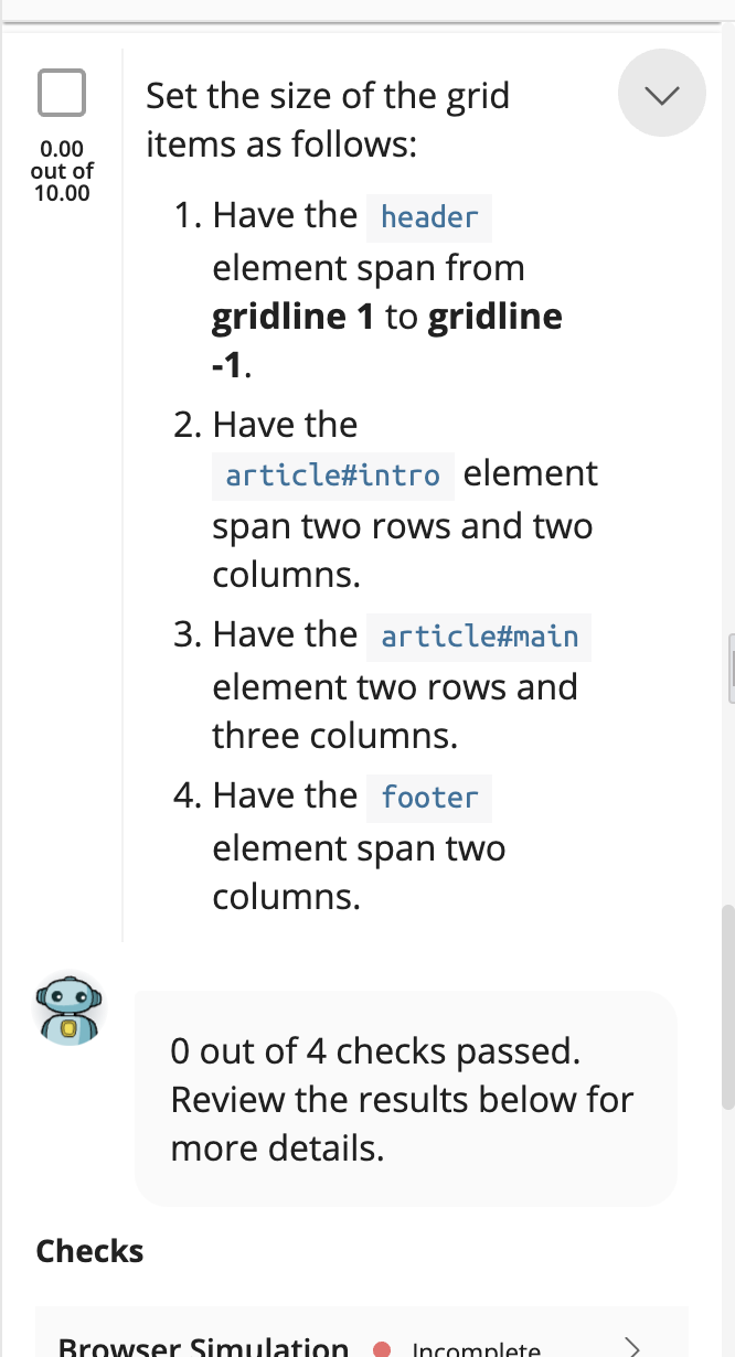
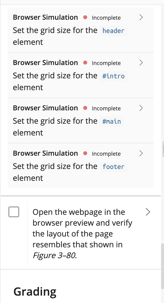
14 15 0.00 out of 10.00 Go to the code3- 2_layout.css file. Create a style rule for the header , footer , aside, article, and a (hyperlink) elements to set the padding space to 10 pixels and add a 3-pixel gray dashed outline. O out of 5 checks passed. Review the results below for more details. 16 /* Structutal Elements*/ 17 18 19 article, aside, footer, header, a{ 20 padding: 10px; 21 outline: 3px dashed gray; 22 } 23 24 /* Page Body Styles*/ 25 26 body {width: 90%; 27 } 28 29 nav { 30 min-width: 640px; 31 max-width: 1024px; 32 margin: 30px auto; 33 display: grid; 34 grid-template-columns: repeat(6, 1fr); 35 grid-template-rows: 50px 30px 1fr 1fr 100px; 36 grid-column-gap: 15px; 37 } 38 39 40 /* Header Styles*/ Checks Browser Simulation. Incomplete Style the header with proper outline and padding values > Browser Simulation. Incomplete Style the footer with proper outline and padding values Browser Simulation. Incomplete > Style the aside with proper outline and padding values > Browser Simulation. Incomplete Style the article with proper outline and padding values Browser Simulation. Incomplete Style the a with proper outline and padding values Create a style rule for the body element that: 35 grid-template-rows: 50px 30px 1fr 1fr 100px; 36 grid-column-gap: 15px; 37 } 38 39 40 /* Header Styles*/ 41 42 a link: { 43 display:block; 44 } 45 46 body > header { 47 grid-row: 1; 48 grid-column: 1/-1; 49 } 50 article#intro { 51 grid-row-end: span 2; 52 } 53 article#main { 54 grid-row-end: span 2; 55 grid-column-end: span 3; 56 } 57 footer { 58 grid-column-end: span 2; 59 } 60 61 1. Sets the width to 90% of the browser window, ranging from a minimum width of 640 pixels up to a maximum width of 1024 pixels. 2. Sets the top/bottom margin to 30 pixels and the left/right margin to auto. Dianlong the 3. Displays the body as a CSS grid. 4. Creates six grid columns each with a width of 1fr. 5. Creates five grid rows with widths of 50 pixels, 30 pixels, 1fr, 1fr, and 100 pixels. 6. Adds a grid gap of 15 pixels. 35 grid-template-rows: 50px 30px 1fr 1fr 100px; 36 grid-column-gap: 15px; 37 } 38 39 40 /* Header Styles*/ 41 42 a link: { 43 display:block; 44 } 45 46 body > header { 47 grid-row: 1; 48 grid-column: 1/-1; 49 } 50 article#intro { 51 grid-row-end: span 2; 52 } 53 article#main { 54 grid-row-end: span 2; 55 grid-column-end: span 3; 56 } 57 footer { 58 grid-column-end: span 2; 59 } 60 61 2 out of 3 checks passed. Review the results below for more details. Checks > Browser Simulation. Incomplete Set the style rules for the page body Custom Test Complete > Set the grid-template-columns nonartu for thengo bed Set the size of the grid items as follows: 0.00 out of 10.00 1. Have the header element span from gridline 1 to gridline -1. 2. Have the article#intro element span two rows and two columns. 3. Have the article#main element two rows and three columns. 4. Have the footer element span two columns. O out of 4 checks passed. Review the results below for more details. Checks Browser Simulation Incomplete > Browser Simulation Incomplete Set the grid size for the header element Browser Simulation Incomplete Set the grid size for the #intro element > Browser Simulation Incomplete Set the grid size for the #main element > Browser Simulation Incomplete Set the grid size for the footer element > Open the webpage in the browser preview and verify the layout of the page resembles that shown in Figure 3-80. Grading


