Answered step by step
Verified Expert Solution
Question
1 Approved Answer
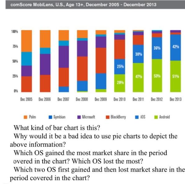
Consider the figure below and answer the following questions comScore Mobilens, U.S., Age 13+, December 2005 - December 2013 100% 75% 50% 25% 25% 29%
Consider the figure below and answer the following questions

comScore Mobilens, U.S., Age 13+, December 2005 - December 2013 100% 75% 50% 25% 25% 29% 30% 47% BlackBerry 36% iOS 53% 0% Dec 2005 Dec 2006 Dec 2007 Dec 2008 Dec 2009 Dec 2010 Dec 2011 Dec 2012 Dec 2013 42% Palm Symbian Microsoft What kind of bar chart is this? Why would it be a bad idea to use pie charts to depict the above information? Android 51% Which OS gained the most market share in the period overed in the chart? Which OS lost the most? Which two OS first gained and then lost market share in the period covered in the chart?
Step by Step Solution
★★★★★
3.40 Rating (141 Votes )
There are 3 Steps involved in it
Step: 1
1 Pie charts are not recommended for depicting market share data because it is difficult to accurately compare the sizes of pie slicesHumans are not v...
Get Instant Access to Expert-Tailored Solutions
See step-by-step solutions with expert insights and AI powered tools for academic success
Step: 2

Step: 3

Ace Your Homework with AI
Get the answers you need in no time with our AI-driven, step-by-step assistance
Get Started


