Answered step by step
Verified Expert Solution
Question
1 Approved Answer
Consider the following snippet of CSS containing some media queries. li { font-size: 1rem; padding: 2rem; Qmedia only screen and (min-width: 768px ) { li
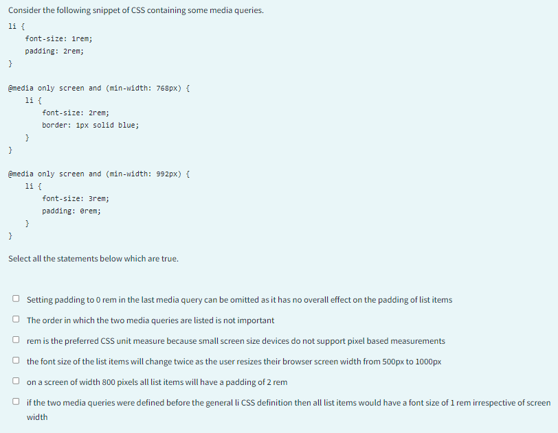
Consider the following snippet of CSS containing some media queries. li \{ font-size: 1rem; padding: 2rem; Qmedia only screen and (min-width: 768px ) \{ li \{ font-size: 2rem; border: 1px solid blue; \} @media only screen and (min-width: 992px ) \{ li \{ font-size: 3rem; \} padding: orem; \} Select all the statements below which are true. Setting padding to 0 rem in the last media query can be omitted as it has no overall effect on the padding of list items The order in which the two media queries are listed is not important rem is the preferred CSS unit measure because small screen size devices do not support pixel based measurements the font size of the list items will change twice as the user resizes their browser screen width from 500px to 1000px on a screen of width 800 pixels all list items will have a padding of 2 rem if the two media queries were defined before the general li cSS definition then all list items would have a font size of 1 rem irrespective of scree width
Step by Step Solution
There are 3 Steps involved in it
Step: 1
Get Instant Access to Expert-Tailored Solutions
See step-by-step solutions with expert insights and AI powered tools for academic success
Step: 2
Step: 3
Ace Your Homework with AI
Get the answers you need in no time with our AI-driven, step-by-step assistance
Get Started