could someone help me with the 3 questions ?
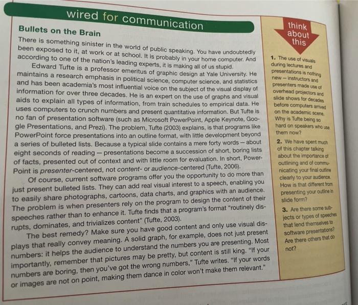
wired for communication think about this Bullets on the Brain There is something sinister in the world of public speaking. You have undoubtedly been exposed to it, at work or at school. It is probably in your home computer. And according to one of the nation's leading experts, it is making all of us stupid. Edward Tufte is a professor emeritus of graphic design at Yale University. He maintains a research emphasis in political science, computer science, and statistics and has been academia's most influential voice on the subject of the visual display of information for over three decades. He is an expert on the use of graphs and visual aids to explain all types of information, from train schedules to empirical data. He uses computers to crunch numbers and present quantitative information. But Tufte is no fan of presentation software (such as Microsoft PowerPoint, Apple Keynote, Goo- gle Presentations, and Prezi). The problem, Tufte (2003) explains, is that programs like PowerPoint force presentations into an outline format, with little development beyond a series of bulleted lists. Because a typical slide contains a mere forty words - about eight seconds of reading - presentations become a succession of short, boring lists of facts, presented out of context and with little room for evaluation. In short, Power- Point is presenter-centered, not content- or audience-centered (Tufte, 2006). Of course, current software programs offer you the opportunity to do more than just present bulleted lists. They can add real visual interest to a speech, enabling you 1. The use of visuals during lectures and presentations is nothing new-instructors and presenters made uso overhead projectors and slide shows for decades before computers and on the academic scene Why is Tutte being so hard on speakers who them now? 2. We have spent much of this chapter talking about the importance of to easily share photographs, cartoons, data charts, and graphics with an audience. The problem is when presenters rely on the program to design the content of their speeches rather than to enhance it. Tufte finds that a program's format "routinely dis- rupts, dominates, and trivializes content" (Tufte, 2003). The best remedy? Make sure you have good content and only use visual dis- plays that really convey meaning. A solid graph, for example, does not just present numbers: it helps the audience to understand the numbers you are presenting. Most importantly, remember that pictures may be pretty, but content is still king. "If your numbers are boring, then you've got the wrong numbers." Tufte writes. "If your words or images are not on point, making them dance in color won't make them relevant." outlining and of commu nicating your final outline clearly to your audienos How is that different from presenting your outine in slide form? 3. Are there some sub- jects or types of speeches that lend themselves to software presentations Are there others that do not


