Answered step by step
Verified Expert Solution
Question
1 Approved Answer
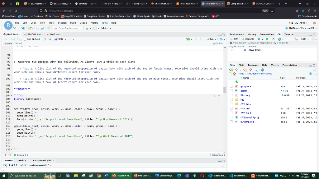
data_new1 and data_new2 represent subsets of data from the dataset babynames. The line plots should show the most popular names for boys and girls(the two
data_new1 and data_new2 represent subsets of data from the dataset "babynames." The line plots should show the most popular names for boys and girls(the two subsets), respectively. The line plot should start at the year 1900 up until 2017. It is supposed to show how popular the top 10 names for 2017 were in other years as well. This is what I have so far, I don't know how to make it so that the popularity of the names show up in multiple years. 
Step by Step Solution
There are 3 Steps involved in it
Step: 1

Get Instant Access to Expert-Tailored Solutions
See step-by-step solutions with expert insights and AI powered tools for academic success
Step: 2

Step: 3

Ace Your Homework with AI
Get the answers you need in no time with our AI-driven, step-by-step assistance
Get Started


