Detailed explanation:-
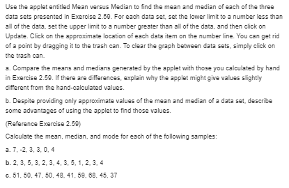
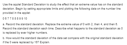
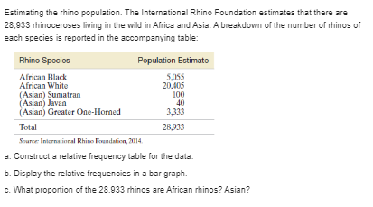
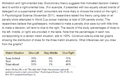
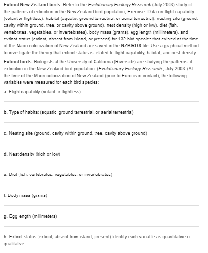
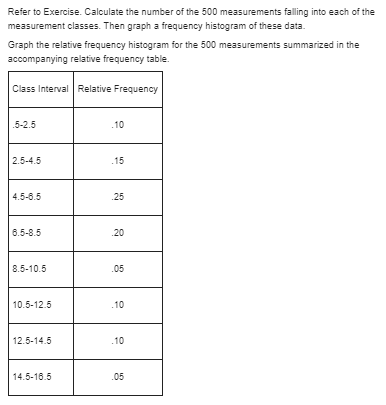
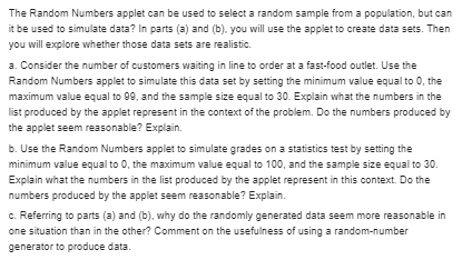
Use the applet entitled Mean versus Median to find the mean and median of each of the three data sets presented in Exercise 2 59. For each data set, set the lower limit to a number less than all of the data, set the upper limit to a number greater than all of the data, and then click on Update. Click on the approximate location of each data item on the number line. You can get rid of a point by dragging it to the trash can. To clear the graph between data sets, simply click on the trash can. 3. Compare the means and medians generated by the applet with those you calculated by hand in Exercise 2.59. If there are differences, explain why the applet might give values slightly different from the hand-calculated values. b. Despite providing only approximate values of the mean and median of a data set, describe some advantages of using the applet to find those values. (Reference Exercise 2.50) Calculate the mean, median, and mode for each of the following samples: a. 7, -2 3, 3, 0. 4 b. 2. 3, 5. 3, 2, 3. 4, 3, 5, 1, 2. 3, 4 C. 51, 50, 47. 50, 48. 41, 59, 68, 45, 37Use the applet Standard Deviation to study the effect that an extreme value has on the standard deviation. Begin by setting appropriate limits and plotting the following data on the number line provided in the applet: 06778880910 a. Record the standard deviation. Replace the extreme value of 0 with 2, then 4, and then 6. Record the standard deviation each time. Describe what happens to the standard deviation as 0 is replaced by ever higher numbers. b. How would the standard deviation of the data set compare with the original standard deviation if the 0 were replaced by 16? Explain.Estimating the rhino population. The International Rhino Foundation estimates that there are 28,933 rhinoceroses living in the wild in Africa and Asia. A breakdown of the number of rhinos of each species is reported in the accompanying table: Rhino Species Population Estimate African Black African White 20.405 (Asian) Sumatran 100 [ Asian) Javan 40 (Asian) Greater One-Horned 3.313 Total 28,933 Source International Rhine Foundation, 7014. a. Construct a relative frequency table for the data. b. Display the relative frequencies in a bar graph. c. What proportion of the 28,933 rhinos are African rhinos? Asian?\fMotivation and right-oriented bias. Evolutionary theory suggests that motivated decision makers tend to exhibit a right-oriented bias. (For example, if presented with two equally valued brands of detergent on a supermarket shelf, consumers are more likely to choose the brand on the right.) In Psychological Science (November 2011), researchers tested this theory using data on all penalty shots attempted in World Cup soccer matches (a total of 204 penalty shots). The researchers believe that goalkeepers, motivated to make a penalty shot save but with little time to make a decision, will tend to dive to the right. The results of the study (percentages of dives to the left, middle, or right) are provided in the table. Note that the percentages in each row. corresponding to a certain match situation, add to 100%. Construct side-by-side bar graphs showing the distribution of dives for the three match situations. What inferences can you draw from the graphs? Match Situation Dive Left Stay Middle Dive Right Team behind 29% 71% Tied 49% Team ahead 51% 48% Sauce: Rockes, M. cial. "The right side? Under time pressure, approach molinvation leads to right-oriented his"Packedopal Saran, Val. ). No. II. Nov 2011 ( adapted from Figure 1).Extinct New Zealand birds. Refer to the Evolutionary Ecology Research (July 2003) study of the patterns of extinction in the New Zealand bird population, Exercise. Data on flight capability (volant or flightless). habitat (aquatic, ground terrestrial, or aerial terrestrial), nesting site (ground, cavity within ground, tree, or cavity above ground). nest density (high or low), diet (fish, vertebrates, vegetables, or invertebrates), body mass (grams). egg length (millimeters), and extinct status (extinct, absent from island, or present) for 132 bird species that existed at the time of the Maori colonization of New Zealand are saved in the NZBIRDS file. Use a graphical method to investigate the theory that extinct status is related to flight capability, habitat, and nest density. Extinct birds. Biologists at the University of California (Riverside) are studying the patterns of extinction in the New Zealand bird population. (Evolutionary Ecology Research , July 2003.) At the time of the Maori colonization of New Zealand (prior to European contact), the following variables were measured for each bird species: a. Flight capability (volant or flightless) b. Type of habitat (aquatic, ground terrestrial, or aerial terrestrial) C. Nesting site (ground, cavity within ground, tree, cavity above ground) d. Nest density (high or low) e. Diet (fish, vertebrates, vegetables, or invertebrates) f. Body mass (grams) g. Egg length (millimeters) h. Extinct status (extinct, absent from island, present) Identify each variable as quantitative or qualitative.\fThe Random Numbers applet can be used to select a random sample from a population, but can it be used to simulate data? In parts (a) and (b). you will use the applet to create data sets. Then you will explore whether those data sets are realistic. a. Consider the number of customers waiting in line to order at a fast-food outlet. Use the Random Numbers applet to simulate this data set by setting the minimum value equal to 0, the maximum value equal to 99, and the sample size equal to 30. Explain what the numbers in the list produced by the applet represent in the context of the problem. Do the numbers produced by the applet seem reasonable? Explain. b. Use the Random Numbers applet to simulate grades on a statistics test by setting the minimum value equal to 0, the maximum value equal to 100, and the sample size equal to 30. Explain what the numbers in the list produced by the applet represent in this context. Do the numbers produced by the applet seem reasonable? Explain. c. Referring to parts (a) and (b). why do the randomly generated data seem more reasonable in one situation than in the other? Comment on the usefulness of using a random-number generator to produce data.Shaft graves in ancient Greece. Archeologists have discovered a rise in shaft graves during the Middle Helladic period in ancient Greece (i.e., around 2000 BC). Shaft graves are named for the beautifully decorated sword shafts that are buried along with the bodies. An analysis of shaft graves was camed out and published in the American Journal of Archaeology (Jan. 2014). The table below gives the number of shafts buried at each of 13 recently discovered grave sites. Construct a dot plot for the data. What number of sword shafts was observed most often in the sample of 13 graves? 1 2 3 1 5 6 2 4 1 2 4 2 9 Source: Harrell K. "The fallen and their swords A new explanation for the rec of the shaft graves" America Journal of Archaeology, Vol. IIS No. 1, January 2014 (Figure I)Comparing SAT Scores. Refer to Exercise 2 46 (p. 52), in which we compared state average SAT scores in 2011 and 2014. a. Construct side-by-side box plots of the SAT scores for the two years. b. Compare the variability of the SAT scores for the two years. c. Are any state SAT scores outliers in either year? If so, identify them. [Reference Exercise 2.48) State SAT scores. Educators are constantly evaluating the efficacy of public schools in the education and training of U.S. students. One quantitative assessment of change over time is the difference in scores on the SAT, which has been used for decades by colleges and universities as one criterion for admission. The SAT file contains average SAT scores for each of the 50 states and the District of Columbia for 2011 and 2014. Selected observations are shown in the following table: State 2011 2014 Alabama 1623 1608 Alaska 1513 1495 Arizona 1539 1551 Arkansas 1692 1697 California 1513 1505 Wisconsin 1767 1771 Wyoming 1692 1757 Based on College Entrance Examination Board, 2014. a. Use graphs to display the two SAT score distributions. How have the distributions of state scores changed from 2011 to 2014? b. As another method of comparing the 2011 and 2014 average SAT scores, compute the paired difference by subtracting the 2011 score from the 2014 score for each state. Summarize these differences with a graph. c. Interpret the graph you made in part b. How do your conclusions compare with those of part d. Identify the state with the largest improvement in the SAT score between 2011 and 2014.Construct a scatterplot for the data in the table that follows. Do you detect a trend? Variable #1: | .5 1 1.5 2 2.5 3 3.5 4 4.5 5 Variable #2: 2 3 4 10 12 17 17
