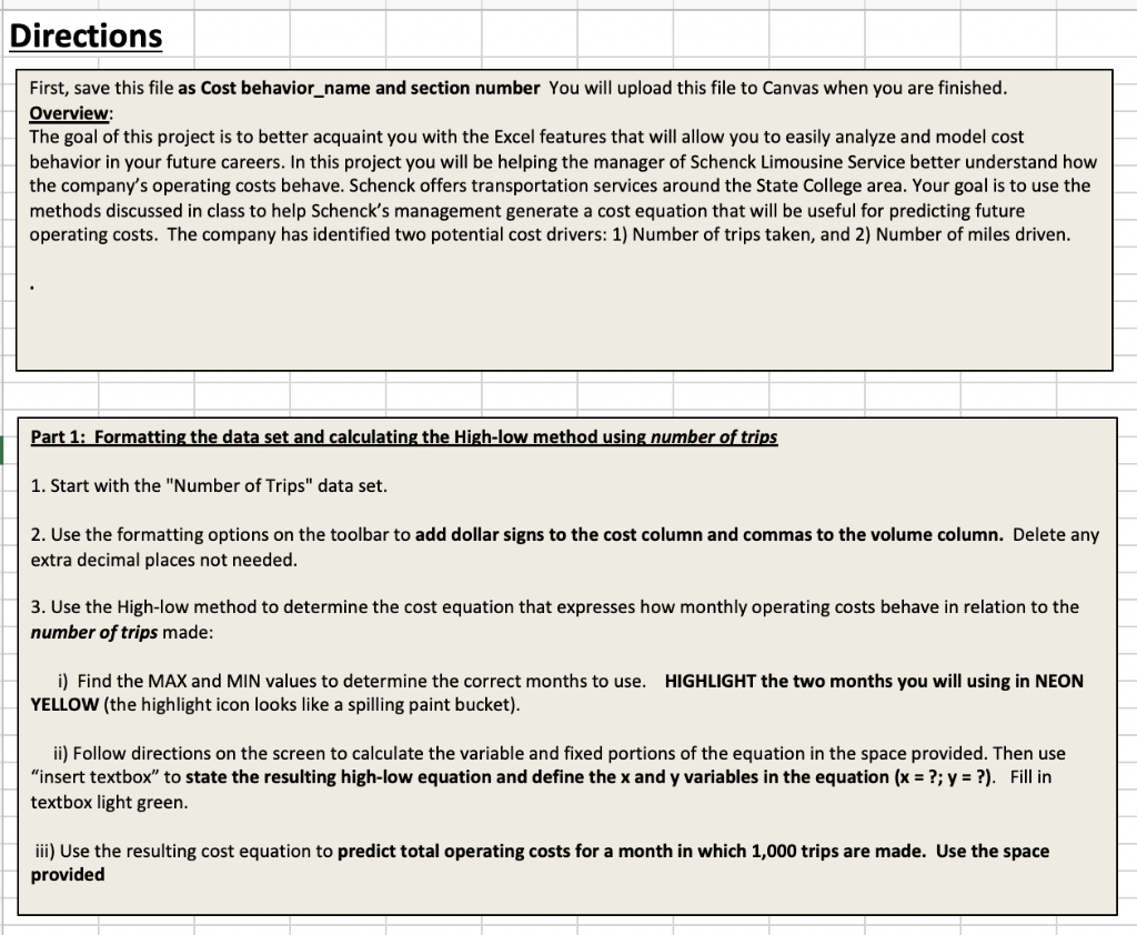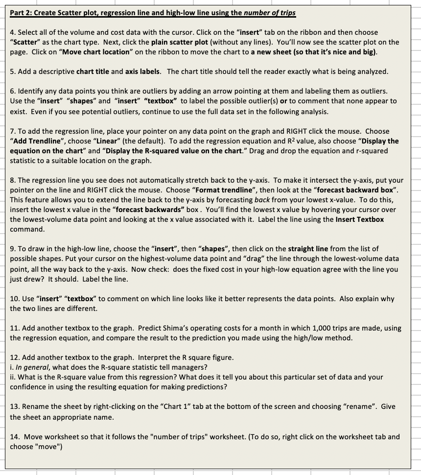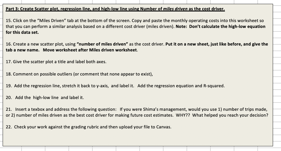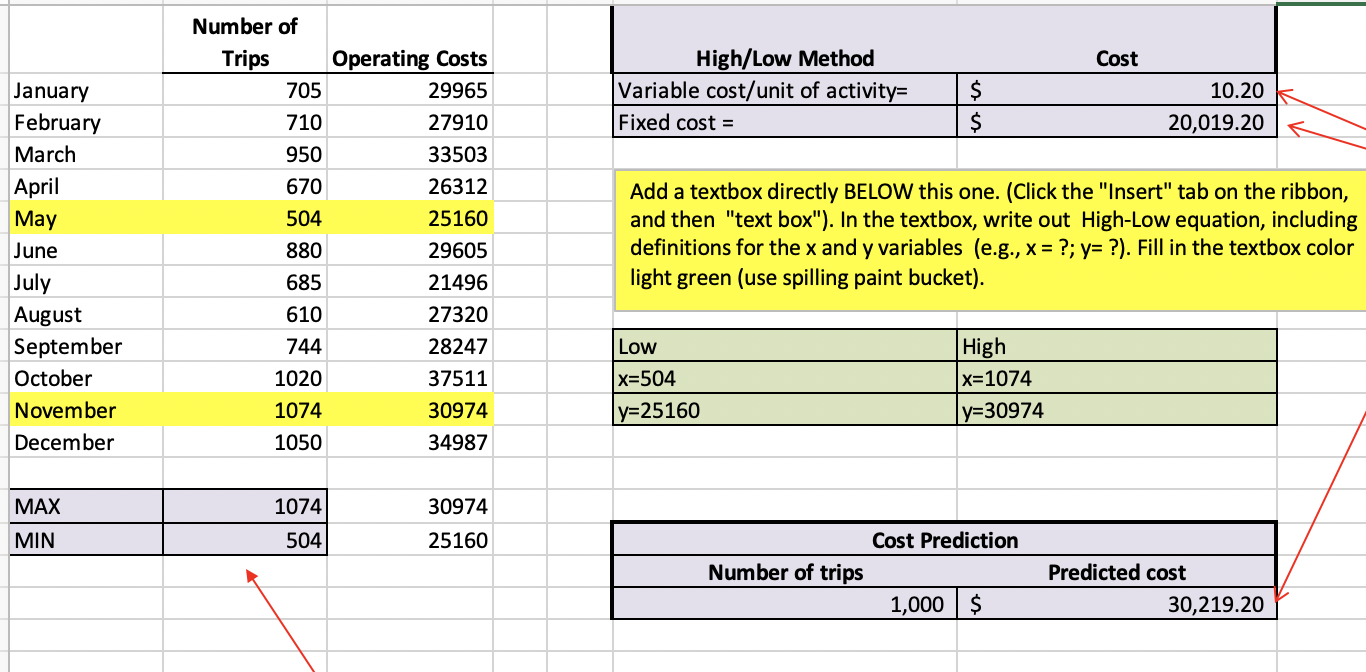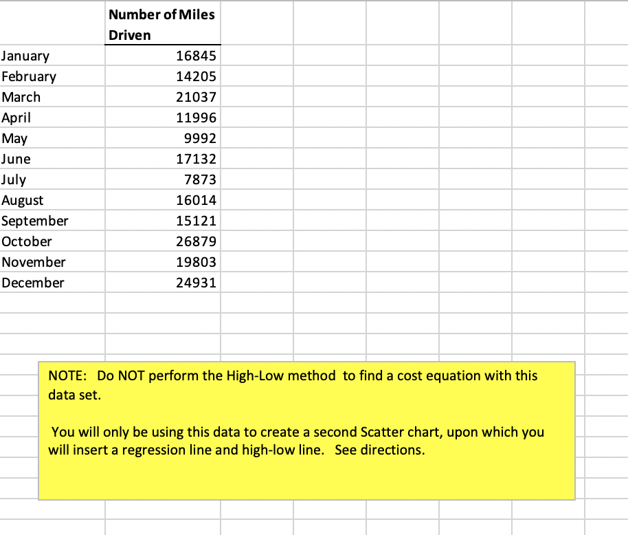


Directions First, save this file as Cost behavior_name and section number You will upload this file to Canvas when you are finished. Overview: The goal of this project is to better acquaint you with the Excel features that will allow you to easily analyze and model cost behavior in your future careers. In this project you will be helping the manager of Schenck Limousine Service better understand how the company's operating costs behave. Schenck offers transportation services around the State College area. Your goal is to use the methods discussed in class to help Schenck's management generate a cost equation that will be useful for predicting future operating costs. The company has identified two potential cost drivers: 1) Number of trips taken, and 2) Number of miles driven. Part 1: Formatting the data set and calculating the High-low method using number of trips 1. Start with the "Number of Trips" data set. 2. Use the formatting options on the toolbar to add dollar signs to the cost column and commas to the volume column. Delete any extra decimal places not needed. 3. Use the High-low method to determine the cost equation that expresses how monthly operating costs behave in relation to the number of trips made: HIGHLIGHT the two months you will using in NEON i) Find the MAX and MIN values to determine the correct months to use. YELLOW (the highlight icon looks like a spilling paint bucket). ii) Follow directions on the screen to calculate the variable and fixed portions of the equation in the space provided. Then use "insert textbox" to state the resulting high-low equation and define the x and y variables in the equation (x = ?; y = ?). Fill in textbox light green. iii) Use the resulting cost equation to predict total operating costs for a month in which 1,000 trips are made. Use the space provided Part 2: Create Scatter plot, regression line and high-low line using the number of trips 4. Select all of the volume and cost data with the cursor. Click on the "insert" tab on the ribbon and then choose "Scatter" as the chart type. Next, click the plain scatter plot (without any lines). You'll now see the scatter plot on the page. Click on "Move chart location" on the ribbon to move the chart to a new sheet (so that it's nice and big). 5. Add a descriptive chart title and axis labels. The chart title should tell the reader exactly what is being analyzed. 6. Identify any data points you think are outliers by adding an arrow pointing at them and labeling them as outliers. Use the "insert" "shapes" and "insert" "textbox" to label the possible outlier(s) or to comment that none appear to exist. Even if you see potential outliers, continue to use the full data set in the following analysis. 7. To add the regression line, place your pointer on any data point on the graph and RIGHT click the mouse. Choose "Add Trendline", choose "Linear" (the default). To add the regression equation and R2 value, also choose "Display the equation on the chart" and "Display the R-squared value on the chart." Drag and drop the equation and r-squared statistic to a suitable location on the graph. 8. The regression line you see does not automatically stretch back to the y-axis. To make it intersect the y-axis, put your pointer on the line and RIGHT click the mouse. Choose "Format trendline", then look at the "forecast backward box". This feature allows you to extend the line back to the y-axis by forecasting back from your lowest x-value. To do this, insert the lowest x value in the "forecast backwards" box. You'll find the lowest x value by hovering your cursor over the lowest-volume data point and looking at the x value associated with it. Label the line using the Insert Textbox command. 9. To draw in the high-low line, choose the "insert", then "shapes", then click on the straight line from the list of possible shapes. Put your cursor on the highest-volume data point and "drag" the line through the lowest-volume data point, all the way back to the y-axis. Now check: does the fixed cost in your high-low equation agree with the line you just drew? It should. Label the line. 10. Use "insert" "textbox" to comment on which line looks like it better represents the data points. Also explain why the two lines are different. 11. Add another textbox to the graph. Predict Shima's operating costs for a month in which 1,000 trips are made, using the regression equation, and compare the result to the prediction you made using the high/low method. 12. Add another textbox to the graph. Interpret the R square figure. i. In general, what does the R-square statistic tell managers? ii. What is the R-square value from this regression? What does it tell you about this particular set of data and your confidence in using the resulting equation for making predictions? 13. Rename the sheet by right-clicking on the "Chart 1" tab at the bottom of the screen and choosing "rename". Give the sheet an appropriate name. 14. Move worksheet so that it follows the "number of trips" worksheet. (To do so, right click on the worksheet tab and choose "move") Part 3: Create Scatter plot, regression line, and high-low line using Number of miles driven as the cost driver. 15. Click on the Miles Driven tab at the bottom of the screen. Copy and paste the monthly operating costs into this worksheet so that you can perform a similar analysis based on a different cost driver (miles driven). Note: Don't calculate the high-low equation for this data set. 16. Create a new scatter plot, using "number of miles driven as the cost driver. Put it on a new sheet, just like before, and give the tab a new name. Move worksheet after Miles driven worksheet. 17. Give the scatter plot a title and label both axes. 18. Comment on possible outliers (or comment that none appear to exist), 19. Add the regression line, stretch it back to y-axis, and label it. Add the regression equation and R-squared. 20. Add the high-low line and label it. 21. Insert a texbox and address the following question: If you were Shima's management, would you use 1) number of trips made, or 2) number of miles driven as the best cost driver for making future cost estimates. WHY?? What helped you reach your decision? 22. Check your work against the grading rubric and then upload your file to Canvas. Cost High/Low Method Variable cost/unit of activity= Fixed cost = $ 10.20 k 20,019.20 January February March April May June July August September October November December Number of Trips Operating Costs 705 29965 710 27910 950 33503 670 26312 504 25160 880 29605 685 21496 610 27320 744 28247 1020 37511 1074 30974 1050 34987 Add a textbox directly BELOW this one. (Click the "Insert" tab on the ribbon, and then "text box"). In the textbox, write out High-Low equation, including definitions for the x and y variables (e.g., x = ?; y= ?). Fill in the textbox color light green (use spilling paint bucket). Low x=504 y=25160 High x=1074 y=30974 MAX 1074 30974 MIN 504 25160 Cost Prediction Number of trips 1,000 $ Predicted cost 30,219.20 January February March April May June July August September October November December Number of Miles Driven 16845 14205 21037 11996 9992 17132 7873 16014 15121 26879 19803 24931 NOTE: DO NOT perform the High-Low method to find a cost equation with this data set. You will only be using this data to create a second Scatter chart, upon which you will insert a regression line and high-low line. See directions. Directions First, save this file as Cost behavior_name and section number You will upload this file to Canvas when you are finished. Overview: The goal of this project is to better acquaint you with the Excel features that will allow you to easily analyze and model cost behavior in your future careers. In this project you will be helping the manager of Schenck Limousine Service better understand how the company's operating costs behave. Schenck offers transportation services around the State College area. Your goal is to use the methods discussed in class to help Schenck's management generate a cost equation that will be useful for predicting future operating costs. The company has identified two potential cost drivers: 1) Number of trips taken, and 2) Number of miles driven. Part 1: Formatting the data set and calculating the High-low method using number of trips 1. Start with the "Number of Trips" data set. 2. Use the formatting options on the toolbar to add dollar signs to the cost column and commas to the volume column. Delete any extra decimal places not needed. 3. Use the High-low method to determine the cost equation that expresses how monthly operating costs behave in relation to the number of trips made: HIGHLIGHT the two months you will using in NEON i) Find the MAX and MIN values to determine the correct months to use. YELLOW (the highlight icon looks like a spilling paint bucket). ii) Follow directions on the screen to calculate the variable and fixed portions of the equation in the space provided. Then use "insert textbox" to state the resulting high-low equation and define the x and y variables in the equation (x = ?; y = ?). Fill in textbox light green. iii) Use the resulting cost equation to predict total operating costs for a month in which 1,000 trips are made. Use the space provided Part 2: Create Scatter plot, regression line and high-low line using the number of trips 4. Select all of the volume and cost data with the cursor. Click on the "insert" tab on the ribbon and then choose "Scatter" as the chart type. Next, click the plain scatter plot (without any lines). You'll now see the scatter plot on the page. Click on "Move chart location" on the ribbon to move the chart to a new sheet (so that it's nice and big). 5. Add a descriptive chart title and axis labels. The chart title should tell the reader exactly what is being analyzed. 6. Identify any data points you think are outliers by adding an arrow pointing at them and labeling them as outliers. Use the "insert" "shapes" and "insert" "textbox" to label the possible outlier(s) or to comment that none appear to exist. Even if you see potential outliers, continue to use the full data set in the following analysis. 7. To add the regression line, place your pointer on any data point on the graph and RIGHT click the mouse. Choose "Add Trendline", choose "Linear" (the default). To add the regression equation and R2 value, also choose "Display the equation on the chart" and "Display the R-squared value on the chart." Drag and drop the equation and r-squared statistic to a suitable location on the graph. 8. The regression line you see does not automatically stretch back to the y-axis. To make it intersect the y-axis, put your pointer on the line and RIGHT click the mouse. Choose "Format trendline", then look at the "forecast backward box". This feature allows you to extend the line back to the y-axis by forecasting back from your lowest x-value. To do this, insert the lowest x value in the "forecast backwards" box. You'll find the lowest x value by hovering your cursor over the lowest-volume data point and looking at the x value associated with it. Label the line using the Insert Textbox command. 9. To draw in the high-low line, choose the "insert", then "shapes", then click on the straight line from the list of possible shapes. Put your cursor on the highest-volume data point and "drag" the line through the lowest-volume data point, all the way back to the y-axis. Now check: does the fixed cost in your high-low equation agree with the line you just drew? It should. Label the line. 10. Use "insert" "textbox" to comment on which line looks like it better represents the data points. Also explain why the two lines are different. 11. Add another textbox to the graph. Predict Shima's operating costs for a month in which 1,000 trips are made, using the regression equation, and compare the result to the prediction you made using the high/low method. 12. Add another textbox to the graph. Interpret the R square figure. i. In general, what does the R-square statistic tell managers? ii. What is the R-square value from this regression? What does it tell you about this particular set of data and your confidence in using the resulting equation for making predictions? 13. Rename the sheet by right-clicking on the "Chart 1" tab at the bottom of the screen and choosing "rename". Give the sheet an appropriate name. 14. Move worksheet so that it follows the "number of trips" worksheet. (To do so, right click on the worksheet tab and choose "move") Part 3: Create Scatter plot, regression line, and high-low line using Number of miles driven as the cost driver. 15. Click on the Miles Driven tab at the bottom of the screen. Copy and paste the monthly operating costs into this worksheet so that you can perform a similar analysis based on a different cost driver (miles driven). Note: Don't calculate the high-low equation for this data set. 16. Create a new scatter plot, using "number of miles driven as the cost driver. Put it on a new sheet, just like before, and give the tab a new name. Move worksheet after Miles driven worksheet. 17. Give the scatter plot a title and label both axes. 18. Comment on possible outliers (or comment that none appear to exist), 19. Add the regression line, stretch it back to y-axis, and label it. Add the regression equation and R-squared. 20. Add the high-low line and label it. 21. Insert a texbox and address the following question: If you were Shima's management, would you use 1) number of trips made, or 2) number of miles driven as the best cost driver for making future cost estimates. WHY?? What helped you reach your decision? 22. Check your work against the grading rubric and then upload your file to Canvas. Cost High/Low Method Variable cost/unit of activity= Fixed cost = $ 10.20 k 20,019.20 January February March April May June July August September October November December Number of Trips Operating Costs 705 29965 710 27910 950 33503 670 26312 504 25160 880 29605 685 21496 610 27320 744 28247 1020 37511 1074 30974 1050 34987 Add a textbox directly BELOW this one. (Click the "Insert" tab on the ribbon, and then "text box"). In the textbox, write out High-Low equation, including definitions for the x and y variables (e.g., x = ?; y= ?). Fill in the textbox color light green (use spilling paint bucket). Low x=504 y=25160 High x=1074 y=30974 MAX 1074 30974 MIN 504 25160 Cost Prediction Number of trips 1,000 $ Predicted cost 30,219.20 January February March April May June July August September October November December Number of Miles Driven 16845 14205 21037 11996 9992 17132 7873 16014 15121 26879 19803 24931 NOTE: DO NOT perform the High-Low method to find a cost equation with this data set. You will only be using this data to create a second Scatter chart, upon which you will insert a regression line and high-low line. See directions
