Question
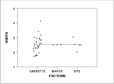
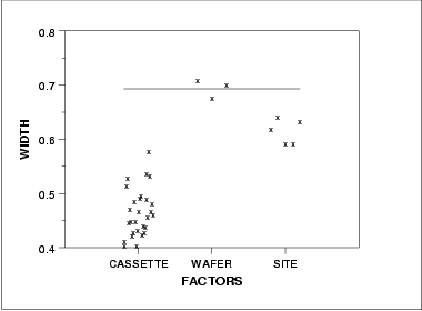
DOE mean plot DOE sd plot Summary The above graphs show that there are differences between the lots and the sites. There are various ways
 DOE sd plot
 Summary
The above graphs show that there are differences between the lots and the sites.
There are various ways we can create subgroups of this dataset: each lot could be a subgroup, each wafer could be a subgroup, or each site measured could be a subgroup (with only one data value in each subgroup).
Recall that for a classical Shewhart means chart, the average within subgroup standard deviation is used to calculate the control limits for the means chart. However, with a means chart you are monitoring the subgroup mean-to-mean variation. There is no problem if you are in a continuous processing situation - this becomes an issue if you are operating in a batch processing environment.
We will look at various control charts based on different subgroupings.
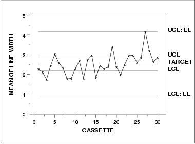
Choosing the right control charts to monitor the processThe largest source of variation in this data is the lot-to-lot variation. So, using classical Shewhart methods, if we specify our subgroup to be anything other than lot, we will be ignoring the known lot-to-lot variation and could get out-of-control points that already have a known, assignable cause - the data comes from different lots. However, in the lithography processing area the measurements of most interest are the site level measurements, not the lot means. How can we get around this seeming contradiction?Chart sources of variation separatelyOne solution is to chart the important sources of variation separately. We would then be able to monitor the variation of our process and truly understand where the variation is coming from and if it changes. For this dataset, this approach would require having two sets of control charts, one for the individual site measurements and the other for the lot means. This would double the number of charts necessary for this process (we would have 4 charts for line width instead of 2).Chart only most important source of variationAnother solution would be to have one chart on the largest source of variation. This would mean we would have one set of charts that monitor the lot-to-lot variation. From a manufacturing standpoint, this would be unacceptable.Use boxplot type chartWe could create a non-standard chart that would plot all the individual data values and group them together in a boxplottype format by lot. The control limits could be generated to monitor the individual data values while the lot-to-lot variation would be monitored by the patterns of the groupings. This would take special programming and management intervention to implement non-standard charts in most floor shop control systems.Alternate form for mean control chartA commonly applied solution is the first option; have multiple charts on this process. When creating the control limits for the lot means, care must be taken to use the lot-to-lot variation instead of the within lot variation. The resulting control charts are: the standard individuals/moving range charts (as seen previously), and a control chart on the lot means that is different from the previous lot means chart. This new chart uses the lot-to-lot variation to calculate control limits instead of the average within-lot standard deviation. The accompanying standard deviation chart is the same as seen previously.Mean control chart using lot-to-lot variation

The control limits labeled with "UCL" and "LCL" are the standard control limits. The control limits labeled with "UCL: LL" and "LCL: LL" are based on the lot-to-lot variation.
Your conclusion?...........................................................................................................
..
..
Step by Step Solution
There are 3 Steps involved in it
Step: 1

Get Instant Access to Expert-Tailored Solutions
See step-by-step solutions with expert insights and AI powered tools for academic success
Step: 2

Step: 3

Ace Your Homework with AI
Get the answers you need in no time with our AI-driven, step-by-step assistance
Get Started


