Answered step by step
Verified Expert Solution
Question
1 Approved Answer
Dr Evil has contaminated the Peaceful River Aquifer with Trichloroethylene. You need to construct a plot to show the concentration ratio of the groundwater contaminant
Dr Evil has contaminated the Peaceful River Aquifer with Trichloroethylene. You need to construct a plot to show the concentration ratio of the groundwater contaminant vs time at the aquifer located at your site. You need to use MATLAB to retrieve the data table for your site and plot a curve fit to the data (your numbers will be different then other students).
Your site is abc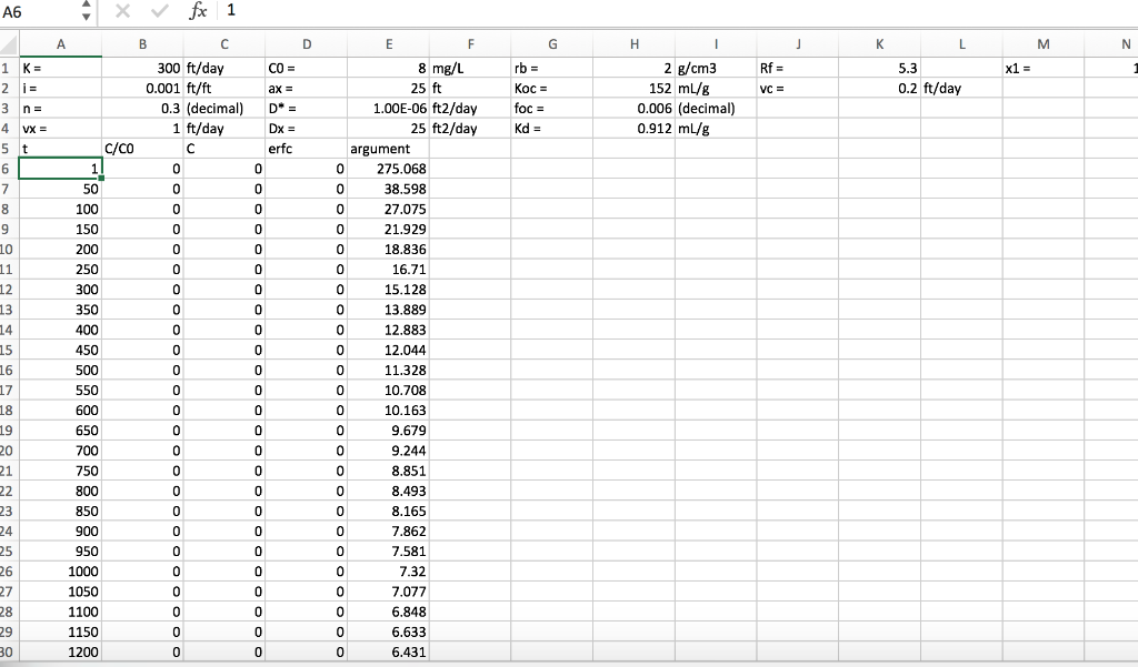 . Site specifications:
- It has a permeability of 200 ft/day
- Dr Evil's contamination level at the source was C0=10 micrograms/Liter.
- It is a distance of 1000 ft from the source of the contamination
Write a code segment to show how the ratio of the concentration of the contaminant at your site to the contamination level C0 changes with time.
- You MUST use the commands weboptions websave and importdata to import the data
- A website listing the url for the data set for your site is here: LINK Hint: Refer to Data Import/Export Lab. Open the data file to determine the delimiter and the number of header lines required.
- The concentration ratio is the 2nd column of file and the time in days is the first column of the file.
- Create a plot for the concentration ratio vs. time
- Use the cftool command after your plot command to perform a Cubic Interpolant curve fit to the data.
- Hint: For a plot using the command plot(x,y) the cftool command is cftool(x,y)
- In the Curve Fitting Tool GUI, to the right of the "Fit name" field is a drop down box where you can select the type of curve fit. The default is shown as polynomial, change it to Interpolant and Cubic
- In the "Fit name" field, type a GOOD name for your curve fit
- Use - File - Print to Figure - to put the curve fit on your plot
- In the new figure window, use the insert pull down menu to
- Include a GOOD plot title
- Include a GOOD X axis label with units
- Include a GOOD Y axis label
- In the figure window use File - Save As - and Save the plot as a png
- For full credit, upload to the Data Analysis Drop Box a png of your plot
- (repeated for emphasis) A png in your dropbox, with the curve fit shown and GOOD axis labels and a title, is required for full credit.
Step by Step Solution
There are 3 Steps involved in it
Step: 1

Get Instant Access to Expert-Tailored Solutions
See step-by-step solutions with expert insights and AI powered tools for academic success
Step: 2

Step: 3
Ace Your Homework with AI
Get the answers you need in no time with our AI-driven, step-by-step assistance
Get Started