

Question
Draw a graph similar to Figure 11.4 showing how the expected return varies with beta. you may use the following: this is an embedded MS
-
Draw a graph similar to Figure 11.4 showing how the expected return varies with beta.
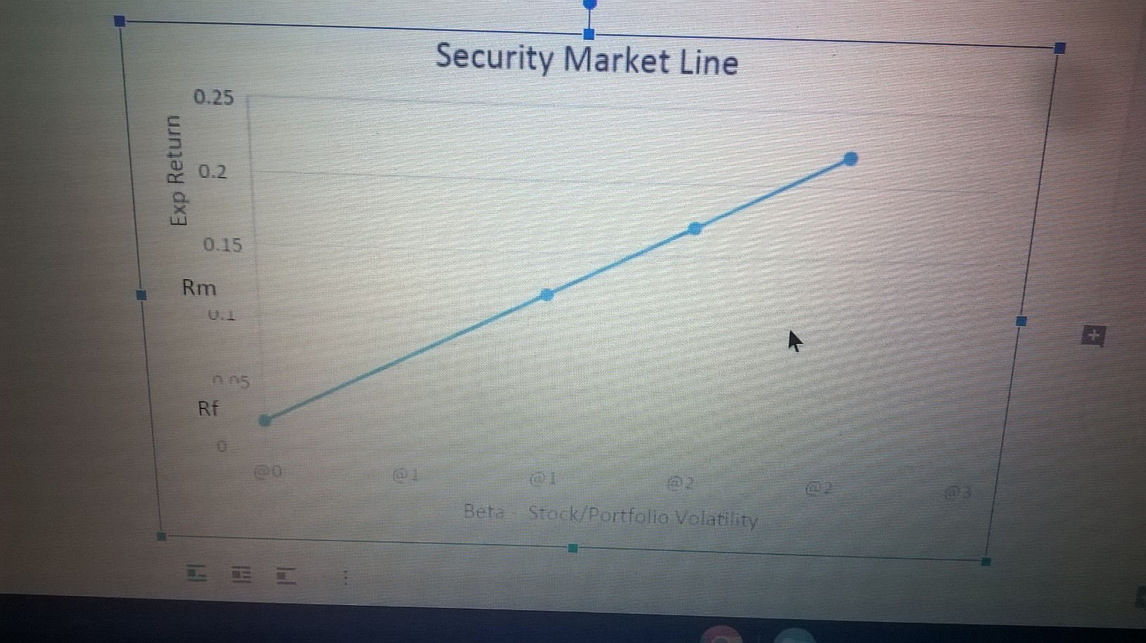
you may use the following: this is an embedded MS Excel Object and Chart, so if you set your cursor over the chart, and right click you mouse, then choose edit data, this may assist in understanding the Security Market Line concept, as well. Or you may choose to use your own.
-
What is the risk premium on the market?
-
What is the required return on an investment with a beta of 2.0? Is the beta above or below the Market beta?
Continued on next page.
-
If an investment has a return (In this case similar to going Market Price) of 7.2% (and a Beta of .7), would this project be considered to have an acceptable NPV, when compared to the required (or expected) fair or intrinsic return calculated by using the CAPM formula? Why?
Step by Step Solution
There are 3 Steps involved in it
Step: 1

Get Instant Access to Expert-Tailored Solutions
See step-by-step solutions with expert insights and AI powered tools for academic success
Step: 2

Step: 3
Ace Your Homework with AI
Get the answers you need in no time with our AI-driven, step-by-step assistance
Get Started
Contemporary Financial Management
Authors: James R Mcguigan, R Charles Moyer, William J Kretlow
10th Edition
978-0324289114, 0324289111