

Answered step by step
Verified Expert Solution
Question
1 Approved Answer
Due Jan 24 at 13 Submission types Text entry, File upload Allowable File Types html Submission & Rubric Description Solve the following questions in JupyterLab.
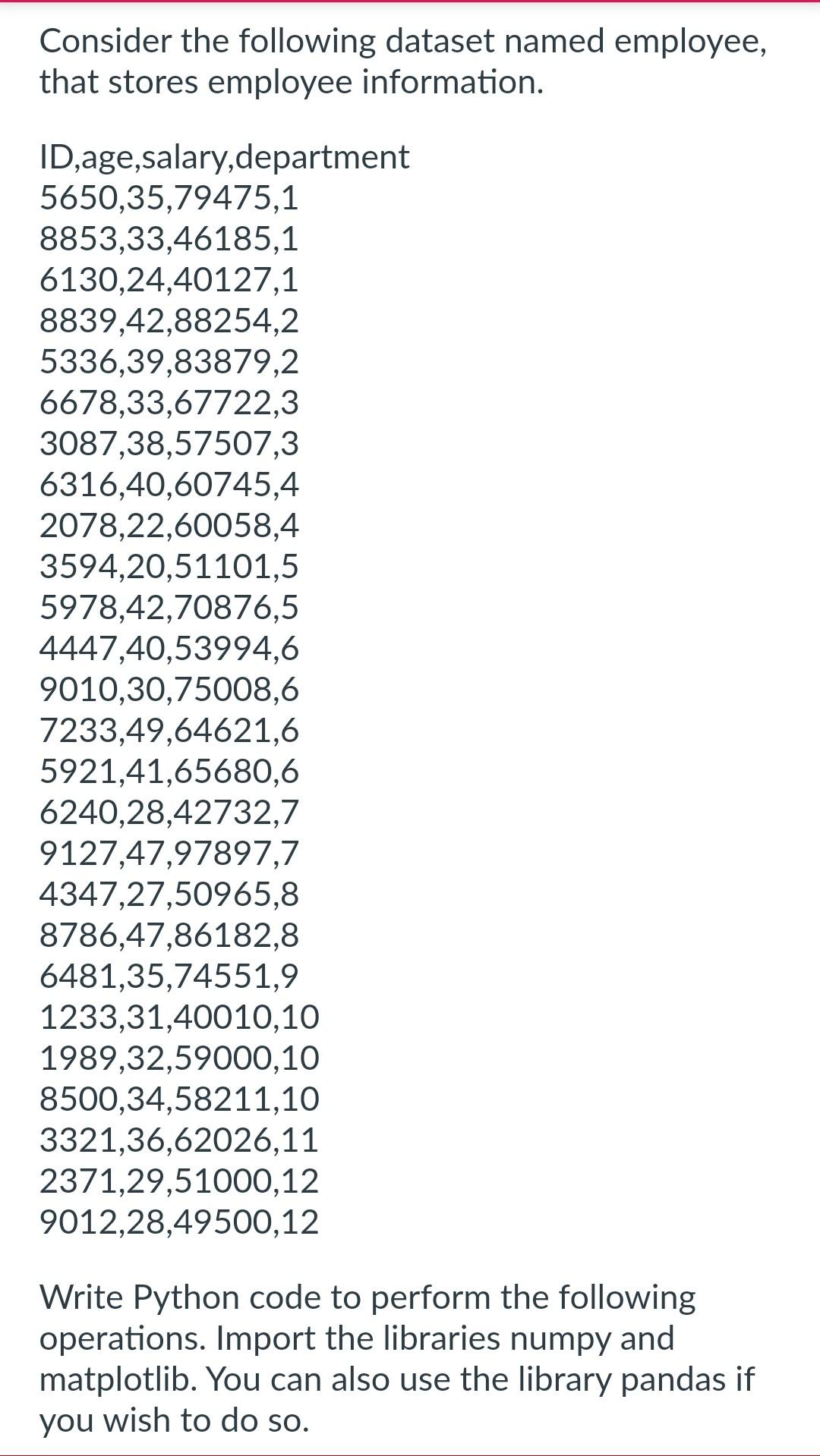
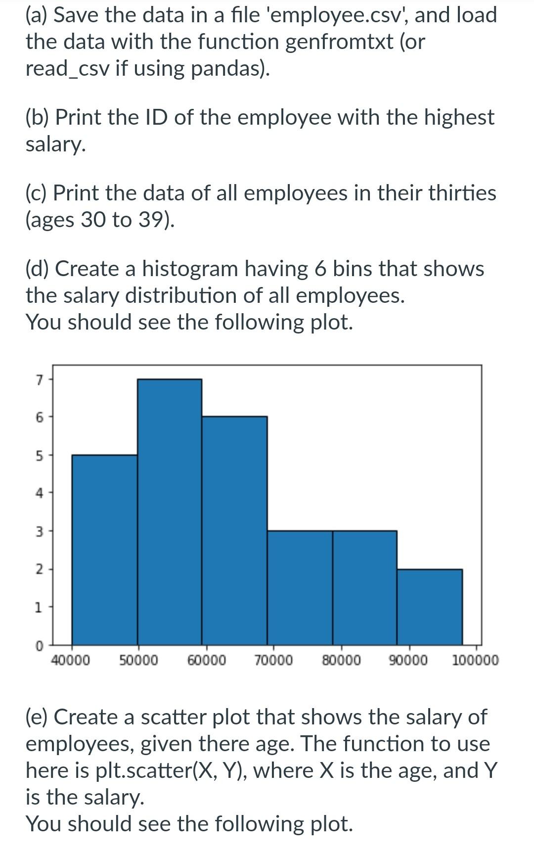
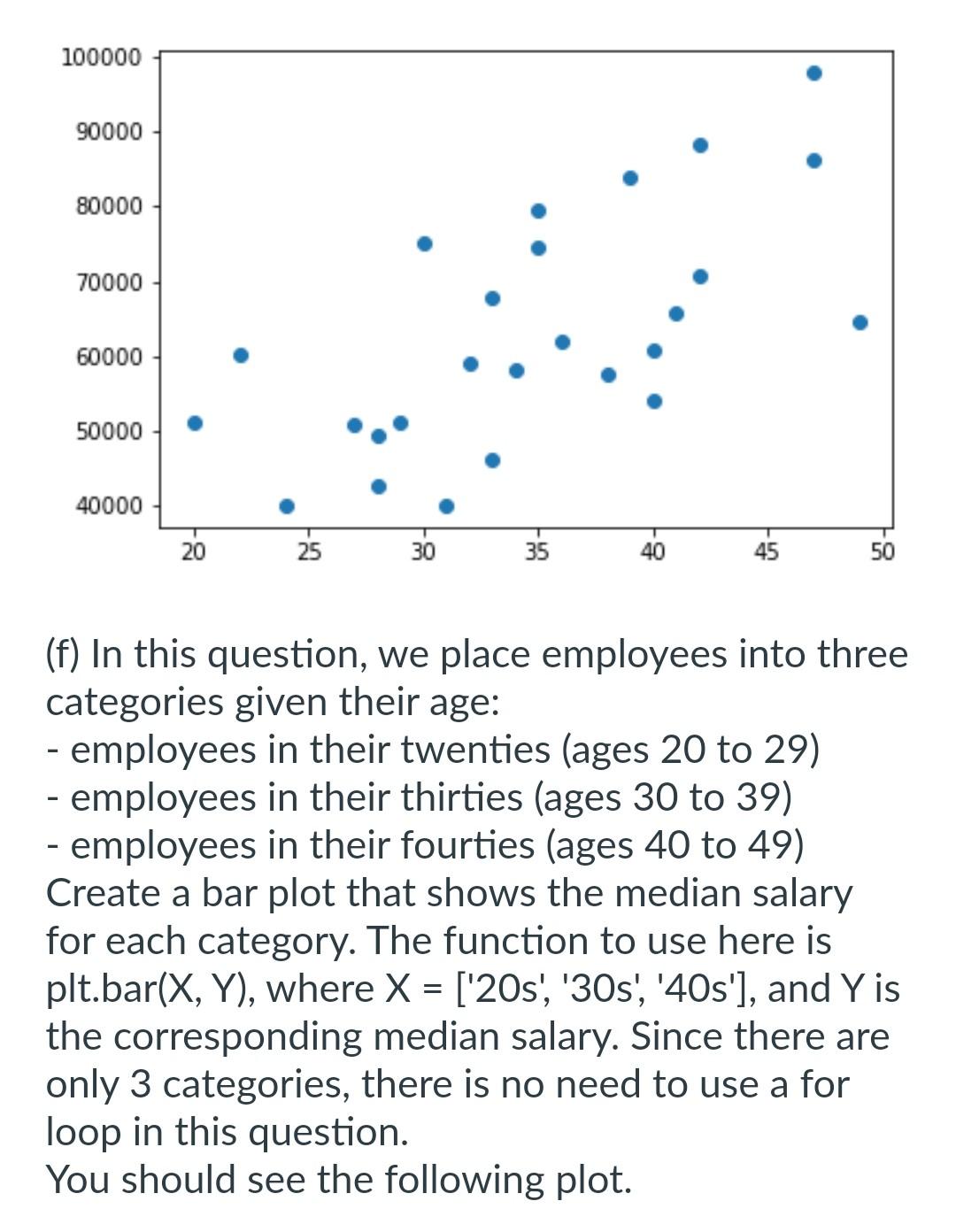
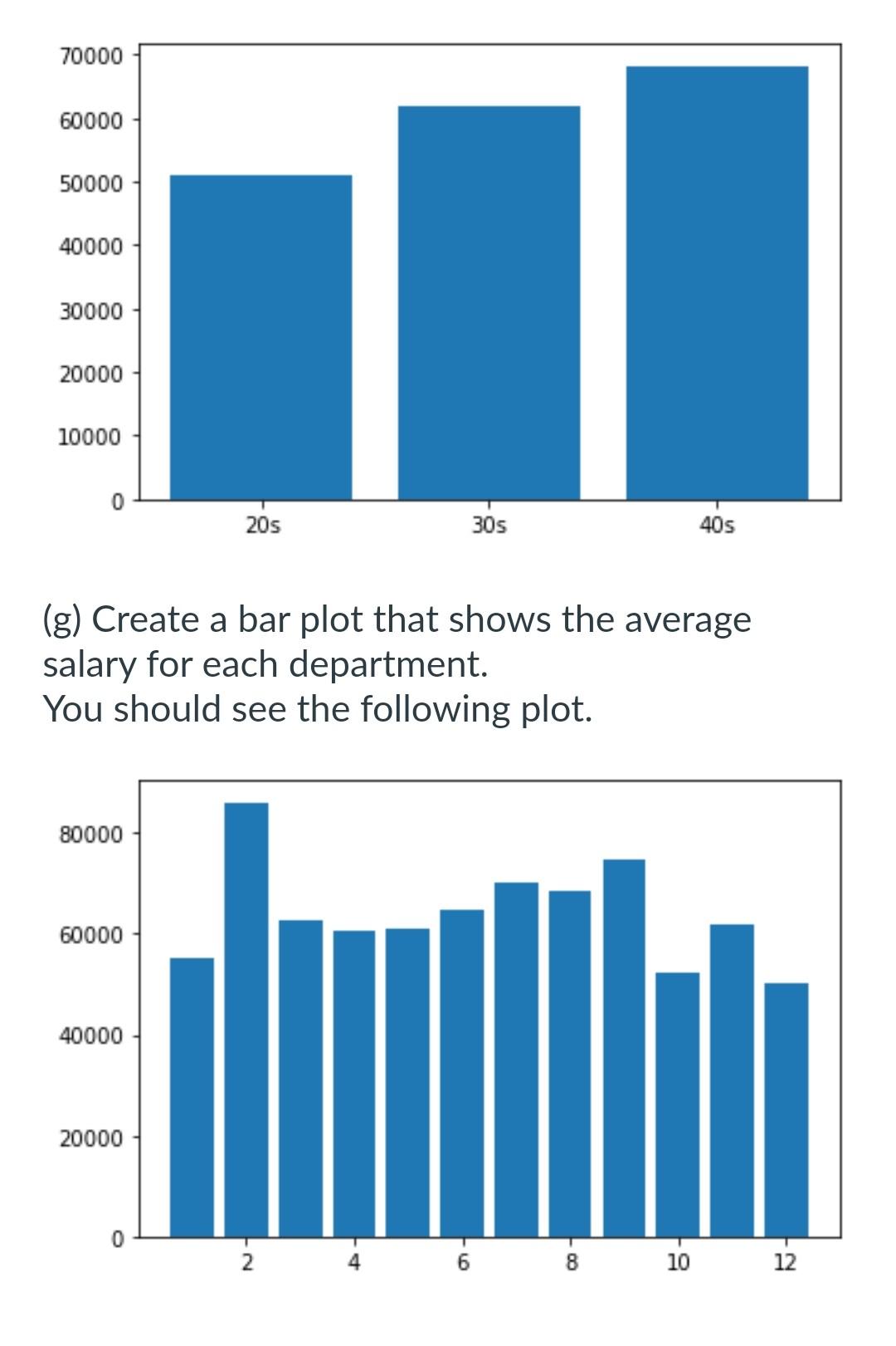
Due Jan 24 at 13 Submission types Text entry, File upload Allowable File Types html Submission \& Rubric Description Solve the following questions in JupyterLab. To submit your work, go to "File", then "Save and export notebook as...". And export your code including the output to HTML. Consider the following dataset named employee, rmation. form the following operations. Import the libraries numpy and matplotlib. You can also use the library pandas if you wish to do so. (a) Save the data in a file 'employee.csv', and load the data with the function genfromtxt (or read_csv if using pandas). (b) Print the ID of the employee with the highest salary. (c) Print the data of all employees in their thirties (ages 30 to 39). (d) Create a histogram having 6 bins that shows the salary distribution of all employees. You should see the following plot. (e) Create a scatter plot that shows the salary of employees, given there age. The function to use here is plt.scatter (X,Y), where X is the age, and Y is the salary. You should see the following plot. (f) In this question, we place employees into three categories given their age: - employees in their twenties (ages 20 to 29) - employees in their thirties (ages 30 to 39) - employees in their fourties (ages 40 to 49) Create a bar plot that shows the median salary for each category. The function to use here is plt.bar (X,Y), where X=[ '20s', '30s', '40s'], and Y is the corresponding median salary. Since there are only 3 categories, there is no need to use a for loop in this question. You should see the following plot. (g) Create a bar plot that shows the average salary for each department. You should see the following plot
Step by Step Solution
There are 3 Steps involved in it
Step: 1

Get Instant Access to Expert-Tailored Solutions
See step-by-step solutions with expert insights and AI powered tools for academic success
Step: 2

Step: 3
Ace Your Homework with AI
Get the answers you need in no time with our AI-driven, step-by-step assistance
Get Started
Intelligent Image Databases Towards Advanced Image Retrieval
Authors: Yihong Gong
1st Edition
1461375037, 978-1461375036