

Question
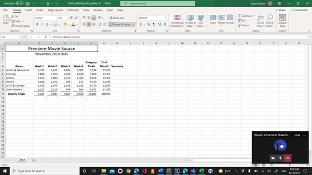
EX16_XL_CH03_GRADER_CAP_AS - Movie Source 1.14 Project Description: Steps to Perform: Step Instructions Points Possible Start Excel. Download and open the file named exploring_e03_grader_a1.xlsx . 0
EX16_XL_CH03_GRADER_CAP_AS - Movie Source 1.14
Project Description:
Steps to Perform:
Step
Instructions
Points Possible
- Start Excel. Download and open the file named exploring_e03_grader_a1.xlsx. 0
- Select the ranges A4:A10, F4:G10 and create a Clustered Column - Line on Secondary Axis combo chart. 10
- Position the chart to start in cell A13. Change the height to 3.5 inches and the width to 6 inches. 6
- Change the chart title to November 2018 Downloads by Genre. Apply Black, Text 1 font color to the chart title. 4
- Add a primary value axis title and type Number of Downloads. Add a secondary value axis title and type Percentage of Monthly Downloads. Apply Black, Text 1 font color to both value axis titles. 6
- Remove the legend. 2
- Add data labels for the % of Month line. Position the data labels Above. 2
- Select the range B5:E11. Insert Line Sparklines in the range H5:H11. 9
- Apply the Sparkline Style Accent 2, Darker 50% sparkline style. 4
- Show the high and low point markers for the sparklines. Change the high point marker color to Red. Change the low point marker to Blue. 8
- Select the range A4:E10. Create a stacked bar chart. Move the chart to new sheet. Type Bar Chart for the sheet name. 8
- Add a chart title above the bar chart and type November 2018 Weekly Downloads by Genre. Apply bold and Blue font color to the bar chart title. 8
- Apply 11 pt font size to the category axis, value axis, and the legend for the bar chart. 6
- Use the Axis Options to display the value axis in units of Thousands, set the Major Units to 500, apply the Number format with 1 decimal place for the bar chart. Click the vertical axis, and under Axis Options, click the Categories in reverse order check box. 10
- Change colors and apply Monochromatic Palette 8 to the bar chart (Blue gradient, light to dark).
Note, if you do not have Monochromatic Palette 8, apply Color 12 (Blue gradient, light to dark). 5
16.
Apply a gradient fill, using any preset or color, to the plot area in the bar chart. 5
17.
Apply landscape orientation for the Data worksheet. 2
18.
Apply horizontal and vertical centering on the page options for the Data worksheet. 5
19.
Ensure that the worksheets are correctly named and placed in the following order in the workbook: Bar Chart, Data. Save the workbook. Close the workbook and then exit Excel. Submit the workbook as directed. 0
Total Points
100
Step by Step Solution
There are 3 Steps involved in it
Step: 1

Get Instant Access to Expert-Tailored Solutions
See step-by-step solutions with expert insights and AI powered tools for academic success
Step: 2

Step: 3
Ace Your Homework with AI
Get the answers you need in no time with our AI-driven, step-by-step assistance
Get Started
Managerial Accounting An Introduction to Concepts Methods and Uses
Authors: Michael W. Maher, Clyde P. Stickney, Roman L. Weil
10th Edition
1111822239, 324639767, 9781111822231, 978-0324639766