Question
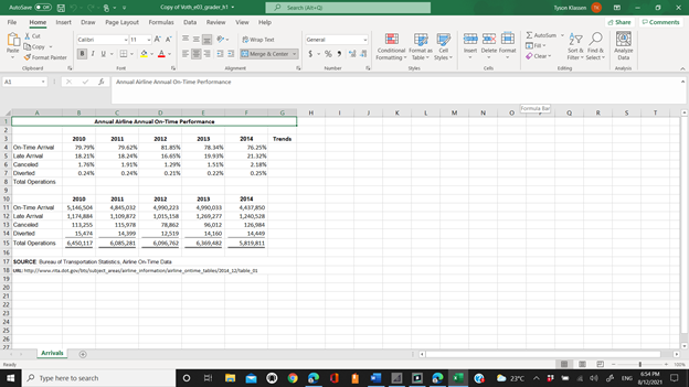
EX16_XL_CH03_GRADER_CAP_HW - Airline Arrivals Analysis 1.9 Project Description: You are an analyst for the airline industry. You created a workbook that lists overall airline arrival
EX16_XL_CH03_GRADER_CAP_HW - Airline Arrivals Analysis 1.9
Project Description:
You are an analyst for the airline industry. You created a workbook that lists overall airline arrival statistics for several years. In particular, you listed the percentage and number of on-time arrivals, late arrivals, canceled flights, and diverted flights based on information provided by the Bureau of Transportation Statistics. You want to create charts and insert sparklines that show the trends to discuss with airline and airport managers.
Steps to Perform:
Step
Instructions
Points Possible
1.Start Excel. Download and open the file namede03_grader_h1.xlsx. 0
2.Insert Line sparklines in the range G4:G7, using the data for the five years in the range B4:F7. 10
3.Display the high and low points for the Sparklines. 4
4.For the range containing Sparklines, change the high point marker color to Green (under Standard Colors). 4
5.Select the range A4:A7 and the range F4:F7. Create a pie chart and move it to a chart sheet namedPie Chart. 10
6.Type2014 Flight Arrivalsas the chart title. 3
7.Apply the Style 12 chart style. Format the chart title with Blue font color (under Standard Colors). 6
8.Change the Legend Position to Top to position the legend between the chart title and the plot area. 4
9.Add data labels to the Best Fit position. 4
10. Apply 12-pt size and bold the data labels. 4
11. Format the Canceled data point with Dark Red fill color. Format the Late Arrival data point in Green. Explode the Late Arrival data point by 5%. 5
12. Select the range A10:F15 in the Arrivals worksheet and create a clustered column chart. 10
13. TypeOn-Time and Late Flight Arrivalsfor the chart title. 3
14. Position the clustered column chart so that the top-left corner is in cell A20. Change the chart width to5.75inches and the height to3.5inches. 6
15. Apply chart filters to remove the canceled, diverted, and total operations data 6
16. Select the value axis, set500000for the Major unit, display the axis units in Millions, select category Number format with1decimal place. 8
17. Add a primary vertical axis titleNumber of Flights. 5
18. Apply the Color 2 chart color to the chart.
Note, depending on the version of Office used, the color name may be Colorful Palette 2. 4
19.
Apply the Light Gradient - Accent 3 fill to the chart area. 4
20.
Close the workbook, and then exit Excel. Submit the workbook as directed. 0
Total Points
100

Step by Step Solution
There are 3 Steps involved in it
Step: 1

Get Instant Access to Expert-Tailored Solutions
See step-by-step solutions with expert insights and AI powered tools for academic success
Step: 2

Step: 3

Ace Your Homework with AI
Get the answers you need in no time with our AI-driven, step-by-step assistance
Get Started


