Excel step by step help 1-13
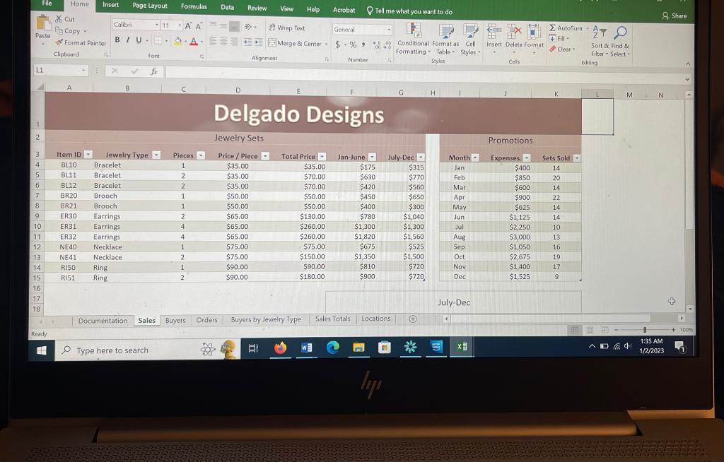
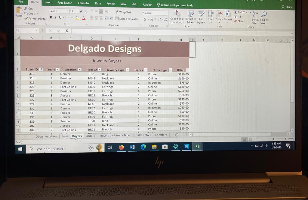
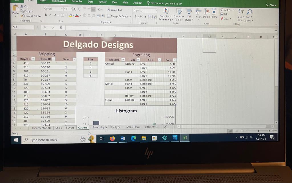
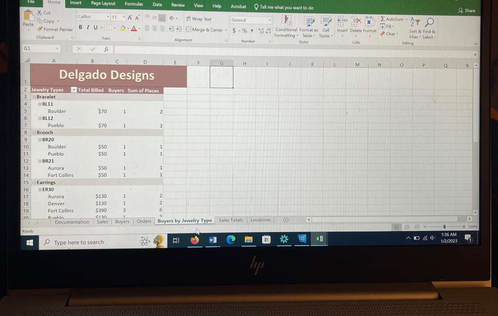
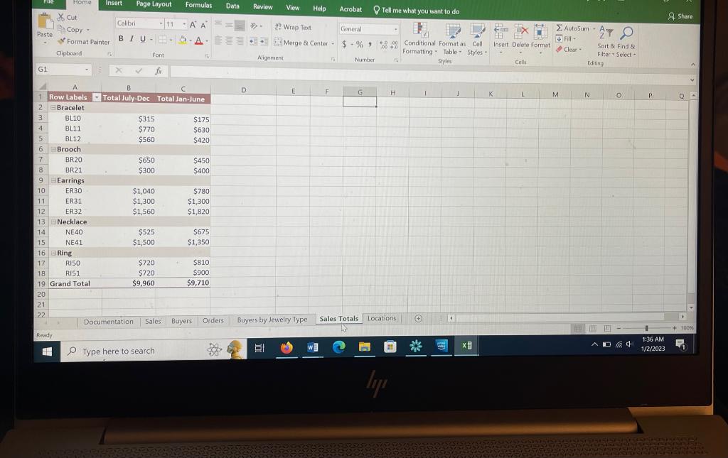
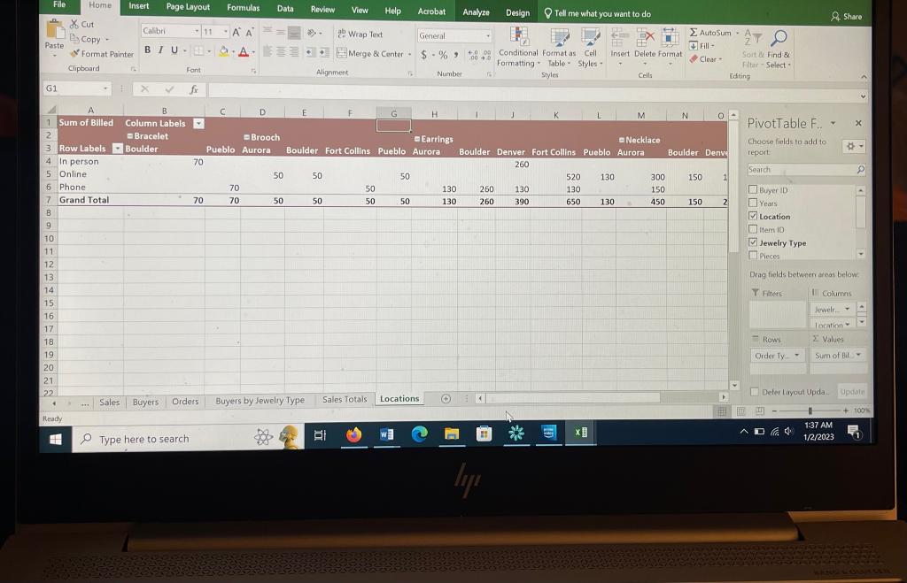
1. Selena Delgado creates and sells jewelry to stores and gift shops in Denver, Colorado, and nearby cities. She is using an Excel workbook to analyze sales from the previous year and asks for your help in creating advanced types of charts and PivotTables to provide an overview of her jewelry, buyers, and orders. Go to the Sales worksheet, which contains a column chart in the range F17: K30 showing sales of each jewelry item from July to December. Selena wants to create a similar chart showing the sales data from January to June. Provide a chart showing the January to June sales data as follows: a. Copy the July-Dec chart. b. Paste the chart in cell A17. c. Select the copied chart and drag the blue outline from the range G3:G15 to the range F3:F15 to change the data shown in the chart. 2. The Promos table in the range I3:K15 compares the expenses for promotions spent in the previous year and the number of jewelry sets sold. Selena asks you to create a chart that shows the relationship between the amount spent and the jewelry sets sold. a. Insert a Scatter chart that shows the relationship between the expense amount (range J3:J15) and the number of jewelry sets sold (range K3:K15). b. Resize and position the scatter chart so that it covers the range L2:S15. c. Use Promo Expense and Sets Sold as the chart title. 3. Selena wants to analyze the relationship between the expense amounts and the jewelry sets sold. Add a Linear Forecast trendline to the scatter chart. 4. Go to the Buyers worksheet, which contains details about store buyers in a table named Buyers. Selena wants to display the amount billed to buyers in each of five cities where she sells her jewelry. Insert a recommended PivotTable based on the Buyers table as follows: a. Insert the Sum of Billed by Location recommended PivotTable. [Mac Hint: Use the Location field in the Rows area and the Billed field in the Values area. Be sure to uncheck the Buyer ID and Item ID check boxes to deselect and remove them from the PivotTable, and drag the Location Field from the Columns area to the Rows area.] b. Use Billed by Location as the name of the new worksheet. c. Apply the Coral, Pivot Style Medium 12 style to the PivotTable. d. Add a second copy of the Billed field to the Values area of the Field List, and then change its summary function to Average so that Selena can compare the average billing amounts to the totals. e. Change the number format of the two value fields to Currency with 0 decimal places and the \$ symbol. f. Use Total Billed as the column heading in cell B3, and use Average Billed as the column heading in cell C3. 5. Insert a PivotChart based on the new PivotTable as follows to help Selena visualize the data: a. Insert a Combo PivotChart based on the Billed by Location PivotTable. [Mac Hint: Insert a Clustered Column Chart.] b. Display the Total Billed as a Clustered Column chart and the Average Billed as a Line chart. [Mac Hint: Select the "Average Billed" data series, select Change Chart Type on the Design tab, point to Combo, and then select Clustered Column Line.] c. Include a secondary axis for the Average Billed data. [Mac Hint: Select the "Average Billed" data series/line, control+click the series/line, select Format Data Point, and then select the Secondary Axis radio button.] change its summary function to Average so that Selena can compare the average billing amounts to the totals. e. Change the number format of the two value fields to Currency with 0 decimal places and the \$ symbol. f. Use Total Billed as the column heading in cell B3, and use Average Billed as the column heading in cell C3. 5. Insert a PivotChart based on the new PivotTable as follows to help Selena visualize the data: a. Insert a Combo PivotChart based on the Billed by Location PivotTable. [Mac Hint: Insert a Clustered Column Chart.] b. Display the Total Billed as a Clustered Column chart and the Average Billed as a Line chart. [Mac Hint: Select the "Average Billed" data series, select Change Chart Type on the Design tab, point to Combo, and then select Clustered Column Line.] c. Include a secondary axis for the Average Billed data. [Mac Hint: Select the "Average Billed" data series/line, control+click the series/line, select Format Data Point, and then select the Secondary Axis radio button.] d. Hide the Field List so that you can format the value axis of the chart. e. Change the maximum bounds for the value axis on the left to 800.0. f. Change the PivotChart colors to Monochromatic Palette 4. g. Resize and position the chart so that it covers the range A11:G25. h. Display the Field List again. 6. Selena also wants to insert a PivotTable that includes other Buyer information so that she can analyze sales of Earrings, her most popular product. Create another PivotTable based on the Buyers table as follows: a. Place the PivotTable on a new worksheet, and then use Buyers and Products as the name of the worksheet. b. Display the Order Type as column headings. c. Display the Locations and then the Buyer IDs as row headings. d. Display the Billed amounts as the values. e. Display the Jewelry Type as a filter, and then filter the PivotTable to display buyer information for Earrings only. f. Hide the field headers to reduce clutter in the PivotTable. 7. Go to the Orders worksheet. The Engraving table in the range G3:J14 shows the sales for three materials Selena engraves as an extra service, with each material divided into types of engraving and then into sizes. Selena wants to display these hierarchies of information in a chart. Insert a Sunburst chart to display the hierarchies for Selena as follows: a. Insert a Sunburst hierarchy chart based on the engraving data in the range G3:J14. b. Resize and position the chart so that it covers the range K3:R21. c. Use Engraving Sales as the chart title. 8. Go to the Buyers by Jewelry Type worksheet, which contains a PivotTable showing buyer data and billing amounts for each type of jewelry. Selena does not need to display the number of pieces, but does want to list the jewelry types separate from the other data to make the PivotTable easier to interpret. Modify the PivotTable for Selena as follows: a. Insert a Sunburst hierarchy chart based on the engraving data in the range G3:J14. b. Resize and position the chart so that it covers the range K3:R21. c. Use Engraving Sales as the chart title. 8. Go to the Buyers by Jewelry Type worksheet, which contains a PivotTable showing buyer data and billing amounts for each type of jewelry. Selena does not need to display the number of pieces, but does want to list the jewelry types separate from the other data to make the PivotTable easier to interpret. Modify the PivotTable for Selena as follows: a. Remove the Sum of Pieces field from the Values area. b. Change the report layout to Outline Form. 9. Go to the Sales Totals worksheet, which contains a PivotTable comparing sales for jewelry from January to June and from July to December. Selena wants to know the difference between the two 6-month periods. Reorder the fields and add a calculated field to the PivotTable as follows: a. Change the order of the fields in the Values area to display the Total Jan-June before the Total July-Dec. b. Create a calculated field using Difference as its name. c. The formula should subtract the Jan-June field value from the July-Dec field value to calculate the difference. d. Use + /- Periods 1 and 2 in cell D1 as the column heading for the calculated field. 10. Go to the Locations worksheet, which contains a PivotTable and PivotChart that should show billings by order type and buyer location. Move the Location field to the Rows area above the Order Type field so that the PivotTable is easier to interpret. 11. Selena is planning to raise the price of her earrings. She wants you to fine-tune the PivotChart on the Locations worksheet, but first asks you to update the data. a. Return to the Sales worksheet, and then change the price per piece to $70.00 for the three earring products. b. Refresh the PivotChart on the Locations worksheet so that it displays accurate data. 12. Now you can make the PivotChart easier to understand and use as follows: a. Change the PivotChart in the range A23:J38 to a Stacked Column chart. b. Apply Layout 2 to the PivotChart to display values in the columns, and then apply the Monochromatic Palette 4 colors if the colors changed when you changed the chart type. c. Increase the height of the chart until the lower-right corner is in cell 342 . 13. Add a slicer to the PivotTable and PivotChart as follows to make it easy for Selena to filter the data: a. Add a slicer based on the Jewelry Type field. b. Without resizing the slicer, position it so that its upper-left corner is in cell H3. c. Use the slicer to filter the PivotTable and PivotChart to display Earrings and Necklace data only. Your workbook should look like the Final Figures on the following pages. Save your changes, close the workbook, and then exit Excel. Follow the directions on the SAM website to submit your completed project. Delgado Designs Delgado Designs