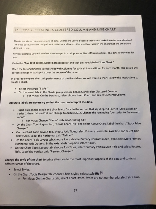
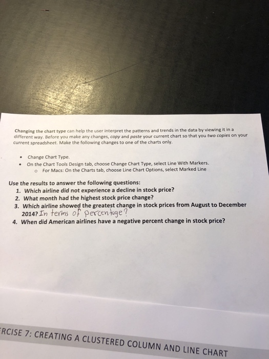
EXERCISE 7: CREATING A CLUSTERED COLUMN AND LINE CHART Charts are visual representations of data. Charts are useful because they often make it easier to understand the data because users can pick out patterns and trends that are illustrated in the chart that are otherwise difficult to see For this exercise you will analyze the changes in stock price for five different airlines. The data is provided for you. Go to the "Bus 1011 Excel Student Spreadsheets and click on sheet labeled "Line Chart." Open the file and find the spreadsheet with Columns for each airline and Rows for each month. The data is the percent change in stock price over the course of the month In order to compare the stock performance of the five airlines we will create a chart. Follow the instructions to create a chart. Select the range "81:56." On the Insert tab, in the Charts group, choose Column, and select Clustered Column o For Macs: On the Data tab, select choose Insert Chart, and select Clustered Column Accurate labels are necessary so that the user can interpret the data, Right click on the graph and click Select Data. In the section that says Legend Entries (Series) click on series 1 then click on Edit and change to August 2014. Change the reminding four series to the correct month. For Macs: Change "Name" instead of clicking edit. . On the Chart Tools Layout tab, choose Chart Title, and select Above Chart, Label the chart "Stock Price Change." . On the Chart Tools Layout tab, choose Axis Titles, select Primary HorizontalAxis Title and select Title Below Axis. Label the horizontal axis "Airline." On the Chart Tools Layout tab, choose Axes, choose Primary Horizontal Axls, and select More Primary HorizontalAxis Options. In the Axis labels drop box select "low". On the Chart Tools Layout tab, choose Axis Titles, select Primary Vertical Axis Title and select Rotated Title. Label the vertical axis "Percent Change." Change the style of the chart to bring attention to the most important aspects of the data and contrast different areas of the chart. Select Styles . On the Chart Tools Design tab, choose Chart Styles, select style Me 14 For Macs: On the Charts tab, select Chart Styles Styles are not numbered; select your own 17 Changing the chart type can help the user interpret the patterns and trends in the data by viewing it in a different way. Before you make any changes, copy and paste your current chart so that you two copies on your current spreadsheet. Make the following changes to one of the charts only. . Change Chart Type. On the Chart Tools Design tab, choose Change Chart Type, select Line With Markers. For Macs: On the Charts tab, choose Line Chart Options, select Marked Line Use the results to answer the following questions: 1. Which airline did not experience a decline in stock price? 2. What month had the highest stock price change? 3. Which airline showed the greatest change in stock prices from August to December 2014? In terms of percentage? 4. When did American airlines have a negative percent change in stock price? RCISE 7: CREATING A CLUSTERED COLUMN AND LINE CHART EXERCISE 7: CREATING A CLUSTERED COLUMN AND LINE CHART Charts are visual representations of data. Charts are useful because they often make it easier to understand the data because users can pick out patterns and trends that are illustrated in the chart that are otherwise difficult to see For this exercise you will analyze the changes in stock price for five different airlines. The data is provided for you. Go to the "Bus 1011 Excel Student Spreadsheets and click on sheet labeled "Line Chart." Open the file and find the spreadsheet with Columns for each airline and Rows for each month. The data is the percent change in stock price over the course of the month In order to compare the stock performance of the five airlines we will create a chart. Follow the instructions to create a chart. Select the range "81:56." On the Insert tab, in the Charts group, choose Column, and select Clustered Column o For Macs: On the Data tab, select choose Insert Chart, and select Clustered Column Accurate labels are necessary so that the user can interpret the data, Right click on the graph and click Select Data. In the section that says Legend Entries (Series) click on series 1 then click on Edit and change to August 2014. Change the reminding four series to the correct month. For Macs: Change "Name" instead of clicking edit. . On the Chart Tools Layout tab, choose Chart Title, and select Above Chart, Label the chart "Stock Price Change." . On the Chart Tools Layout tab, choose Axis Titles, select Primary HorizontalAxis Title and select Title Below Axis. Label the horizontal axis "Airline." On the Chart Tools Layout tab, choose Axes, choose Primary Horizontal Axls, and select More Primary HorizontalAxis Options. In the Axis labels drop box select "low". On the Chart Tools Layout tab, choose Axis Titles, select Primary Vertical Axis Title and select Rotated Title. Label the vertical axis "Percent Change." Change the style of the chart to bring attention to the most important aspects of the data and contrast different areas of the chart. Select Styles . On the Chart Tools Design tab, choose Chart Styles, select style Me 14 For Macs: On the Charts tab, select Chart Styles Styles are not numbered; select your own 17 Changing the chart type can help the user interpret the patterns and trends in the data by viewing it in a different way. Before you make any changes, copy and paste your current chart so that you two copies on your current spreadsheet. Make the following changes to one of the charts only. . Change Chart Type. On the Chart Tools Design tab, choose Change Chart Type, select Line With Markers. For Macs: On the Charts tab, choose Line Chart Options, select Marked Line Use the results to answer the following questions: 1. Which airline did not experience a decline in stock price? 2. What month had the highest stock price change? 3. Which airline showed the greatest change in stock prices from August to December 2014? In terms of percentage? 4. When did American airlines have a negative percent change in stock price? RCISE 7: CREATING A CLUSTERED COLUMN AND LINE CHART


