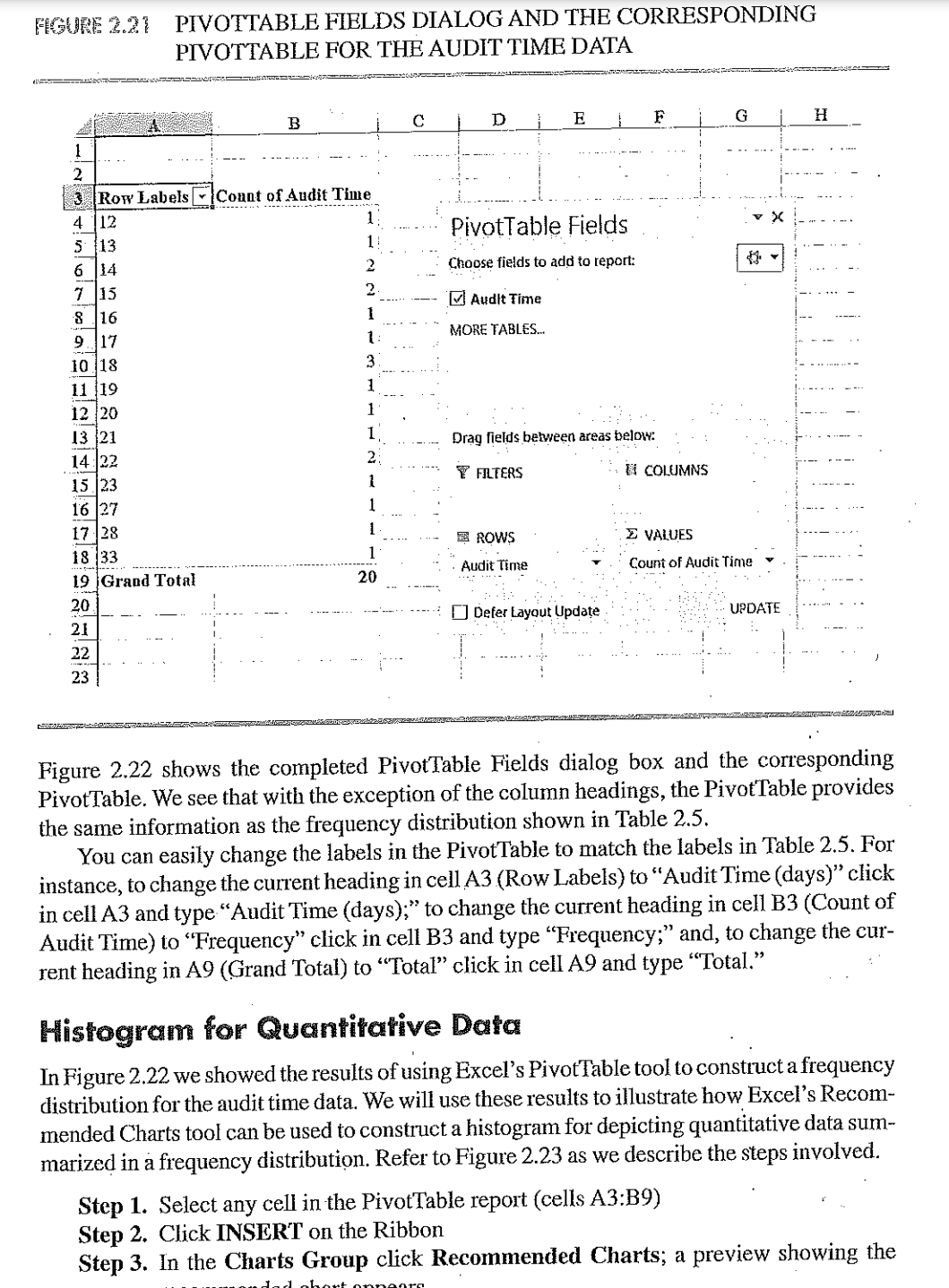
FIGURE 2.21 PIVOTTABLE FIELDS DIALOG AND THE CORRESPONDING PIVOTTABLE FOR THE AUDIT TIME DATA G H 2 3 Row Labels . Count of Audit Time 4 12 5 13 PivotTable Fields 1! 6 14 Choose fields to add to report: 7 15 2 . 8 16 Audit Time 1 9. 17 1: MORE TABLES. 10 18 3 - - . . . . . 11 19 12 20 13 21 Drag fields between areas below: 14 22 2: 15 23 FILTERS If COLUMNS 16 27 . ..- 17 28 E ROWS E VALUES .. . . . 18 33 19 Grand Total . Audit Time Count of Audit Time 20 20 . ..". . ] Defer Layout Update . UPDATE 21 22 -..' . ... 23 Figure 2.22 shows the completed PivotTable Fields dialog box and the corresponding PivotTable. We see that with the exception of the column headings, the PivotTable provides the same information as the frequency distribution shown in Table 2.5. You can easily change the labels in the PivotTable to match the labels in Table 2.5. For instance, to change the current heading in cell A3 (Row Labels) to "Audit Time (days)" click in cell A3 and type "Audit Time (days);" to change the current heading in cell B3 (Count of Audit Time) to "Frequency" click in cell B3 and type "Frequency;" and, to change the cur- rent heading in A9 (Grand Total) to "Total" click in cell A9 and type "Total." Histogram for Quantitative Data In Figure 2.22 we showed the results of using Excel's PivotTable tool to construct a frequency distribution for the audit time data. We will use these results to illustrate how Excel's Recom- mended Charts tool can be used to construct a histogram for depicting quantitative data sum- marized in a frequency distribution. Refer to Figure 2.23 as we describe the steps involved. Step 1. Select any cell in the PivotTable report (cells A3:B9) Step 2. Click INSERT on the Ribbon Step 3. In the Charts Group click Recommended Charts; a preview showing the