Answered step by step
Verified Expert Solution
Question
1 Approved Answer
Figure 3 shows that the shape of the column charts is similar for men and women, with some charges for males existing in the $8,500
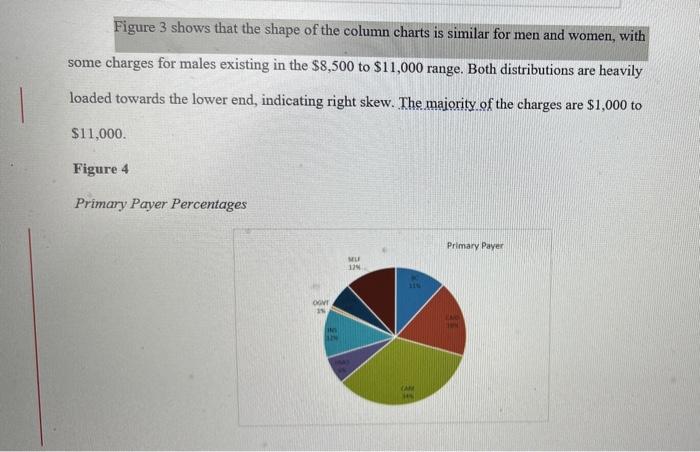
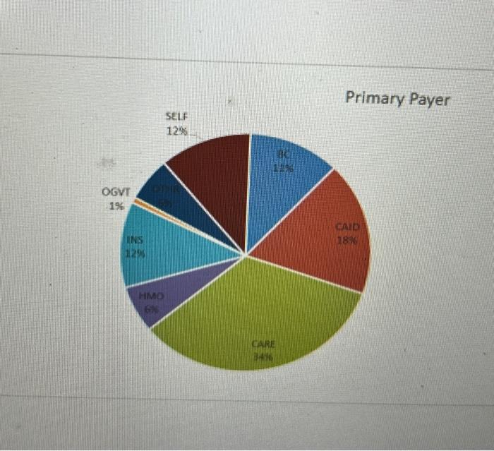
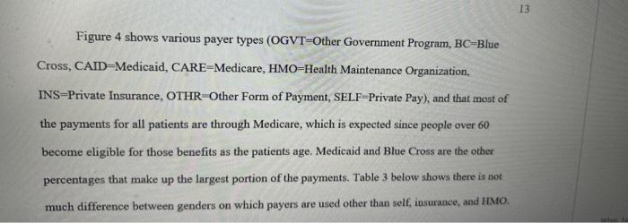
Figure 3 shows that the shape of the column charts is similar for men and women, with some charges for males existing in the $8,500 to $11,000 range. Both distributions are heavily loaded towards the lower end, indicating right skew. The majority of the charges are $1,000 to $11,000. Figure 4 Primary Paver Percentages Primary Payer MILE13 Figure 4 shows various payer types (OGVT=Other Government Program, BC=Blue Cross, CAID=Medicaid, CARE-Medicare, HMO=Health Maintenance Organization, INS=Private Insurance, OTHR Other Form of Payment, SELF-Private Pay), and that most of the payments for all patients are through Medicare, which is expected since people over 60 become eligible for those benefits as the patients age. Medicaid and Blue Cross are the other percentages that make up the largest portion of the payments. Table 3 below shows there is not much difference between genders on which payers are used other than self, insurance, and HMO.\fIn the pie chart on Primary Payer which payer was 18%? a) HMO b) CARE OC) SELF O d) CAID
Step by Step Solution
There are 3 Steps involved in it
Step: 1
Get Instant Access to Expert-Tailored Solutions
See step-by-step solutions with expert insights and AI powered tools for academic success
Step: 2
Step: 3
Ace Your Homework with AI
Get the answers you need in no time with our AI-driven, step-by-step assistance
Get Started