

Answered step by step
Verified Expert Solution
Question
1 Approved Answer
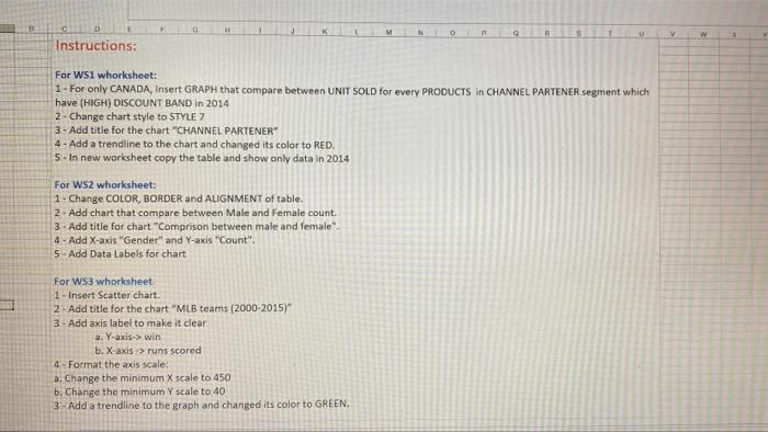
G J K N 0 Q U w Instructions: For WSI whorksheet: 1 - For only CANADA, Insert GRAPH that compare between UNIT SOLD for
Step by Step Solution
There are 3 Steps involved in it
Step: 1

Get Instant Access to Expert-Tailored Solutions
See step-by-step solutions with expert insights and AI powered tools for academic success
Step: 2

Step: 3
Ace Your Homework with AI
Get the answers you need in no time with our AI-driven, step-by-step assistance
Get Started
Database Benchmarking And Stress Testing An Evidence Based Approach To Decisions On Architecture And Technology
Authors: Bert Scalzo
1st Edition
148424009X, 978-1484240090