Question
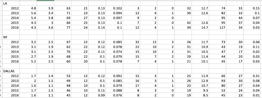
Generate the air quality report for each of the 3 cities for 5 years (it should be the same year for each of the 3
Generate the air quality report for each of the 3 cities for 5 years (it should be the same year for each of the 3 cities).
Represent this data 2 ways, 1- in a table form, 2- in a graph with an explanation.
Graph/Chart:
Present your data in graph/chart form. Make sure the chart is appropriate for the data. One should be able to see all the categories of pollutants, for all of the years for all 3 cities and tell them apart. Be sure to include the keys to the graph/chart.
I believe I have the table worksheet right but for the life of me I cannot graph it clearly. I need to show the air quality as well as the years and Cities. I think I can find a way to add the cities, but as far as the air qualities and years go I am lost. And before anyone says to just put it in excel then graph it... i did that and it still was not clear. I have screen shotted what I have. Maybe I am doing it wrong, but anything will help me right now!
Step by Step Solution
There are 3 Steps involved in it
Step: 1

Get Instant Access to Expert-Tailored Solutions
See step-by-step solutions with expert insights and AI powered tools for academic success
Step: 2

Step: 3

Ace Your Homework with AI
Get the answers you need in no time with our AI-driven, step-by-step assistance
Get Started


