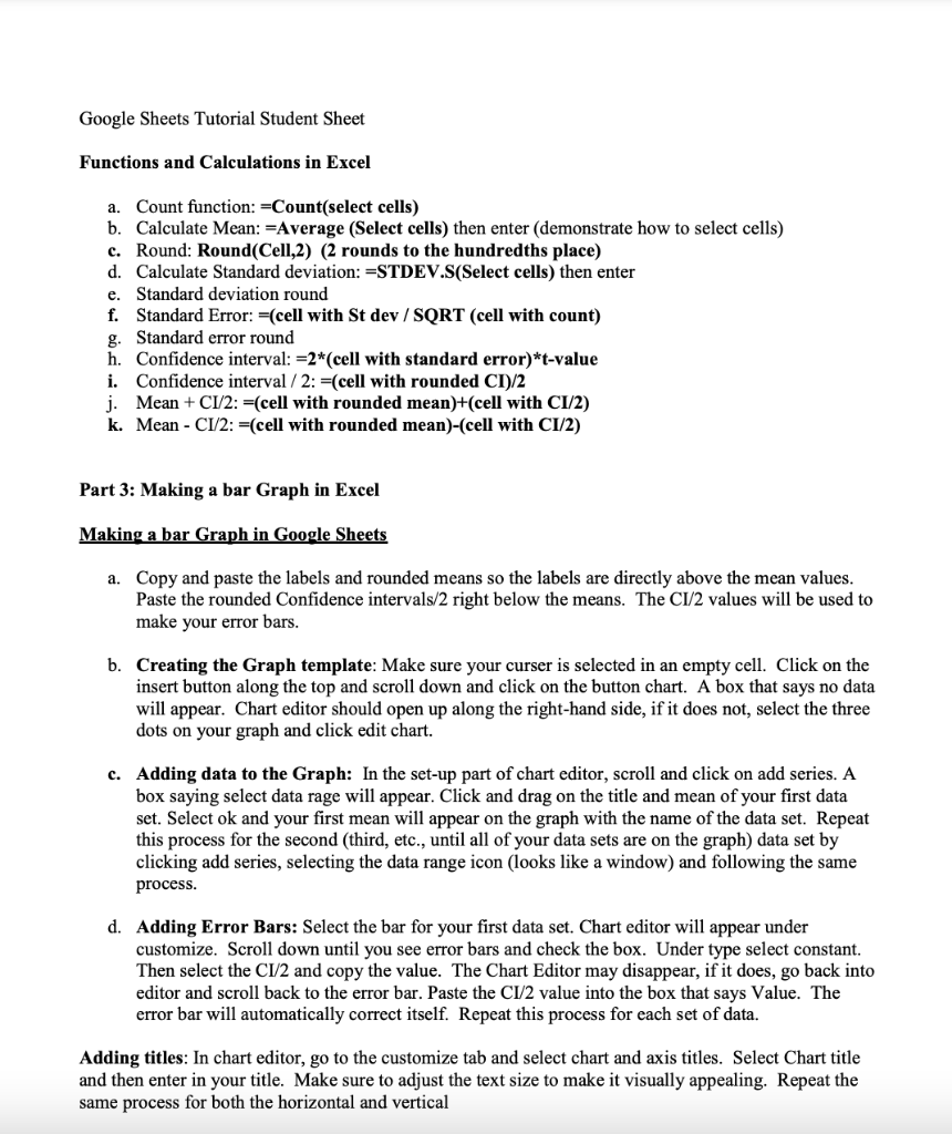
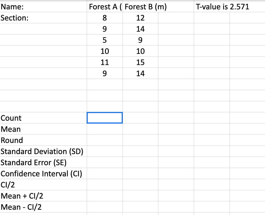
Google Sheets Tutorial Student Sheet Functions and Calculations in Excel a. Count function: -Count(select cells) b. Calculate Mean: "Average (Select cells) then enter (demonstrate how to select cells) c. Round: Round(Cell,2) (2 rounds to the hundredths place) d. Calculate Standard deviation: =STDEV.S(Select cells) then enter e. Standard deviation round f. Standard Error: =(cell with St dev / SQRT (cell with count) g. Standard error round h. Confidence interval: =2*(cell with standard error)*t-value i. Confidence interval/2: =(cell with rounded CT)/2 j. Mean + C1/2: =(cell with rounded mean)+(cell with CI/2) k. Mean - C1/2: =(cell with rounded mean)-(cell with CI/2) Part 3: Making a bar Graph in Excel Making a bar Graph in Google Sheets a. Copy and paste the labels and rounded means so the labels are directly above the mean values. Paste the rounded Confidence intervals/2 right below the means. The CI/2 values will be used to make your error bars. b. Creating the Graph template: Make sure your curser is selected in an empty cell. Click on the insert button along the top and scroll down and click on the button chart. A box that says no data will appear. Chart editor should open up along the right-hand side, if it does not, select the three dots on your graph and click edit chart. c. Adding data to the Graph: In the set-up part of chart editor, scroll and click on add series. A box saying select data rage will appear. Click and drag on the title and mean of your first data set. Select ok and your first mean will appear on the graph with the name of the data set. Repeat this process for the second (third, etc., until all of your data sets are on the graph) data set by clicking add series, selecting the data range icon (looks like a window) and following the same process. d. Adding Error Bars: Select the bar for your first data set. Chart editor will appear under customize. Scroll down until you see error bars and check the box. Under type select constant. Then select the CI/2 and copy the value. The Chart Editor may disappear, if it does, go back into editor and scroll back to the error bar. Paste the CI/2 value into the box that says Value. The error bar will automatically correct itself. Repeat this process for each set of data. Adding titles: In chart editor, go to the customize tab and select chart and axis titles. Select Chart title and then enter in your title. Make sure to adjust the text size to make it visually appealing. Repeat the same process for both the horizontal and vertical T-value is 2.571 Name: Section: Forest A ( Forest B (m) 8 12 9 14 5 9 10 10 11 15 9 14 Count Mean Round Standard Deviation (SD) Standard Error (SE) Confidence Interval (CI) CI/2 Mean + C1/2 Mean - C1/2 Google Sheets Tutorial Student Sheet Functions and Calculations in Excel a. Count function: -Count(select cells) b. Calculate Mean: "Average (Select cells) then enter (demonstrate how to select cells) c. Round: Round(Cell,2) (2 rounds to the hundredths place) d. Calculate Standard deviation: =STDEV.S(Select cells) then enter e. Standard deviation round f. Standard Error: =(cell with St dev / SQRT (cell with count) g. Standard error round h. Confidence interval: =2*(cell with standard error)*t-value i. Confidence interval/2: =(cell with rounded CT)/2 j. Mean + C1/2: =(cell with rounded mean)+(cell with CI/2) k. Mean - C1/2: =(cell with rounded mean)-(cell with CI/2) Part 3: Making a bar Graph in Excel Making a bar Graph in Google Sheets a. Copy and paste the labels and rounded means so the labels are directly above the mean values. Paste the rounded Confidence intervals/2 right below the means. The CI/2 values will be used to make your error bars. b. Creating the Graph template: Make sure your curser is selected in an empty cell. Click on the insert button along the top and scroll down and click on the button chart. A box that says no data will appear. Chart editor should open up along the right-hand side, if it does not, select the three dots on your graph and click edit chart. c. Adding data to the Graph: In the set-up part of chart editor, scroll and click on add series. A box saying select data rage will appear. Click and drag on the title and mean of your first data set. Select ok and your first mean will appear on the graph with the name of the data set. Repeat this process for the second (third, etc., until all of your data sets are on the graph) data set by clicking add series, selecting the data range icon (looks like a window) and following the same process. d. Adding Error Bars: Select the bar for your first data set. Chart editor will appear under customize. Scroll down until you see error bars and check the box. Under type select constant. Then select the CI/2 and copy the value. The Chart Editor may disappear, if it does, go back into editor and scroll back to the error bar. Paste the CI/2 value into the box that says Value. The error bar will automatically correct itself. Repeat this process for each set of data. Adding titles: In chart editor, go to the customize tab and select chart and axis titles. Select Chart title and then enter in your title. Make sure to adjust the text size to make it visually appealing. Repeat the same process for both the horizontal and vertical T-value is 2.571 Name: Section: Forest A ( Forest B (m) 8 12 9 14 5 9 10 10 11 15 9 14 Count Mean Round Standard Deviation (SD) Standard Error (SE) Confidence Interval (CI) CI/2 Mean + C1/2 Mean - C1/2