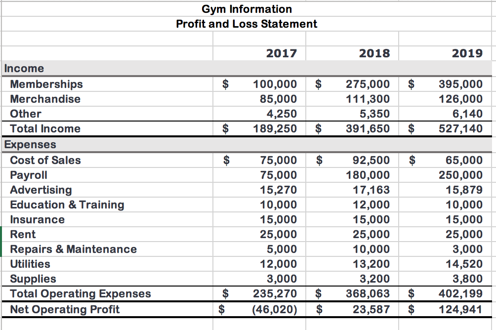
Gym Information Profit and Loss Statement 2017 2018 2019 $ $ 100,000 85,000 4,250 189,250 275,000 111,300 5,350 391,650 395,000 126,000 6,140 527,140 $ $ $ $ $ $ Income Memberships Merchandise Other Total Income Expenses Cost of Sales Payroll Advertising Education & Training Insurance Rent Repairs & Maintenance Utilities Supplies Total Operating Expenses Net Operating Profit 75,000 75,000 15,270 10,000 15,000 25,000 5,000 12,000 3,000 235,270 (46,020) 92,500 180,000 17,163 12,000 15,000 25,000 10,000 13,200 3,200 368,063 23,587 65,000 250,000 15,879 10,000 15,000 25,000 3,000 14,520 3,800 402,199 124,941 $ $ $ $ $ $ Gym Balance Sheet Year 1 Year 2 Year 3 $ $ $ 81,696 41,300 15,095 40,000 178,091 147,907 65,667 8,000 55,000 276,574 260,409 74,340 9,000 60,000 403,749 $ $ $ Assets Bank Account Accounts Receivable Gym Equipment Merchandise Inventory Total Assets Liabilities Accounts Payable Current Loans Due Long Term Equipment Loan Total Liabilities Retained Earnings Net Worth $ $ $ 18,134 26,000 174,000 218,134 (40,043) 178,091 16,244 26,000 148,000 190,244 86,330 276,574 18,213 26,000 122,000 166,213 237,536 403,749 $ $ $ $ $ $ Gym Year 3 Daily Attendance Trends Better You Fitness Center 3-Year Membership Totals Year 1 Year 2 250 560 560 Monday 50 125 100 560 Mar Apr May Jun Jul Thursday 40 110 90 250 255 275 275 260 Weekday Tuesday Wednesday 50 45 100 85 100 110 100 100 65 70 50 55 140 150 150 105 4am - 6am 6am - 8am 8am - 10am 10am - 12pm 12pm - 2pm 2pm - 4pm 4pm - 6pm 6pm - 8pm 8pm - 10pm 90 90 Year 3 935 948 960 990 990 990 1,025 1,025 1,050 1,100 Friday 30 120 100 100 25 35 35 20 20 575 575 575 585 750 750 75 50 50 Aug Sep Oct Nov Dec Jan Feb 62 125 125 75 85 250 275 275 325 765 150 30 20 40 925 500 550 930 6am - 8am 8am -10am 10am - 12pm 12pm - 2pm 2pm - 4pm Saturday 100 125 75 Weekend Sunday 90 100 75 25 25 50 25 Create a pie chart to focus on the expenses for 2019 2 Insert a 2-D pie chart using the ranges A11:A19 and D11:D19 on the Income worksheet. 3 Move the chart to a new chart sheet named Expenses. Move it to the right of the Membership sheet. The chart needs a descriptive, easy-to-read title. 4 Change the chart title to Expenses for Year 3 and change the font size to 20. Change the color to Blue Accent 1 Darker 25% and center the title You want to create a clustered bar chart. 5 Insert a clustered bar chart using the ranges A4:D4 and A11:D19 on the Income worksheet. You want to place this chart and other charts on a Summary worksheet to look at trends. 6 Move the chart as an object on the Summary worksheet. Cut the bar chart and paste it in cell 11. The chart should have a descriptive title to explain which expenses are excluded 7 Change the bar chart title to Expenses (Without Payroll and Cost of Sales) You want to filter out the Payroll and Cost of Sales to focus on other expenses. The bar chart displays expenses the first expense (Advertising) at the bottom of the category axis. You want to reverse the categories to display in the same sequence as the expenses are listed in the worksheet. 8 Apply a chart filter to remove Payroll and Cost of Sales. Select the category axis and use the Format Axis task pane to display categories in reverse order. Change the Maximum Bound to 25000 Mac Users: Apply the filter using Select Data and Switch Row/Column. Be sure to switch the rows and columns back after filtering the data You decide to format the ple chart with data labels and remove the legend because there are too many categories for the legend to be effective. Display the Expenses sheet and remove the legend. Add Percent and Category Name data labels and choose Outside End position for the labels. Change the data labels font size to 10. You want to emphasize the Education & Training slice by exploding it 10 Explode the Education & Training slice by 12%. 11 Add the Light Gradient - Accent 2 fill color to the chart area. You create another chart showing the Balance sheet items. You change the chart to a clustered column and switch the row and column data to focus on each balance sheet item. 12 Insert a stacked column chart using the ranges A4:D4, A10:D10, A15:D15, and A16:D16 on the Balance sheet. Change the chart type to Clustered Column and switch the rows and columns in the chart. You want to move the column chart to be on the Summary worksheet along with the bar chart. 13 Move the column chart to the Summary worksheet. Cut the chart and paste it in cell A1. The column chart needs to have a descriptive title to indicate the data comes from the Balance sheet. 14 Change the title to 3-Year Balance Sheet. The last chart will be a line chart to show the trends in Memberships. 15 Insert a line chart using the range 13:L15 on the Membership worksheet You want to move the line chart to be on the same Summary sheet as column and bar charts. 16 Move the line chart to the Summary worksheet. Cut the chart and paste it in cell A17. Because the lowest value is between 200 and 300, you will change the vertical axis at 200 instead of 0. 17 Adjust the vertical axis so the Minimum Bound is 200 and display a vertical axis title # of Memberships for the line chart. 18 Apply Chart Style 4 and change colors to Monochromatic Palette 8 for the line chart 19 Move the legend to the top of the chart and add the chart title 3-Year Membership Trends. It is a best practice to add Alt Text for each chart for accessibility compliance. 20 Display the pie chart and add Alt Text: The pie chart displays percentage of expenses for Year 3. (including the period) 21 Display the column chart and add Alt Text: The column chart displays total assets, total liabilities, and retained earnings for three years. (including the period) 22 Display the bar chart and add Alt Text: The bar chart displays expenses for three years without payroll or cost of sales. (including the period) 23 Display the line chart and add Alt Text: The line chart displays monthly trends in memberships for three years. (including the period) You want to add sparklines to the Daily Attendance Trends. You add high points to emphasize which time of day is the most popular for your membership. 24 Select range B16:F16 on the Membership worksheet. Insert Column Sparklines using data from the range B6:F14. Display the high points for the sparklines. 25 Insert a footer with Exploring Series on the left, the sheet name code in the center, and the file name code on the right on the Membership, Expenses, and Summary sheets individually. Change to Normal view. 26 Save and close Exp19_Excel_Cho3_Cap Gym.xlsx. Exit Excel. Submit the file as directed. Gym Information Profit and Loss Statement 2017 2018 2019 $ $ 100,000 85,000 4,250 189,250 275,000 111,300 5,350 391,650 395,000 126,000 6,140 527,140 $ $ $ $ $ $ Income Memberships Merchandise Other Total Income Expenses Cost of Sales Payroll Advertising Education & Training Insurance Rent Repairs & Maintenance Utilities Supplies Total Operating Expenses Net Operating Profit 75,000 75,000 15,270 10,000 15,000 25,000 5,000 12,000 3,000 235,270 (46,020) 92,500 180,000 17,163 12,000 15,000 25,000 10,000 13,200 3,200 368,063 23,587 65,000 250,000 15,879 10,000 15,000 25,000 3,000 14,520 3,800 402,199 124,941 $ $ $ $ $ $ Gym Balance Sheet Year 1 Year 2 Year 3 $ $ $ 81,696 41,300 15,095 40,000 178,091 147,907 65,667 8,000 55,000 276,574 260,409 74,340 9,000 60,000 403,749 $ $ $ Assets Bank Account Accounts Receivable Gym Equipment Merchandise Inventory Total Assets Liabilities Accounts Payable Current Loans Due Long Term Equipment Loan Total Liabilities Retained Earnings Net Worth $ $ $ 18,134 26,000 174,000 218,134 (40,043) 178,091 16,244 26,000 148,000 190,244 86,330 276,574 18,213 26,000 122,000 166,213 237,536 403,749 $ $ $ $ $ $ Gym Year 3 Daily Attendance Trends Better You Fitness Center 3-Year Membership Totals Year 1 Year 2 250 560 560 Monday 50 125 100 560 Mar Apr May Jun Jul Thursday 40 110 90 250 255 275 275 260 Weekday Tuesday Wednesday 50 45 100 85 100 110 100 100 65 70 50 55 140 150 150 105 4am - 6am 6am - 8am 8am - 10am 10am - 12pm 12pm - 2pm 2pm - 4pm 4pm - 6pm 6pm - 8pm 8pm - 10pm 90 90 Year 3 935 948 960 990 990 990 1,025 1,025 1,050 1,100 Friday 30 120 100 100 25 35 35 20 20 575 575 575 585 750 750 75 50 50 Aug Sep Oct Nov Dec Jan Feb 62 125 125 75 85 250 275 275 325 765 150 30 20 40 925 500 550 930 6am - 8am 8am -10am 10am - 12pm 12pm - 2pm 2pm - 4pm Saturday 100 125 75 Weekend Sunday 90 100 75 25 25 50 25 Create a pie chart to focus on the expenses for 2019 2 Insert a 2-D pie chart using the ranges A11:A19 and D11:D19 on the Income worksheet. 3 Move the chart to a new chart sheet named Expenses. Move it to the right of the Membership sheet. The chart needs a descriptive, easy-to-read title. 4 Change the chart title to Expenses for Year 3 and change the font size to 20. Change the color to Blue Accent 1 Darker 25% and center the title You want to create a clustered bar chart. 5 Insert a clustered bar chart using the ranges A4:D4 and A11:D19 on the Income worksheet. You want to place this chart and other charts on a Summary worksheet to look at trends. 6 Move the chart as an object on the Summary worksheet. Cut the bar chart and paste it in cell 11. The chart should have a descriptive title to explain which expenses are excluded 7 Change the bar chart title to Expenses (Without Payroll and Cost of Sales) You want to filter out the Payroll and Cost of Sales to focus on other expenses. The bar chart displays expenses the first expense (Advertising) at the bottom of the category axis. You want to reverse the categories to display in the same sequence as the expenses are listed in the worksheet. 8 Apply a chart filter to remove Payroll and Cost of Sales. Select the category axis and use the Format Axis task pane to display categories in reverse order. Change the Maximum Bound to 25000 Mac Users: Apply the filter using Select Data and Switch Row/Column. Be sure to switch the rows and columns back after filtering the data You decide to format the ple chart with data labels and remove the legend because there are too many categories for the legend to be effective. Display the Expenses sheet and remove the legend. Add Percent and Category Name data labels and choose Outside End position for the labels. Change the data labels font size to 10. You want to emphasize the Education & Training slice by exploding it 10 Explode the Education & Training slice by 12%. 11 Add the Light Gradient - Accent 2 fill color to the chart area. You create another chart showing the Balance sheet items. You change the chart to a clustered column and switch the row and column data to focus on each balance sheet item. 12 Insert a stacked column chart using the ranges A4:D4, A10:D10, A15:D15, and A16:D16 on the Balance sheet. Change the chart type to Clustered Column and switch the rows and columns in the chart. You want to move the column chart to be on the Summary worksheet along with the bar chart. 13 Move the column chart to the Summary worksheet. Cut the chart and paste it in cell A1. The column chart needs to have a descriptive title to indicate the data comes from the Balance sheet. 14 Change the title to 3-Year Balance Sheet. The last chart will be a line chart to show the trends in Memberships. 15 Insert a line chart using the range 13:L15 on the Membership worksheet You want to move the line chart to be on the same Summary sheet as column and bar charts. 16 Move the line chart to the Summary worksheet. Cut the chart and paste it in cell A17. Because the lowest value is between 200 and 300, you will change the vertical axis at 200 instead of 0. 17 Adjust the vertical axis so the Minimum Bound is 200 and display a vertical axis title # of Memberships for the line chart. 18 Apply Chart Style 4 and change colors to Monochromatic Palette 8 for the line chart 19 Move the legend to the top of the chart and add the chart title 3-Year Membership Trends. It is a best practice to add Alt Text for each chart for accessibility compliance. 20 Display the pie chart and add Alt Text: The pie chart displays percentage of expenses for Year 3. (including the period) 21 Display the column chart and add Alt Text: The column chart displays total assets, total liabilities, and retained earnings for three years. (including the period) 22 Display the bar chart and add Alt Text: The bar chart displays expenses for three years without payroll or cost of sales. (including the period) 23 Display the line chart and add Alt Text: The line chart displays monthly trends in memberships for three years. (including the period) You want to add sparklines to the Daily Attendance Trends. You add high points to emphasize which time of day is the most popular for your membership. 24 Select range B16:F16 on the Membership worksheet. Insert Column Sparklines using data from the range B6:F14. Display the high points for the sparklines. 25 Insert a footer with Exploring Series on the left, the sheet name code in the center, and the file name code on the right on the Membership, Expenses, and Summary sheets individually. Change to Normal view. 26 Save and close Exp19_Excel_Cho3_Cap Gym.xlsx. Exit Excel. Submit the file as directed