

Answered step by step
Verified Expert Solution
Question
1 Approved Answer
Hello, this is for Datascience Applications. Below is a question from the textbook fundamentals of machine learning for predictive data analytics, chapter 3, ISBN: 978-0-262-02944-5.
Hello, this is for Datascience Applications. Below is a question from the textbook fundamentals of machine learning for predictive data analytics, chapter 3, ISBN: 978-0-262-02944-5. 
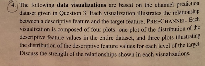
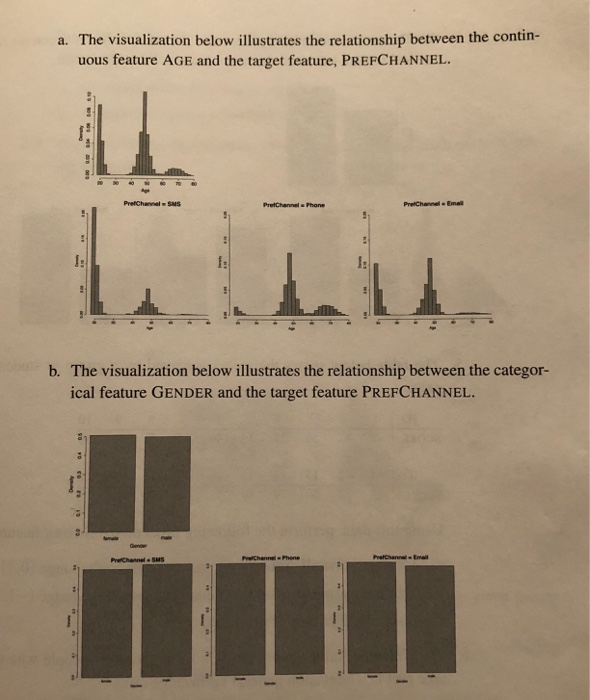
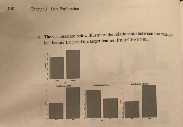
JoHN D. KELLEHER BRIAN MAC NAMEE AoIFE D'ARCY FUNDAMENTALS OF MACHINE LEARNING FOR PREDICTIVE DATA ANALYTICS ALGORITHMS, WORKED EXAMPLES, AND CASE STUDIES 4. The following data visualizations are based on the channel prediction dataset given in Question 3. Each visualization illustrates the relationship between a descriptive feature and the target feature, PREFCHANNEL. Each Each o four plots: one plot of descriptive feature values in the entire dataset, and three plots illustrating the distribution of the descriptive feature values for each level of the target Discuss the strength of the relationships shown in each visualizations. a. The visualization below illustrates the relationship between the contin- uous feature AGE and the target feature, PREFCHANNEL b. The visualization below illustrates the relationship between the categor- ical feature GENDER and the target feature PREFCHANNEL 108 Chapter 3 Data Exploration categor- c. The visualization below illustrates the relationship between the ca ical feature LOC and the target feature, PREFCHANNEL PrefChannel Emal PrefChannel SMS PretChannel Phone If you use excel please include all formulas you use, for example =quartile(table1(income),0.25) , I ask this because I am new to excel and I could really use that as guidance, so please include everything. Please include any chart you may make too please.
Thank you so very much!
Below is a picture of the textbook and the exercise 4 from chapter 3.
Note for table A, the y-axis is density and the x-axis is age.
For table B, the y-axis is density and the x-axis is gender where the left bar is female and the right bar is male.
For table C, the y-axis is density and the x-axis is Loc where the left bar is Rural and the right bar is Urban.
Step by Step Solution
There are 3 Steps involved in it
Step: 1

Get Instant Access to Expert-Tailored Solutions
See step-by-step solutions with expert insights and AI powered tools for academic success
Step: 2

Step: 3
Ace Your Homework with AI
Get the answers you need in no time with our AI-driven, step-by-step assistance
Get Started
Optimizing Data Collection In Warzones
Authors: Aaget Aamber
1st Edition
B0CQRRFP5F, 979-8869065902