

Answered step by step
Verified Expert Solution
Question
1 Approved Answer
help please need excel formulas After following the tutorial to create a PivotTable, your final table should match the table shown below. Check your Pivot
help please need excel formulas 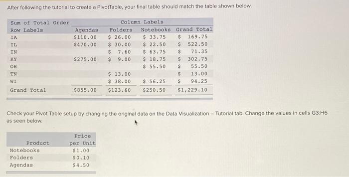
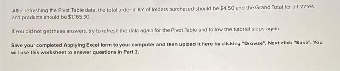
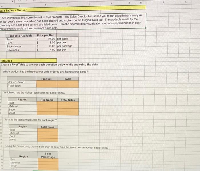
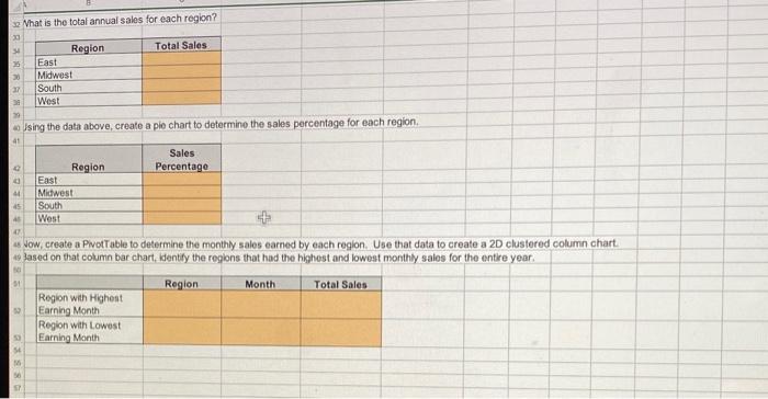
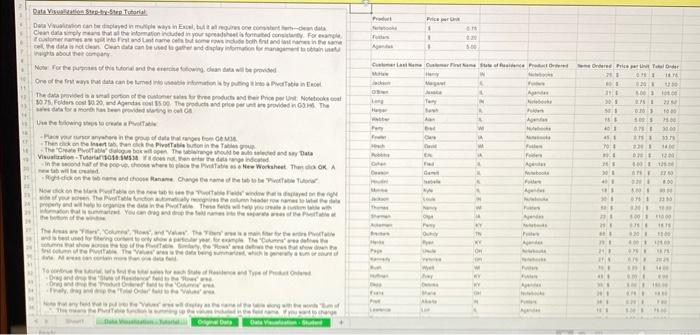
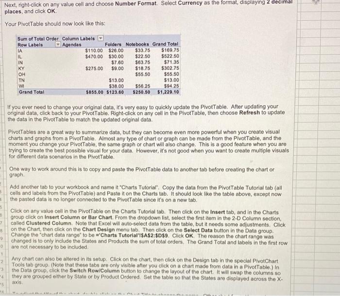
After following the tutorial to create a PivotTable, your final table should match the table shown below. Check your Pivot Table setup by changing the original data on the Data Visualization - Tutorial tab. Change the values in cells G3 :H6 as seen below. After refreshing the Pivot Table data, the total order in KY of folders purchased should be $4.50 and the Grand Total for all states and products should be $1,165.30 If you did not get these answers, try to refresh the data again for the Pivot Table and follow the tutorial steps again. Save your completed Applying Excel form to your computer and then upload it here by clicking "Browse". Next click "Save". You will use this worksheet to answer questions in Part 2. Dlfice Warehouse inc. currenty makes four products. Tho Sales Director has asked you to run a preliminary analysis on last year's sales data, which has been cleaned and is given on the Original Data tab. The products made by the company and sales price per unit are isted below. Use the different data visualzation methods recommended in each requirement to analvze the company's sales data. \begin{tabular}{|l|lr|l|} \hline Products Available & \multicolumn{2}{|c|}{ Price per Unit } & \\ \hline Paper & $ & 21.00 & per case \\ \hline Pens & $ & 8.00 & per box \\ \hline Sticky Notes & $ & 10.00 & per package \\ Envelopes & $ & 4.00 & per box \\ \hline \end{tabular} Required Create a PivotTable to answer each question below while analyzing the data. Which product had the highest total units ordered and highest total sales? \begin{tabular}{|l|l|c|} \hline & Product & Total \\ \hline Units Ordered & & \\ \hline Total Sales & & \\ \hline \end{tabular} Which rep has the highest total saios for each region? \begin{tabular}{|l|l|l|} \hline \multicolumn{1}{|c|}{ Region } & Rep Name & Total Sales \\ \hline East & & \\ \hline Midwest & & \\ \hline South & & \\ \hline West & & \\ \hline \end{tabular} What is the total annual sales for each region? \begin{tabular}{|l|l|} \hline \multicolumn{1}{|c|}{ Region } & Total Sales \\ \hline East & \\ \hline Mdwest & \\ \hline South & \\ \hline Wost & \\ \hline \end{tabular} Using the data above, create a ple chart to determine the sales percentage for each region. \begin{tabular}{|l|c|} \hline \multicolumn{1}{|c|}{ Region } & Sales \\ \hline Fast & Percentage \\ \hline Midwest & \\ \hline South & \\ \hline What & \\ \hline \end{tabular} What is the total annual sales for each region? Ising the data above, create a ple chart to determine the sales percentage for each region. \begin{tabular}{|l|l|} \hline \multicolumn{1}{|c|}{ Region } & \multicolumn{1}{|c|}{ Sales } \\ \hline Percentage \\ \hline East & \\ \hline Mitwest & \\ \hline South & \\ \hline West & \\ \hline \end{tabular} Jow, create a Pivot able to determine the monthly sales earned by each region. Use that data to create a 2D clustered column chart. Jased on that column bar chart, identify the regions that had the highest and lowest monthly sales for the entre year. inilis about their centeary Ten tat wit te oeved. Next, right-click on any value cell and choose Number Format. Select Currency as the format, displaying 2 decimal places, and click OK. Your PivotTable should now look like this: If you ever need to change your original data, it's very easy to quickly update the PivotTable. After updating your original data, click back to your PivotTable. Right-click on any cell in the PivotTable, then choose Refresh to update the data in the PivotTable to match the updated original data. PivotTables are a great way to summarize data, but they can become even more powerful when you create visual charts and graphs from a PivotTable. Almost any type of chart or graph can be made from the PivotTable, and the moment you change your PivotTable, the same graph or chart will also change. This is a good feature when you are trying to create the best possible visual for your data. However, it's not good when you want to create multiple visuals for different data scenarios in the PivotTable. One way to work around this is to copy and paste the PivotTable data to another tab before creating the chart or graph. Add another tab to your workbook and name it "Charts Tutorial". Copy the data from the PivotTable Tutorial tab (all cells and labels from the PlvotTable) and Paste it on the Charts tab. It should look like the table above, except now the pasted data is no longer connected to the PivotTable since it's on a new tab. Click on any value cell in the PivotTable on the Charts Tutorial tab. Then click on the Insert tab, and in the Charts group click on Insert Column or Bar Chart. From the dropdown list, select the first item in the 2-D Column section, called Clustered Column. Note that Excel will auto-select data from the table, but it needs some adjustments. Click on the Chart, then click on the Chart Design menu tab. Then click on the Select Data button in the Data group. Change the "chart data range" to be = Charts Tutorial'i\$A\$2:\$D\$9. Click OK. The reason the chart range was changed is to only include the States and Producis the sum of total orders. The Grand Total and labels in the first row are not necessary to be included. Any chart can also be altered in its setup. Click on the chart, then click on the Design tab in the special PivotChart Tools tab group. (Note that these tabs are only visible after you click on a chart made from data in a PivotTable.) In the Data group, click the Switch Row/Column button to change the layout of the chart. It will swap the columns so they are grouped either by State or by Product Ordered. Set the table so that the States are displayed across the Xaxis. After following the tutorial to create a PivotTable, your final table should match the table shown below. Check your Pivot Table setup by changing the original data on the Data Visualization - Tutorial tab. Change the values in cells G3 :H6 as seen below. After refreshing the Pivot Table data, the total order in KY of folders purchased should be $4.50 and the Grand Total for all states and products should be $1,165.30 If you did not get these answers, try to refresh the data again for the Pivot Table and follow the tutorial steps again. Save your completed Applying Excel form to your computer and then upload it here by clicking "Browse". Next click "Save". You will use this worksheet to answer questions in Part 2. Dlfice Warehouse inc. currenty makes four products. Tho Sales Director has asked you to run a preliminary analysis on last year's sales data, which has been cleaned and is given on the Original Data tab. The products made by the company and sales price per unit are isted below. Use the different data visualzation methods recommended in each requirement to analvze the company's sales data. \begin{tabular}{|l|lr|l|} \hline Products Available & \multicolumn{2}{|c|}{ Price per Unit } & \\ \hline Paper & $ & 21.00 & per case \\ \hline Pens & $ & 8.00 & per box \\ \hline Sticky Notes & $ & 10.00 & per package \\ Envelopes & $ & 4.00 & per box \\ \hline \end{tabular} Required Create a PivotTable to answer each question below while analyzing the data. Which product had the highest total units ordered and highest total sales? \begin{tabular}{|l|l|c|} \hline & Product & Total \\ \hline Units Ordered & & \\ \hline Total Sales & & \\ \hline \end{tabular} Which rep has the highest total saios for each region? \begin{tabular}{|l|l|l|} \hline \multicolumn{1}{|c|}{ Region } & Rep Name & Total Sales \\ \hline East & & \\ \hline Midwest & & \\ \hline South & & \\ \hline West & & \\ \hline \end{tabular} What is the total annual sales for each region? \begin{tabular}{|l|l|} \hline \multicolumn{1}{|c|}{ Region } & Total Sales \\ \hline East & \\ \hline Mdwest & \\ \hline South & \\ \hline Wost & \\ \hline \end{tabular} Using the data above, create a ple chart to determine the sales percentage for each region. \begin{tabular}{|l|c|} \hline \multicolumn{1}{|c|}{ Region } & Sales \\ \hline Fast & Percentage \\ \hline Midwest & \\ \hline South & \\ \hline What & \\ \hline \end{tabular} What is the total annual sales for each region? Ising the data above, create a ple chart to determine the sales percentage for each region. \begin{tabular}{|l|l|} \hline \multicolumn{1}{|c|}{ Region } & \multicolumn{1}{|c|}{ Sales } \\ \hline Percentage \\ \hline East & \\ \hline Mitwest & \\ \hline South & \\ \hline West & \\ \hline \end{tabular} Jow, create a Pivot able to determine the monthly sales earned by each region. Use that data to create a 2D clustered column chart. Jased on that column bar chart, identify the regions that had the highest and lowest monthly sales for the entre year. inilis about their centeary Ten tat wit te oeved. Next, right-click on any value cell and choose Number Format. Select Currency as the format, displaying 2 decimal places, and click OK. Your PivotTable should now look like this: If you ever need to change your original data, it's very easy to quickly update the PivotTable. After updating your original data, click back to your PivotTable. Right-click on any cell in the PivotTable, then choose Refresh to update the data in the PivotTable to match the updated original data. PivotTables are a great way to summarize data, but they can become even more powerful when you create visual charts and graphs from a PivotTable. Almost any type of chart or graph can be made from the PivotTable, and the moment you change your PivotTable, the same graph or chart will also change. This is a good feature when you are trying to create the best possible visual for your data. However, it's not good when you want to create multiple visuals for different data scenarios in the PivotTable. One way to work around this is to copy and paste the PivotTable data to another tab before creating the chart or graph. Add another tab to your workbook and name it "Charts Tutorial". Copy the data from the PivotTable Tutorial tab (all cells and labels from the PlvotTable) and Paste it on the Charts tab. It should look like the table above, except now the pasted data is no longer connected to the PivotTable since it's on a new tab. Click on any value cell in the PivotTable on the Charts Tutorial tab. Then click on the Insert tab, and in the Charts group click on Insert Column or Bar Chart. From the dropdown list, select the first item in the 2-D Column section, called Clustered Column. Note that Excel will auto-select data from the table, but it needs some adjustments. Click on the Chart, then click on the Chart Design menu tab. Then click on the Select Data button in the Data group. Change the "chart data range" to be = Charts Tutorial'i\$A\$2:\$D\$9. Click OK. The reason the chart range was changed is to only include the States and Producis the sum of total orders. The Grand Total and labels in the first row are not necessary to be included. Any chart can also be altered in its setup. Click on the chart, then click on the Design tab in the special PivotChart Tools tab group. (Note that these tabs are only visible after you click on a chart made from data in a PivotTable.) In the Data group, click the Switch Row/Column button to change the layout of the chart. It will swap the columns so they are grouped either by State or by Product Ordered. Set the table so that the States are displayed across the Xaxis Step by Step Solution
There are 3 Steps involved in it
Step: 1

Get Instant Access to Expert-Tailored Solutions
See step-by-step solutions with expert insights and AI powered tools for academic success
Step: 2

Step: 3
Ace Your Homework with AI
Get the answers you need in no time with our AI-driven, step-by-step assistance
Get Started
Establishing A CGMP Laboratory Audit System A Practical Guide
Authors: David M. Bliesner
1st Edition
0471738409, 978-0471738404