Answered step by step
Verified Expert Solution
Question
1 Approved Answer
Here's my Yoga.css This is my index. html JO N Netflix https://www.facebo... Path of Light Yoga Studio Case Study In this chapter's case study, you
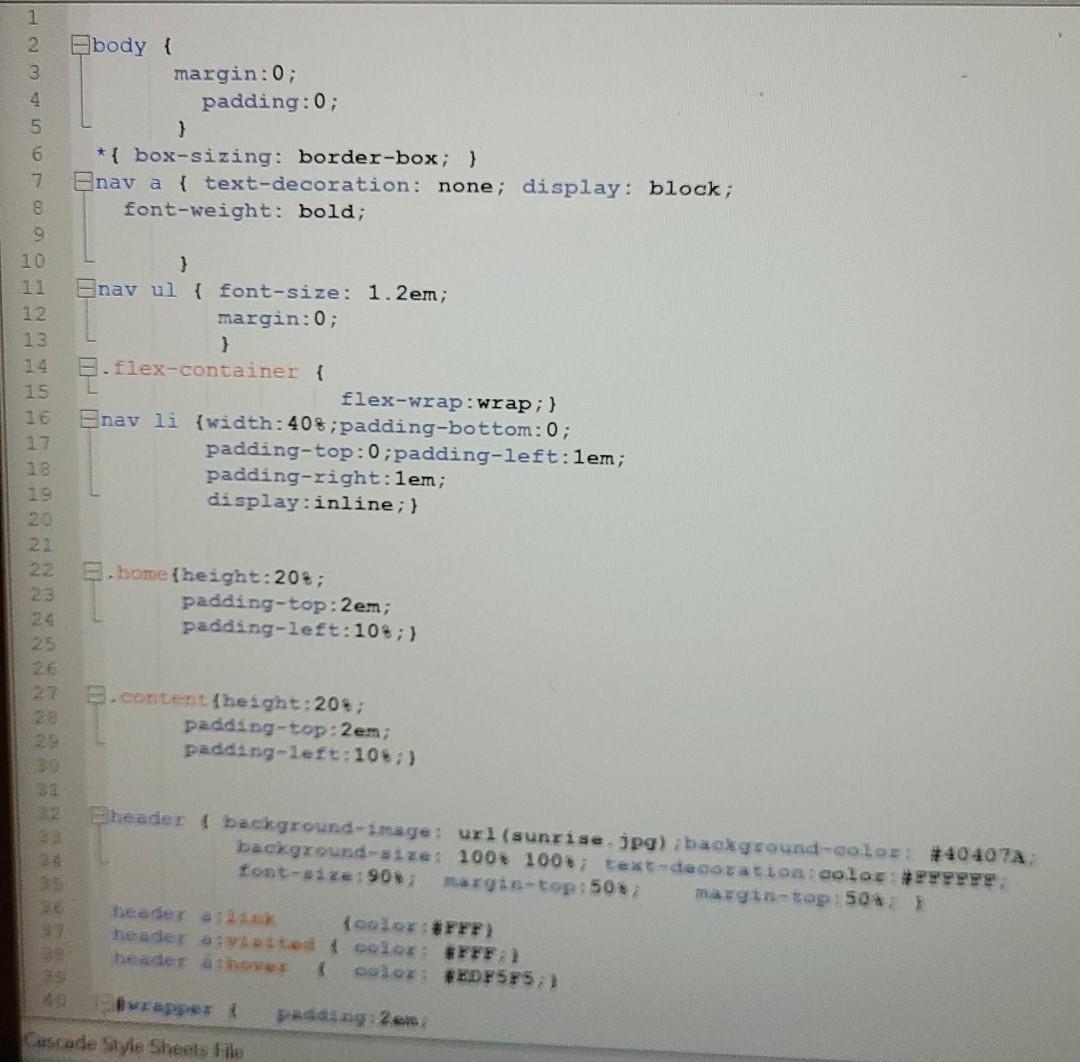
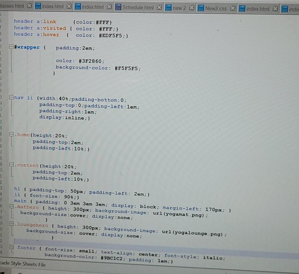
Here's my Yoga.css
This is my index. html
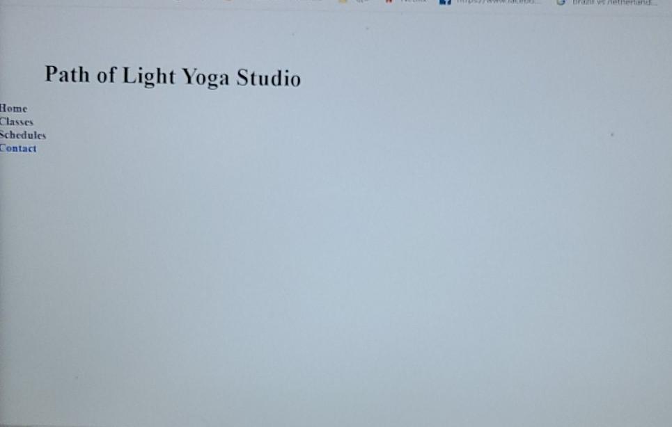
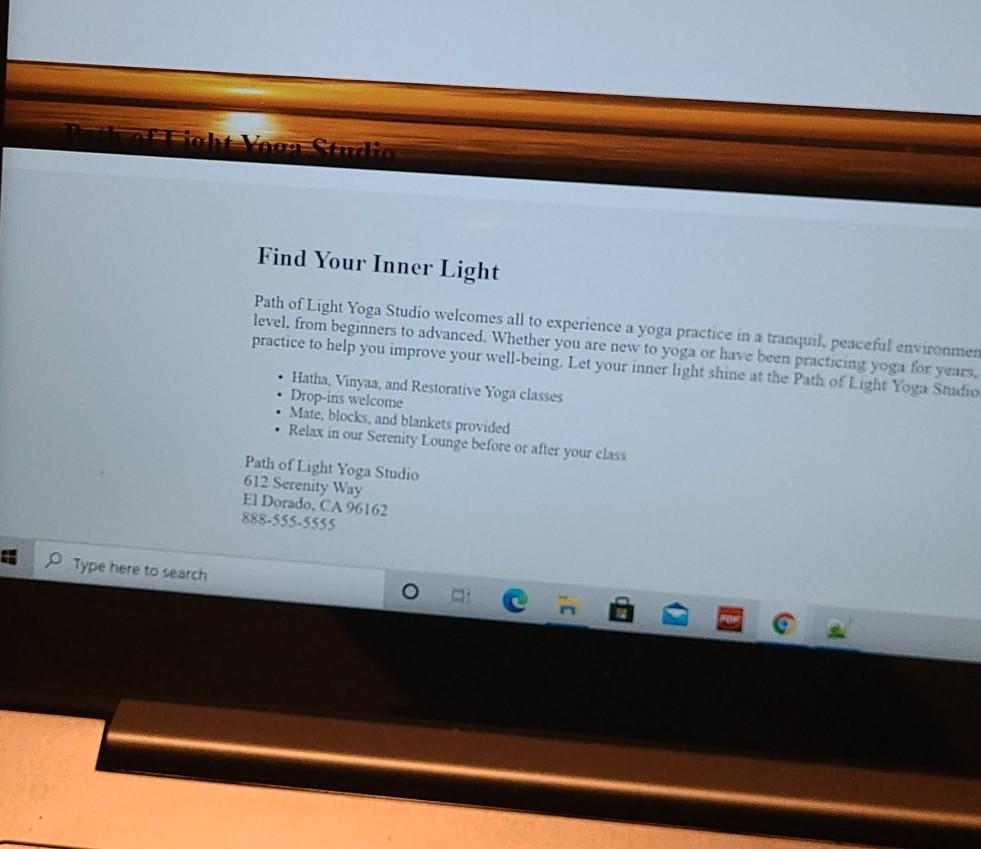
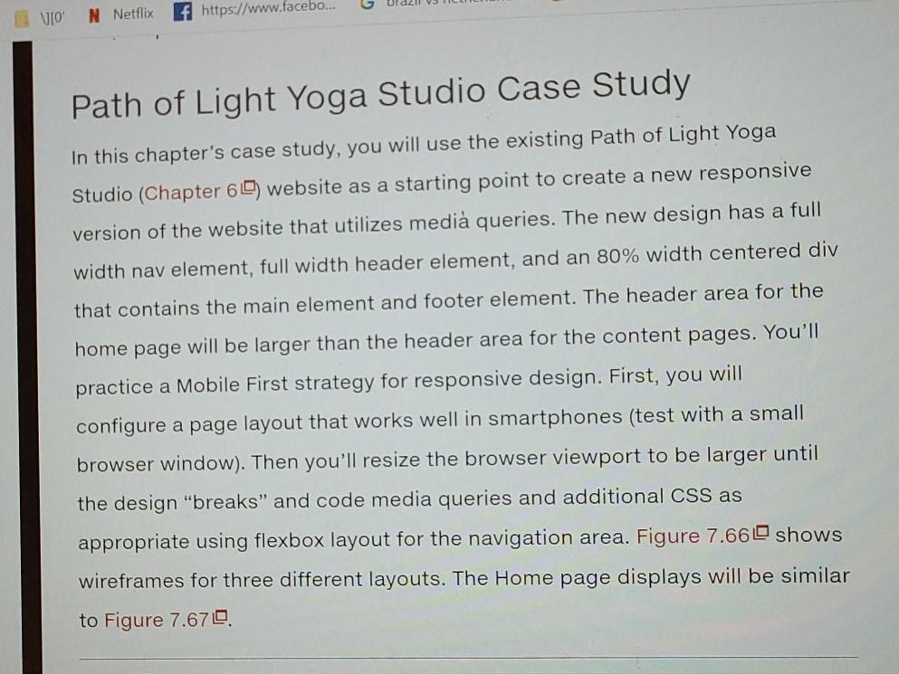
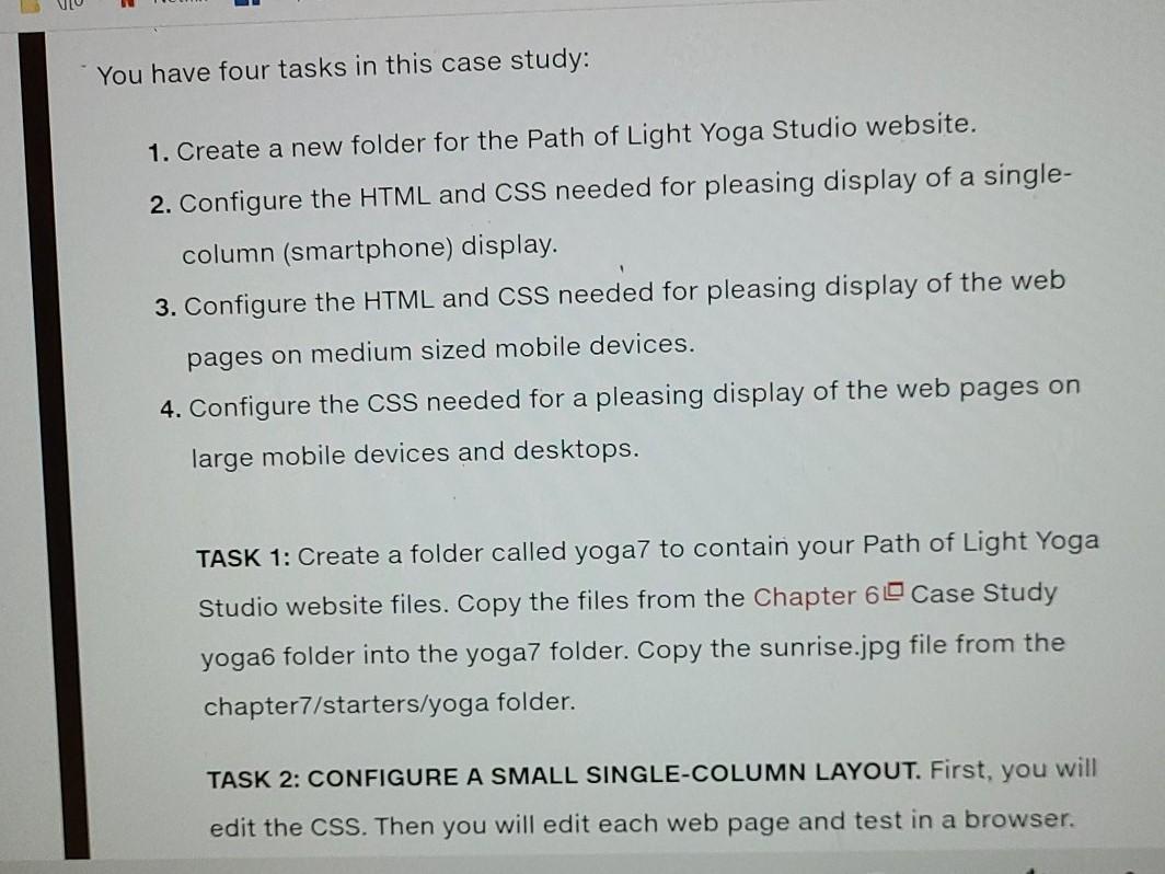
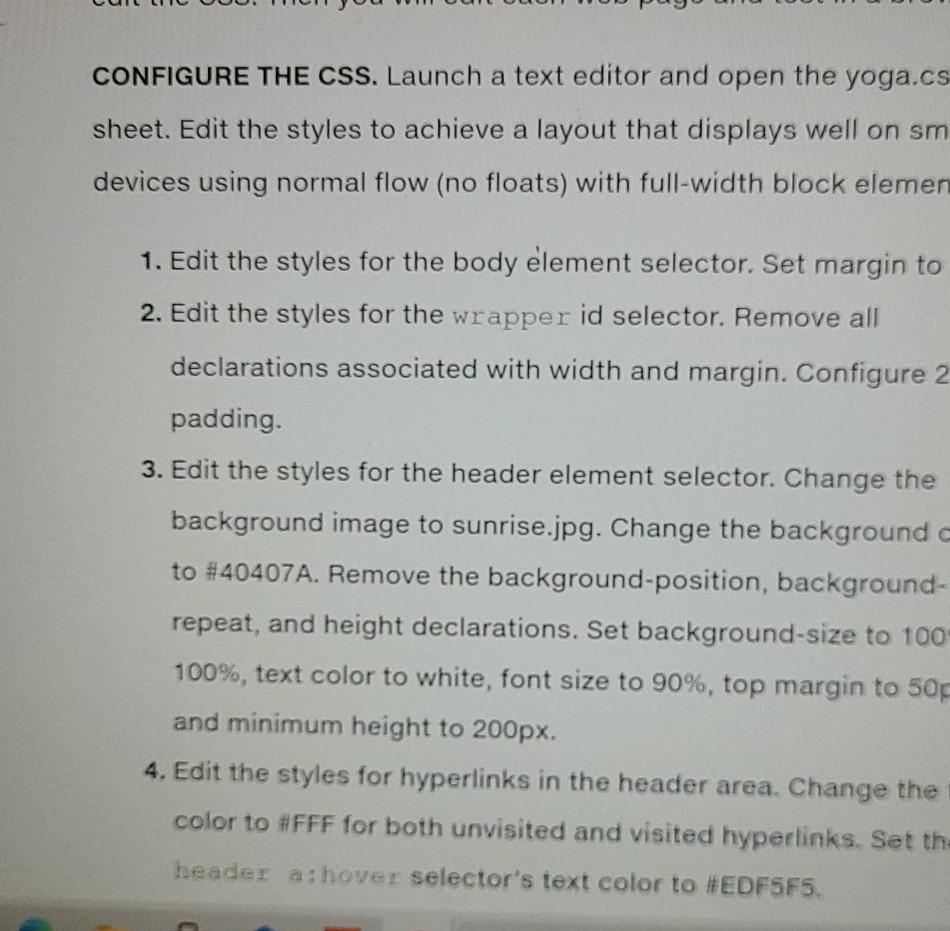
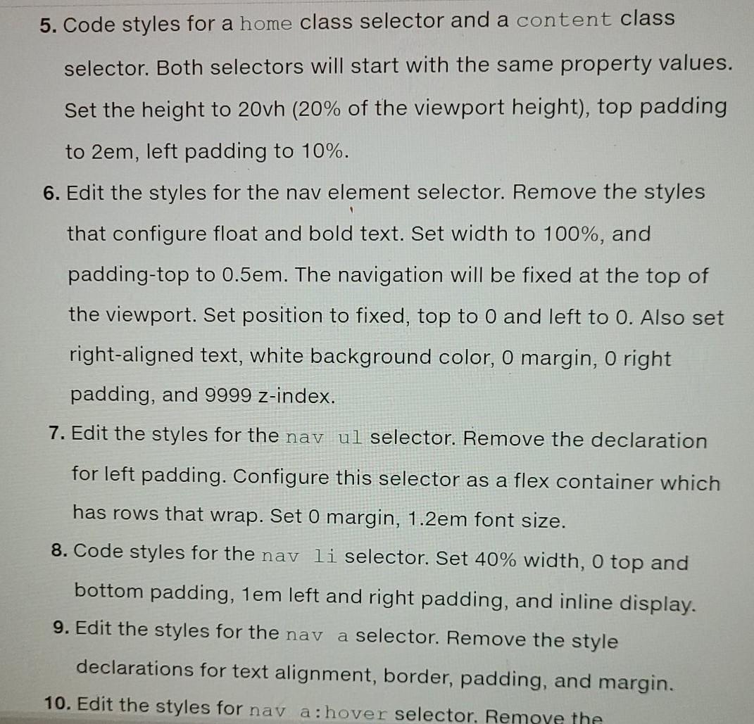
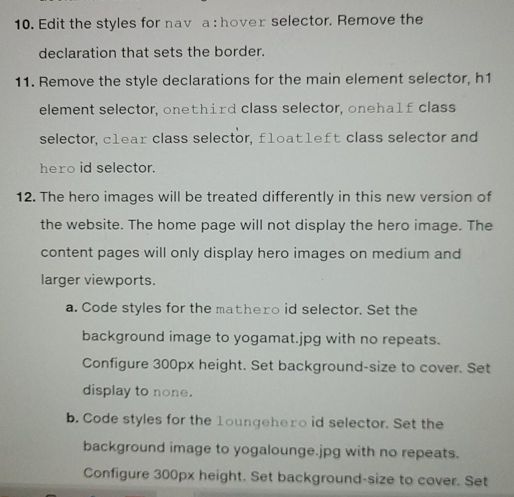
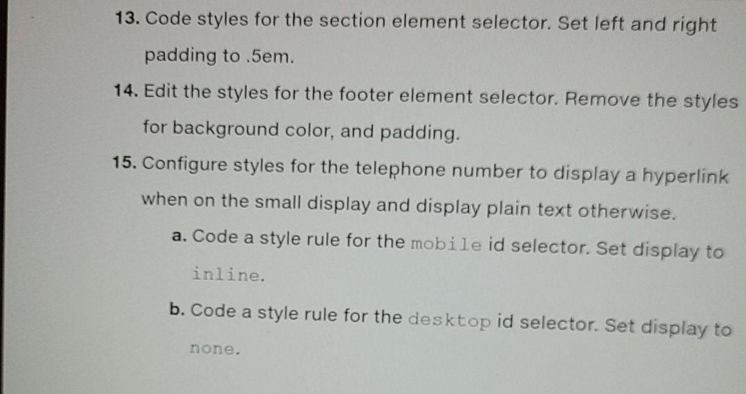
JO N Netflix https://www.facebo... Path of Light Yoga Studio Case Study In this chapter's case study, you will use the existing Path of Light Yoga Studio (Chapter 69) website as a starting point to create a new responsive version of the website that utilizes media queries. The new design has a full width nav element, full width header element, and an 80% width centered div that contains the main element and footer element. The header area for the home page will be larger than the header area for the content pages. You'll practice a Mobile First strategy for responsive design. First, you will configure a page layout that works well in smartphones (test with a small browser window). Then you'll resize the browser viewport to be larger until the design "breaks" and code media queries and additional CSS as appropriate using flexbox layout for the navigation area. Figure 7.660 shows wireframes for three different layouts. The Home page displays will be similar to Figure 7.670 You have four tasks in this case study: 1. Create a new folder for the Path of Light Yoga Studio website. 2. Configure the HTML and CSS needed for pleasing display of a single- column (smartphone) display. 3. Configure the HTML and CSS needed for pleasing display of the web pages on medium sized mobile devices. 4. Configure the CSS needed for a pleasing display of the web pages on large mobile devices and desktops. TASK 1: Create a folder called yoga7 to contain your Path of Light Yoga Studio website files. Copy the files from the Chapter 6 Case Study yoga folder into the yoga7 folder. Copy the sunrise.jpg file from the chapter7/starters/yoga folder. TASK 2: CONFIGURE A SMALL SINGLE-COLUMN LAYOUT. First, you will edit the CSS. Then you will edit each web page and test in a browser. CONFIGURE THE CSS. Launch a text editor and open the yoga.cs sheet. Edit the styles to achieve a layout that displays well on sm devices using normal flow (no floats) with full-width block elemen 1. Edit the styles for the body element selector. Set margin to 2. Edit the styles for the wrapper id selector. Remove all declarations associated with width and margin. Configure 2 padding. 3. Edit the styles for the header element selector. Change the background image to sunrise.jpg. Change the background to #40407A. Remove the background-position, background- repeat, and height declarations. Set background-size to 100 100%, text color to white, font size to 90%, top margin to 50 and minimum height to 200px. 4. Edit the styles for hyperlinks in the header area. Change the color to #FFF for both unvisited and visited hyperlinks. Set th header a:hover selector's text color to #EDF5F5. 3 5. Code styles for a home class selector and a content class selector. Both selectors will start with the same property values. Set the height to 20vh (20% of the viewport height), top padding to 2em, left padding to 10%. 6. Edit the styles for the nav element selector. Remove the styles that configure float and bold text. Set width to 100%, and padding-top to 0.5em. The navigation will be fixed at the top of the viewport. Set position to fixed, top to 0 and left to 0. Also set right-aligned text, white background color, o margin, o right padding, and 9999 z-index. 7. Edit the styles for the nav ul selector. Remove the declaration for left padding. Configure this selector as a flex container which has rows that wrap. Set O margin, 1.2em font size. 8. Code styles for the nav li selector. Set 40% width, 0 top and bottom padding, 1em left and right padding, and inline display. 9. Edit the styles for the nav a selector. Remove the style declarations for text alignment, border, padding, and margin. 10. Edit the styles for nav a:hover selector. Remove the 10. Edit the styles for nav a:hover selector. Remove the declaration that sets the border. 11. Remove the style declarations for the main element selector, h1 element selector, onethird class selector, onehalf class selector, clear class selector, floatleft class selector and hero id selector. 12. The hero images will be treated differently in this new version of the website. The home page will not display the hero image. The content pages will only display hero images on medium and larger viewports. a. Code styles for the mathero id selector. Set the background image to yogamat.jpg with no repeats. Configure 300px height. Set background-size to cover. Set display to none. b. Code styles for the loungehero id selector. Set the background image to yogalounge.jpg with no repeats. Configure 300px height. Set background-size to cover. Set 13. Code styles for the section element selector. Set left and right padding to .5em. 14. Edit the styles for the footer element selector. Remove the styles for background color, and padding. 15. Configure styles for the telephone number to display a hyperlink when on the small display and display plain text otherwise. a. Code a style rule for the mobile id selector. Set display to inline. b. Code a style rule for the desktop id selector. Set display to none. 1 2 3 5 6 7 body { margin:0; padding:0; } *{ box-sizing: border-box; } Enav a { text-decoration: none; display: block; font-weight: bold; 8 10 11 12 13 ni w } Enav ul { font-size: 1.2em; margin:0; } E.flex-container { flex-wrap:wrap; } Enav li {width:40%;padding-bottom:0; padding-top:0;padding-left: 1em; padding-right: 1em; display:inline; } 15 16 17 18 NNNNNNN 5. home{height:20%; padding-top:2em; padding-left: 10; } 28 B.content{height:20%; padding-top:2em; padding-left:10+;) header { background-image: url(sunrise.jpg) background-color: #404074 background-size: 100* 100; text-decoration color: #PPPPPE. font-size: 90 margin-top: 50%; margin-top: 50*: beader (color:#FFF) header avaited color: #FFF} { color: #EDF5F5 : 1 padding 2 er Cascade Style Sheets file Elasses html index.html index.html Schedule html 23 new 2 X New2.css indexhtml x inde 7 header a:link {color:#FFF) header a:visited { color: #FFF;} header a:hover { color: #EDF5F5; } #wrapper { padding: 2em; 3 1 2 3 color: #3F2860; background-color: #F5F5F5; } 7 3 nav li {width: 40%;padding-bottom:0; padding-top:0;padding-left: 1em; padding-right: 1em; display:inline; } 1 3 2 home {height:20%; padding-top:2em; padding-left: 10%; } 6 7 B .content{height: 20%; padding-top: 2em; padding-left: 10%; } 1 2 3 4 5 hi { padding-top: 50px; padding-left: 2em; } li { font-size: 90%) main { padding: 0 3em 3em 3em; display: block; margin-left: 170px; } 8.mathero { height: 300px; background-image: url (yogamat.png); background-size:cover; display:none; ) B.loungehero { height: 300px; background-image: url (yogalounge.png): background-size: cover; display:none; ) 0 1 4 footer { font-size: small; text-align: center; font-style: italie: background-color: #9BC1C2; padding: lem; ) cade Style Sheets File Path of Light Yoga Studio Home Classes Schedules Contact Find Your Inner Light Path of Light Yoga Studio welcomes all to experience a yoga practice in a tranquil, peaceful environmen level. from beginners to advanced. Whether you are new to yoga or have been practicing yoga for years. practice to help you improve your well-being. Let your inner light shine at the Path of Light Yoga Studio Hatha, Vinyan, and Restorative Yoga classes Drop-ins welcome Mate, blocks, and blankets provided Relax in our Serenity Lounge before or after your class Path of Light Yoga Studio 612 Serenity Way El Dorado, CA 96162 888-555-5555 3 Type here to search JO N Netflix https://www.facebo... Path of Light Yoga Studio Case Study In this chapter's case study, you will use the existing Path of Light Yoga Studio (Chapter 69) website as a starting point to create a new responsive version of the website that utilizes media queries. The new design has a full width nav element, full width header element, and an 80% width centered div that contains the main element and footer element. The header area for the home page will be larger than the header area for the content pages. You'll practice a Mobile First strategy for responsive design. First, you will configure a page layout that works well in smartphones (test with a small browser window). Then you'll resize the browser viewport to be larger until the design "breaks" and code media queries and additional CSS as appropriate using flexbox layout for the navigation area. Figure 7.660 shows wireframes for three different layouts. The Home page displays will be similar to Figure 7.670 You have four tasks in this case study: 1. Create a new folder for the Path of Light Yoga Studio website. 2. Configure the HTML and CSS needed for pleasing display of a single- column (smartphone) display. 3. Configure the HTML and CSS needed for pleasing display of the web pages on medium sized mobile devices. 4. Configure the CSS needed for a pleasing display of the web pages on large mobile devices and desktops. TASK 1: Create a folder called yoga7 to contain your Path of Light Yoga Studio website files. Copy the files from the Chapter 6 Case Study yoga folder into the yoga7 folder. Copy the sunrise.jpg file from the chapter7/starters/yoga folder. TASK 2: CONFIGURE A SMALL SINGLE-COLUMN LAYOUT. First, you will edit the CSS. Then you will edit each web page and test in a browser. CONFIGURE THE CSS. Launch a text editor and open the yoga.cs sheet. Edit the styles to achieve a layout that displays well on sm devices using normal flow (no floats) with full-width block elemen 1. Edit the styles for the body element selector. Set margin to 2. Edit the styles for the wrapper id selector. Remove all declarations associated with width and margin. Configure 2 padding. 3. Edit the styles for the header element selector. Change the background image to sunrise.jpg. Change the background to #40407A. Remove the background-position, background- repeat, and height declarations. Set background-size to 100 100%, text color to white, font size to 90%, top margin to 50 and minimum height to 200px. 4. Edit the styles for hyperlinks in the header area. Change the color to #FFF for both unvisited and visited hyperlinks. Set th header a:hover selector's text color to #EDF5F5. 3 5. Code styles for a home class selector and a content class selector. Both selectors will start with the same property values. Set the height to 20vh (20% of the viewport height), top padding to 2em, left padding to 10%. 6. Edit the styles for the nav element selector. Remove the styles that configure float and bold text. Set width to 100%, and padding-top to 0.5em. The navigation will be fixed at the top of the viewport. Set position to fixed, top to 0 and left to 0. Also set right-aligned text, white background color, o margin, o right padding, and 9999 z-index. 7. Edit the styles for the nav ul selector. Remove the declaration for left padding. Configure this selector as a flex container which has rows that wrap. Set O margin, 1.2em font size. 8. Code styles for the nav li selector. Set 40% width, 0 top and bottom padding, 1em left and right padding, and inline display. 9. Edit the styles for the nav a selector. Remove the style declarations for text alignment, border, padding, and margin. 10. Edit the styles for nav a:hover selector. Remove the 10. Edit the styles for nav a:hover selector. Remove the declaration that sets the border. 11. Remove the style declarations for the main element selector, h1 element selector, onethird class selector, onehalf class selector, clear class selector, floatleft class selector and hero id selector. 12. The hero images will be treated differently in this new version of the website. The home page will not display the hero image. The content pages will only display hero images on medium and larger viewports. a. Code styles for the mathero id selector. Set the background image to yogamat.jpg with no repeats. Configure 300px height. Set background-size to cover. Set display to none. b. Code styles for the loungehero id selector. Set the background image to yogalounge.jpg with no repeats. Configure 300px height. Set background-size to cover. Set 13. Code styles for the section element selector. Set left and right padding to .5em. 14. Edit the styles for the footer element selector. Remove the styles for background color, and padding. 15. Configure styles for the telephone number to display a hyperlink when on the small display and display plain text otherwise. a. Code a style rule for the mobile id selector. Set display to inline. b. Code a style rule for the desktop id selector. Set display to none. 1 2 3 5 6 7 body { margin:0; padding:0; } *{ box-sizing: border-box; } Enav a { text-decoration: none; display: block; font-weight: bold; 8 10 11 12 13 ni w } Enav ul { font-size: 1.2em; margin:0; } E.flex-container { flex-wrap:wrap; } Enav li {width:40%;padding-bottom:0; padding-top:0;padding-left: 1em; padding-right: 1em; display:inline; } 15 16 17 18 NNNNNNN 5. home{height:20%; padding-top:2em; padding-left: 10; } 28 B.content{height:20%; padding-top:2em; padding-left:10+;) header { background-image: url(sunrise.jpg) background-color: #404074 background-size: 100* 100; text-decoration color: #PPPPPE. font-size: 90 margin-top: 50%; margin-top: 50*: beader (color:#FFF) header avaited color: #FFF} { color: #EDF5F5 : 1 padding 2 er Cascade Style Sheets file Elasses html index.html index.html Schedule html 23 new 2 X New2.css indexhtml x inde 7 header a:link {color:#FFF) header a:visited { color: #FFF;} header a:hover { color: #EDF5F5; } #wrapper { padding: 2em; 3 1 2 3 color: #3F2860; background-color: #F5F5F5; } 7 3 nav li {width: 40%;padding-bottom:0; padding-top:0;padding-left: 1em; padding-right: 1em; display:inline; } 1 3 2 home {height:20%; padding-top:2em; padding-left: 10%; } 6 7 B .content{height: 20%; padding-top: 2em; padding-left: 10%; } 1 2 3 4 5 hi { padding-top: 50px; padding-left: 2em; } li { font-size: 90%) main { padding: 0 3em 3em 3em; display: block; margin-left: 170px; } 8.mathero { height: 300px; background-image: url (yogamat.png); background-size:cover; display:none; ) B.loungehero { height: 300px; background-image: url (yogalounge.png): background-size: cover; display:none; ) 0 1 4 footer { font-size: small; text-align: center; font-style: italie: background-color: #9BC1C2; padding: lem; ) cade Style Sheets File Path of Light Yoga Studio Home Classes Schedules Contact Find Your Inner Light Path of Light Yoga Studio welcomes all to experience a yoga practice in a tranquil, peaceful environmen level. from beginners to advanced. Whether you are new to yoga or have been practicing yoga for years. practice to help you improve your well-being. Let your inner light shine at the Path of Light Yoga Studio Hatha, Vinyan, and Restorative Yoga classes Drop-ins welcome Mate, blocks, and blankets provided Relax in our Serenity Lounge before or after your class Path of Light Yoga Studio 612 Serenity Way El Dorado, CA 96162 888-555-5555 3 Type here to search
Step by Step Solution
There are 3 Steps involved in it
Step: 1

Get Instant Access to Expert-Tailored Solutions
See step-by-step solutions with expert insights and AI powered tools for academic success
Step: 2

Step: 3

Ace Your Homework with AI
Get the answers you need in no time with our AI-driven, step-by-step assistance
Get Started


