Question
I am reposting one more time becaue I am getting close, but it is still not working quite right. I have the following dataframe I
I am reposting one more time becaue I am getting close, but it is still not working quite right. I have the following dataframe I want to make a grouped bar graph from.
library(ggplot2)
# Create dataframe
df
# Plot variables
ggplot(data = df, aes(x = nucleotide)) + geom_col(aes(y = first.exon, fill = "first.exon"), position = "dodge") + geom_col(aes(y = internal.exon, fill = "internal.exon"), position = "dodge") + geom_col(aes(y = last.exon, fill = "last.exon"), position = "dodge") + scale_fill_manual(values = c("first.exon" = "light blue", "internal.exon" = "light green", "last.exon" = "pink")) + labs(title = "Number of Nucleotides in Each Exon", subtitle = "Grouped barplot using ggplot2", x = "Nucleotide", y = "Counts", fill = "") + theme_minimal()
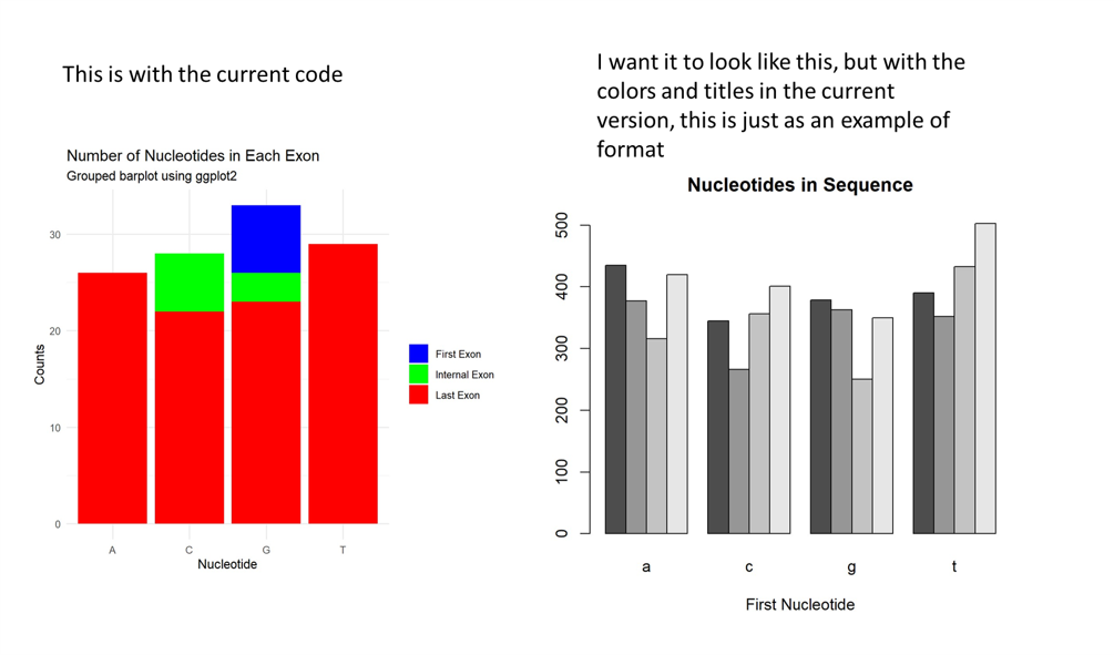
This should put the nucleotides as the groups on the x-axis, and the exons as the subgroups and the frequency of bases on the y axis. it is working mostly, except it is still a stacked barplot instead of a grouped bar plot. I want all three bars in each subgroup beside each other along the x-axis. below is the result I am getting, which is not what I want,

This is with the current code I want it to look like this, but with the colors and titles in the current version, this is just as an example of format Nucleotides in Sequence
Step by Step Solution
There are 3 Steps involved in it
Step: 1

Get Instant Access to Expert-Tailored Solutions
See step-by-step solutions with expert insights and AI powered tools for academic success
Step: 2

Step: 3

Ace Your Homework with AI
Get the answers you need in no time with our AI-driven, step-by-step assistance
Get Started


