

Question
I had a difficult time to clear my graph because I feel like it was not right to do as the instruction said (like the

I had a difficult time to clear my graph because I feel like it was not right to do as the instruction said (like the 5-step or 10-step increments)
here is my coding and the graph:
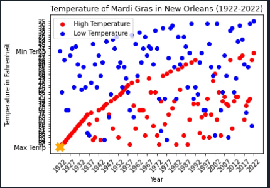
import matplotlib.pyplot as plt NOLA_FILE = "nola_weather_feb.csv" years = [] high_temperature = [] low_temperature = [] with open(NOLA_FILE, "r") as file: for line in file: year, max_temp, min_temp, mean, humidity = line.strip().split(",") years.append(year) high_temperature.append(max_temp) low_temperature.append(min_temp) highest_temperature_year = years[high_temperature.index(max(high_temperature))] highest_temperature = max(high_temperature) plt.scatter(years, high_temperature, color = "red", label = "High Temperature") plt.scatter(years, low_temperature, color = "blue", label = "Low Temperature") plt.scatter(highest_temperature_year, highest_temperature, color = "orange", marker = "X", s=200) plt.title("Temperature of Mardi Gras in New Orleans (1922-2022)") plt.xlabel("Year") plt.ylabel("Temperature in Fahrenheit") plt.legend() pos = [i for i in range(0, len(years), 5)] years_range = range(1922, 2023, 5) plt.xticks(pos, years_range, rotation = 45) plt.show()
Step by Step Solution
There are 3 Steps involved in it
Step: 1

Get Instant Access to Expert-Tailored Solutions
See step-by-step solutions with expert insights and AI powered tools for academic success
Step: 2

Step: 3
Ace Your Homework with AI
Get the answers you need in no time with our AI-driven, step-by-step assistance
Get Started
Successful Keyword Searching Initiating Research On Popular Topics Using Electronic Databases
Authors: Randall MacDonald, Susan MacDonald
1st Edition
0313306761, 978-0313306761