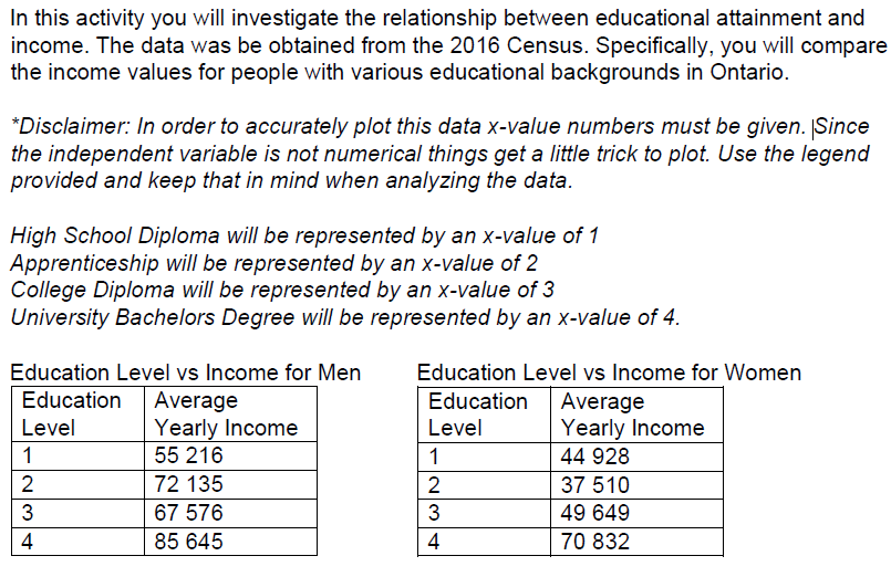
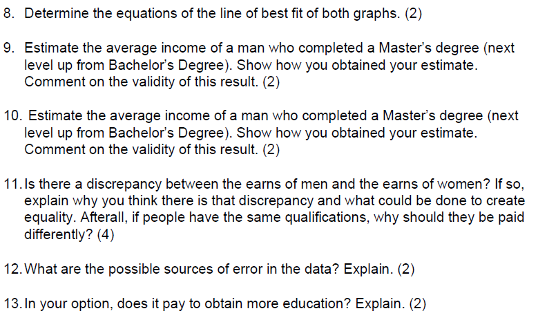
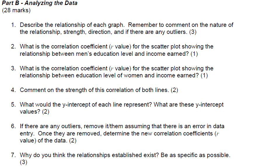
In this activity you will investigate the relationship between educational attainment and income. The data was be obtained from the 2016 Census. Specifically, you will compare the income values for people with various educational backgrounds in Ontario. *Disclaimer: In order to accurately plot this data x-value numbers must be given. (Since the independent variable is not numerical things get a little trick to plot. Use the legend provided and keep that in mind when analyzing the data. High School Diploma will be represented by an x-value of 1 Apprenticeship will be represented by an x-value of 2 College Diploma will be represented by an x-value of 3 University Bachelors Degree will be represented by an x-value of 4. Education Level vs Income for Men Education Level vs Income for Women Education Average Education Average Level Yearly Income Level Yearly Income 1 55 216 1 44 928 2 72 135 2 37 510 3 67 576 3 49 649 4 85 645 4 70 8328. Determine the equations of the line of best t of both graphs. {2} 9. Estimate the average income of a man who completed a Master's degree (next level up from Bachelor's Degree}. Show how you obtained your estimate. Comment on the validity ofthis result. {2} 10. Estimate the average income of a man who completed a Master's degree {next level up from Bachelor's Degree}. Show how you obtained your estimate. Comment on the validity of this result. {2} 11.ls there a discrepancy between the earns of men and the earns of women? If so, explain why you think there is that discrepancy and what could be done to create equality. Afterall, if people have the same qualications, why should they be paid differently? {4} 12.What are the possible sources of error in the data? Explain. {2} 13. In your option, does it pay to obtain more education? Explain. {2) Part A - Preparing the Data Using the provided data tables: (5 marks) 1. Create a scatter plot for both data sets. (Note: At the time of the Census gender identities outside of the binary were not recognized and therefore would have been categorized by their assigned sex at birth). You may find it beneficial to plot both data sets onto one graph. 2. Add the lines of best fit.Part B - Analyzing the Data (28 marks) 1. Describe the relationship of each graph. Remember to comment on the nature of the relationship, strength, direction, and if there are any outliers. (3) 2. What is the correlation coefficient (7 value) for the scatter plot showing the relationship between men's education level and income earned? (1) 3. What is the correlation coefficient ( value) for the scatter plot showing the relationship between education level of women and income earned? (1) 4. Comment on the strength of this correlation of both lines. (2) 5. What would the y-intercept of each line represent? What are these y-intercept values? (2) 6. If there are any outliers, remove it/them assuming that there is an error in data entry. Once they are removed, determine the new correlation coefficients (7 value) of the data. (2) 7. Why do you think the relationships established exist? Be as specific as possible. (3)


