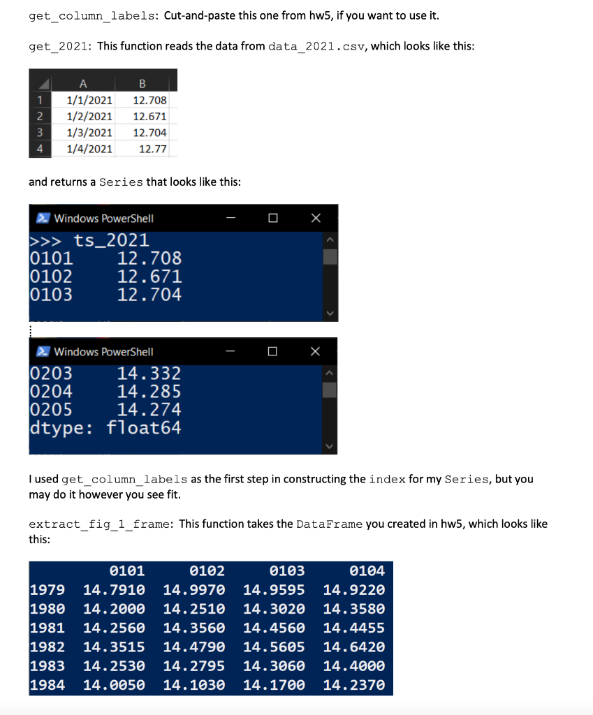
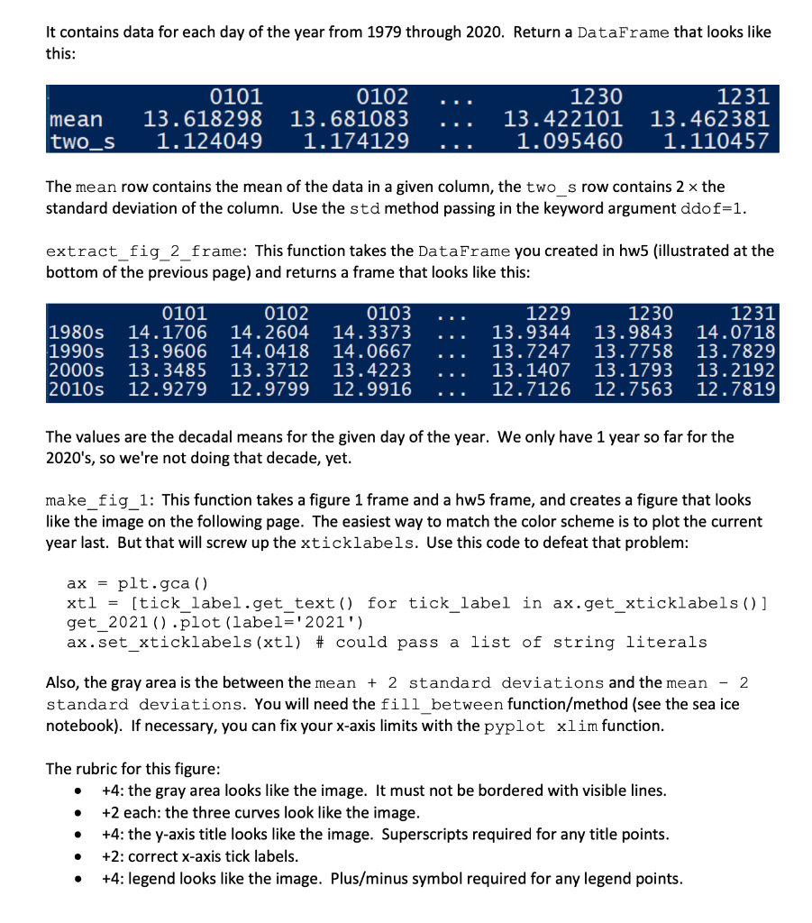
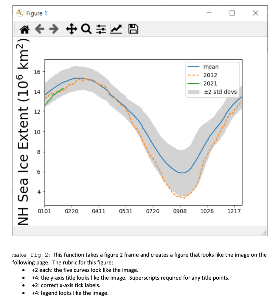
Introduction. This homework is the second in a three-assignment arc intended to introduce you to dealing with data that is stored on disk in csv format using pandas. In this assignment, you will reproduce figures from the web created by the National Snow and Ice Data Center (NSIDC) and Japan's version, the Arctic Data Archive System (ADS). The NSIDC plot is the way they used to do it, better than their current version. The ADS site will be changing soon, so who knows how long that link will work. Plus, they made their plots worse. We'll recreate the old style. Instructions. Create a module named hw6.py. Below is the spec for seven functions. Implement them and upload your module to D2L Assignments. Testing. Download hw6_test.py and auxiliary testing files and put them in the same folder as your hw6.py module. Each of the first three functions is worth 20% of your total score. You do not directly receive points for main, but it has to work correctly or you will get no points for two of your other functions. You can examine the test module in a text editor to understand better what your code should do. The test module is part of the spec. The test file we will use to grade your program will be different and may uncover failings in your work not evident upon testing with the provided file. Add any necessary tests to make sure your code works in all cases. Documentation. Your module must contain a header docstring containing your name, your section leader's name, the date, ISTA 131 Hw6, and a brief summary of the module. Each function must contain a docstring. Each docstring should include a description of the function's purpose, the name, type, and purpose of each parameter, and the type and meaning of the function's return value. Grading. Your module will be graded on correctness, documentation, and coding style. Code should be clear and concise. You will only lose style points if your code is a real mess. Include inline comments to explain tricky lines and summarize sections of code. Collaboration. Collaboration is allowed. You are responsible for your learning. Depending too much on others will hurt you on the tests. "Helping" others too much harms them in reality. Cite any sources/collaborators in your header docstring. Leaving this out is dishonest. Resources. http:/sidc.org/arcticseaicenews/ https://ads.nipr.ac.jp/vishop/#/extent http://pandas.pydata.org/pandas-docs/stable/api.html https://docs.python.org/3/tutorial/datastructures.html http://matplotlib.org/users/mathtext.html http://matplotlib.org/api/axes api.html get_column_labels: Cut-and-paste this one from hw5, if you want to use it. get_2021: This function reads the data from data_2021.csv, which looks like this: 1 2 A 1/1/2021 1/2/2021 1/3/2021 1/4/2021 . 12.708 12.671 12.704 12.77 3 4 and returns a Series that looks like this: 2. Windows PowerShell >>> ts_2021 0101 12.708 0102 12.671 0103 12.704 2. Windows PowerShell 0203 14.332 0204 14.285 0205 14.274 dtype: float64 I used get_column_labels as the first step in constructing the index for my Series, but you may do it however you see fit. extract_fig_1_frame: This function takes the DataFrame you created in hw5, which looks like this: 1979 1980 1981 1982 1983 1984 0101 14.7910 14.2000 14.2560 14.3515 14.2530 14.0050 0102 14.9970 14.2510 14.3560 14.4790 14.2795 14.1030 0103 14.9595 14.3020 14.4560 14.5605 14.3060 14.1700 0104 14.9220 14.3580 14.4455 14.6420 14.4000 14.2370 It contains data for each day of the year from 1979 through 2020. Return a DataFrame that looks like this: mean two_S 0101 13.618298 1.124049 0102 13.681083 1.174129 1230 13.422101 1.095460 1231 13.462381 1.110457 The mean row contains the mean of the data in a given column, the two_s row contains 2 x the standard deviation of the column. Use the std method passing in the keyword argument ddof=1. extract_fig_2_frame: This function takes the DataFrame you created in hw5 (illustrated at the bottom of the previous page) and returns a frame that looks like this: 1980s 1990s 2000s 2010s 0101 14.1706 13.9606 13.3485 12.9279 0102 14.2604 14.0418 13.3712 12.9799 0103 14.3373 14.0667 13.4223 12.9916 1229 13.9344 13.7247 13.1407 12.7126 1230 13.9843 13.7758 13.1793 12.7563 1231 14.0718 13.7829 13.2192 12.7819 The values are the decadal means for the given day of the year. We only have 1 year so far for the 2020's, so we're not doing that decade, yet. make_fig_1: This function takes a figure 1 frame and a hw5 frame, and creates a figure that looks like the image on the following page. The easiest way to match the color scheme is to plot the current year last. But that will screw up the xticklabels. Use this code to defeat that problem: ax = plt.gca () xtl = [tick_label.get_text() for tick_label in ax.get_xticklabels() ] get_2021().plot (label='2021') ax.set_xticklabels (xtl) # could pass a list of string literals Also, the gray area is the between the mean + 2 standard deviations and the mean - 2 standard deviations. You will need the fill_between function/method (see the sea ice notebook). If necessary, you can fix your x-axis limits with the pyplot xlim function. The rubric for this figure: +4: the gray area looks like the image. It must not be bordered with visible lines. +2 each: the three curves look like the image. +4: the y-axis title looks like the image. Superscripts required for any title points. +2: correct x-axis tick labels. +4: legend looks like the image. Plus/minus symbol required for any legend points. Figure 1 - #QW 16 mean 2012 2021 +2 std devs 12 NH Sea Ice Extent (106 km2) 10 4 0101 0220 0411 0531 0720 0908 1028 1217 make_fig_2: This function takes a figure 2 frame and creates a figure that looks like the image on the following page. The rubric for this figure: +2 each: the five curves look like the image. +4: the y-axis title looks like the image. Superscripts required for any title points. +2: correct x-axis tick labels. +4: legend looks like the image. O . O Introduction. This homework is the second in a three-assignment arc intended to introduce you to dealing with data that is stored on disk in csv format using pandas. In this assignment, you will reproduce figures from the web created by the National Snow and Ice Data Center (NSIDC) and Japan's version, the Arctic Data Archive System (ADS). The NSIDC plot is the way they used to do it, better than their current version. The ADS site will be changing soon, so who knows how long that link will work. Plus, they made their plots worse. We'll recreate the old style. Instructions. Create a module named hw6.py. Below is the spec for seven functions. Implement them and upload your module to D2L Assignments. Testing. Download hw6_test.py and auxiliary testing files and put them in the same folder as your hw6.py module. Each of the first three functions is worth 20% of your total score. You do not directly receive points for main, but it has to work correctly or you will get no points for two of your other functions. You can examine the test module in a text editor to understand better what your code should do. The test module is part of the spec. The test file we will use to grade your program will be different and may uncover failings in your work not evident upon testing with the provided file. Add any necessary tests to make sure your code works in all cases. Documentation. Your module must contain a header docstring containing your name, your section leader's name, the date, ISTA 131 Hw6, and a brief summary of the module. Each function must contain a docstring. Each docstring should include a description of the function's purpose, the name, type, and purpose of each parameter, and the type and meaning of the function's return value. Grading. Your module will be graded on correctness, documentation, and coding style. Code should be clear and concise. You will only lose style points if your code is a real mess. Include inline comments to explain tricky lines and summarize sections of code. Collaboration. Collaboration is allowed. You are responsible for your learning. Depending too much on others will hurt you on the tests. "Helping" others too much harms them in reality. Cite any sources/collaborators in your header docstring. Leaving this out is dishonest. Resources. http:/sidc.org/arcticseaicenews/ https://ads.nipr.ac.jp/vishop/#/extent http://pandas.pydata.org/pandas-docs/stable/api.html https://docs.python.org/3/tutorial/datastructures.html http://matplotlib.org/users/mathtext.html http://matplotlib.org/api/axes api.html get_column_labels: Cut-and-paste this one from hw5, if you want to use it. get_2021: This function reads the data from data_2021.csv, which looks like this: 1 2 A 1/1/2021 1/2/2021 1/3/2021 1/4/2021 . 12.708 12.671 12.704 12.77 3 4 and returns a Series that looks like this: 2. Windows PowerShell >>> ts_2021 0101 12.708 0102 12.671 0103 12.704 2. Windows PowerShell 0203 14.332 0204 14.285 0205 14.274 dtype: float64 I used get_column_labels as the first step in constructing the index for my Series, but you may do it however you see fit. extract_fig_1_frame: This function takes the DataFrame you created in hw5, which looks like this: 1979 1980 1981 1982 1983 1984 0101 14.7910 14.2000 14.2560 14.3515 14.2530 14.0050 0102 14.9970 14.2510 14.3560 14.4790 14.2795 14.1030 0103 14.9595 14.3020 14.4560 14.5605 14.3060 14.1700 0104 14.9220 14.3580 14.4455 14.6420 14.4000 14.2370 It contains data for each day of the year from 1979 through 2020. Return a DataFrame that looks like this: mean two_S 0101 13.618298 1.124049 0102 13.681083 1.174129 1230 13.422101 1.095460 1231 13.462381 1.110457 The mean row contains the mean of the data in a given column, the two_s row contains 2 x the standard deviation of the column. Use the std method passing in the keyword argument ddof=1. extract_fig_2_frame: This function takes the DataFrame you created in hw5 (illustrated at the bottom of the previous page) and returns a frame that looks like this: 1980s 1990s 2000s 2010s 0101 14.1706 13.9606 13.3485 12.9279 0102 14.2604 14.0418 13.3712 12.9799 0103 14.3373 14.0667 13.4223 12.9916 1229 13.9344 13.7247 13.1407 12.7126 1230 13.9843 13.7758 13.1793 12.7563 1231 14.0718 13.7829 13.2192 12.7819 The values are the decadal means for the given day of the year. We only have 1 year so far for the 2020's, so we're not doing that decade, yet. make_fig_1: This function takes a figure 1 frame and a hw5 frame, and creates a figure that looks like the image on the following page. The easiest way to match the color scheme is to plot the current year last. But that will screw up the xticklabels. Use this code to defeat that problem: ax = plt.gca () xtl = [tick_label.get_text() for tick_label in ax.get_xticklabels() ] get_2021().plot (label='2021') ax.set_xticklabels (xtl) # could pass a list of string literals Also, the gray area is the between the mean + 2 standard deviations and the mean - 2 standard deviations. You will need the fill_between function/method (see the sea ice notebook). If necessary, you can fix your x-axis limits with the pyplot xlim function. The rubric for this figure: +4: the gray area looks like the image. It must not be bordered with visible lines. +2 each: the three curves look like the image. +4: the y-axis title looks like the image. Superscripts required for any title points. +2: correct x-axis tick labels. +4: legend looks like the image. Plus/minus symbol required for any legend points. Figure 1 - #QW 16 mean 2012 2021 +2 std devs 12 NH Sea Ice Extent (106 km2) 10 4 0101 0220 0411 0531 0720 0908 1028 1217 make_fig_2: This function takes a figure 2 frame and creates a figure that looks like the image on the following page. The rubric for this figure: +2 each: the five curves look like the image. +4: the y-axis title looks like the image. Superscripts required for any title points. +2: correct x-axis tick labels. +4: legend looks like the image. O . O