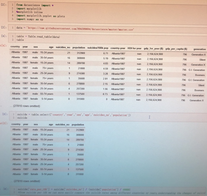
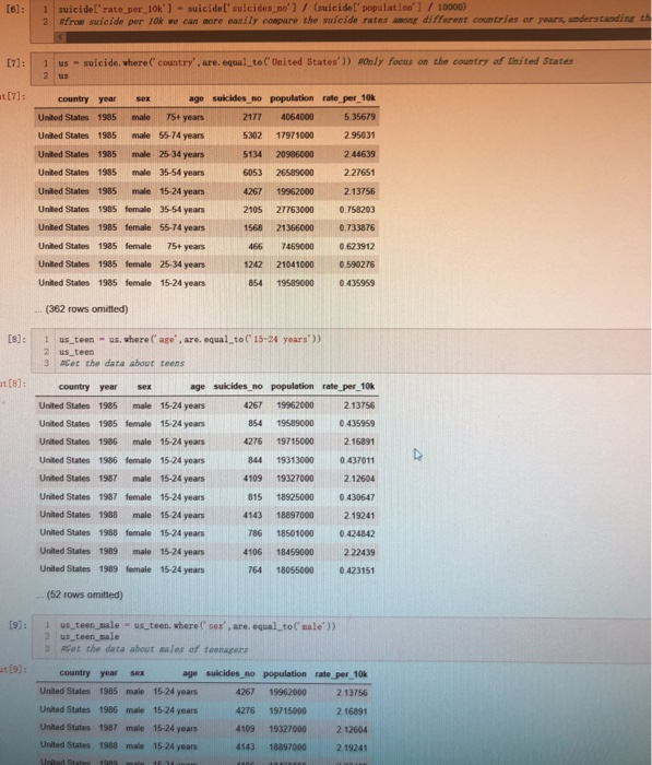
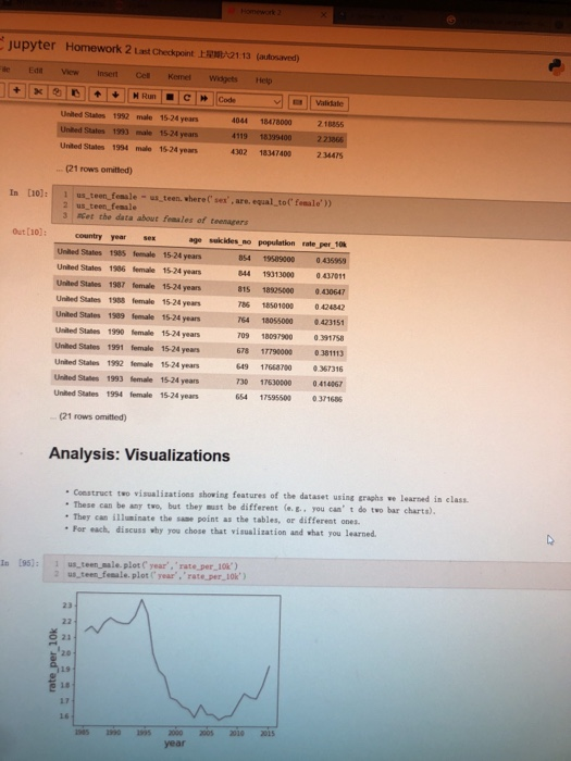
Just want to know how to combine two graphs in the last photo into one overlaid graph. Two lines are about male and female in the graph wanted, where x-axis is year and y-axis is suicide numbers.


[2): 1 from datascience isport 2 import matplotlib 3 Mnatplotlib inline 4 import matplotlib.pyplot as plots 5 import numpy as np 13): 1 data 'https://rav. githubusercontent. con/8943 4: 1 table Table. read table (data) t4: country year sex 99684/datasciencesster/master. csv 2 table no population suicides/100k pop country year HDI for year gdp for year (5) gdp per capita (S) generation 21 312900 Albania 1987 male 1524 years Albania 1987 male 35-54 years Albania 1987 female 15-24 years Albania 1987 male 75+ years Albania 1987 male 25-34 years Albania 1987 female 75+ years Albania 1987 female 35-54 years Albania 1987 female 25 34 years Albania 1987 male 55-74 years Albania 1987 female5-14 years 6.71 Albania1987 16 308000 14 289700 21800 9 274300 35600 6 278800 4 257200 1 137500 0 311000 5.19 Abania 1987 483 Albania 1987 4.59 Albania 1987 3.28 Abania 1987 2.81 Albania 1987 2.15 Albania 1987 .56 Albania 1987 073 Albania 1987 0 Albania1987 nan 2,156,624,900 nan 2,156,624,900 nan 2,156,624,900 nan 2,156,624900 nan 2,156,624,900 nan 2,156,624,900 nan 2,156,624,900 nan 2,156,624900 nan 2,156,624,900 nan 2,156,624 900 796 Generation x 796 796 Generation X 796 GI Generation 796 Boomers 796 GI Generation 796 796 Silent Silent 756 GLGeneration 96 Generation X (27810 rows ormitted) 15): 1 suicide table. select (C' country. 'year, 'sex, age, 'suicides_no, 'population']) 2 suicide t (5 country year sex Albania 1987 male 1524 years Albania 1987 male 35-54 years Albania 1987 female 15-24 years Albania 1987 male 75+ years Albania 1987 male 25-34 years Albania 1987 female 75+ years Albania 1987 female 35-54 years Albania 1987 female 25-34 years Albania 1987 male 55-74 years Albania 1987 female 5-14 years populatiorn 21 312900 16 308000 14 289700 21800 9 274300 35600 6 278800 4 257200 1 137500 0 311000 (27810 rows omitted 6): suicidel' rate.per 10k' -suicide suicides.no' /(suicide[ population'1/10000) auieide rates anong Analysis: Visualizations Construct two visualizations shoving features of the dataset using graphs ve learned in class These can be any two, but they aust be different (e.t., you can' t do two bar charts). - They can illusinate the sase point as the tables, or different ones For each, discuss why you chose that visualization and vhat you learned. s5):1 us teen sale.plot C rear, 'rate per 10k') 2 us teenfemale. plot year,'rate per_10k') 23 O 21 2.0 19 18 17 16 1985 90 1995 2000 2005 2010 2015 year 050 6 045 040 0 30 1985 1990 1995 2000 2005 2010 201 year
