l For each of the following statements, determine if it is true or false. Circle A or B. No explanation to justify your answer is
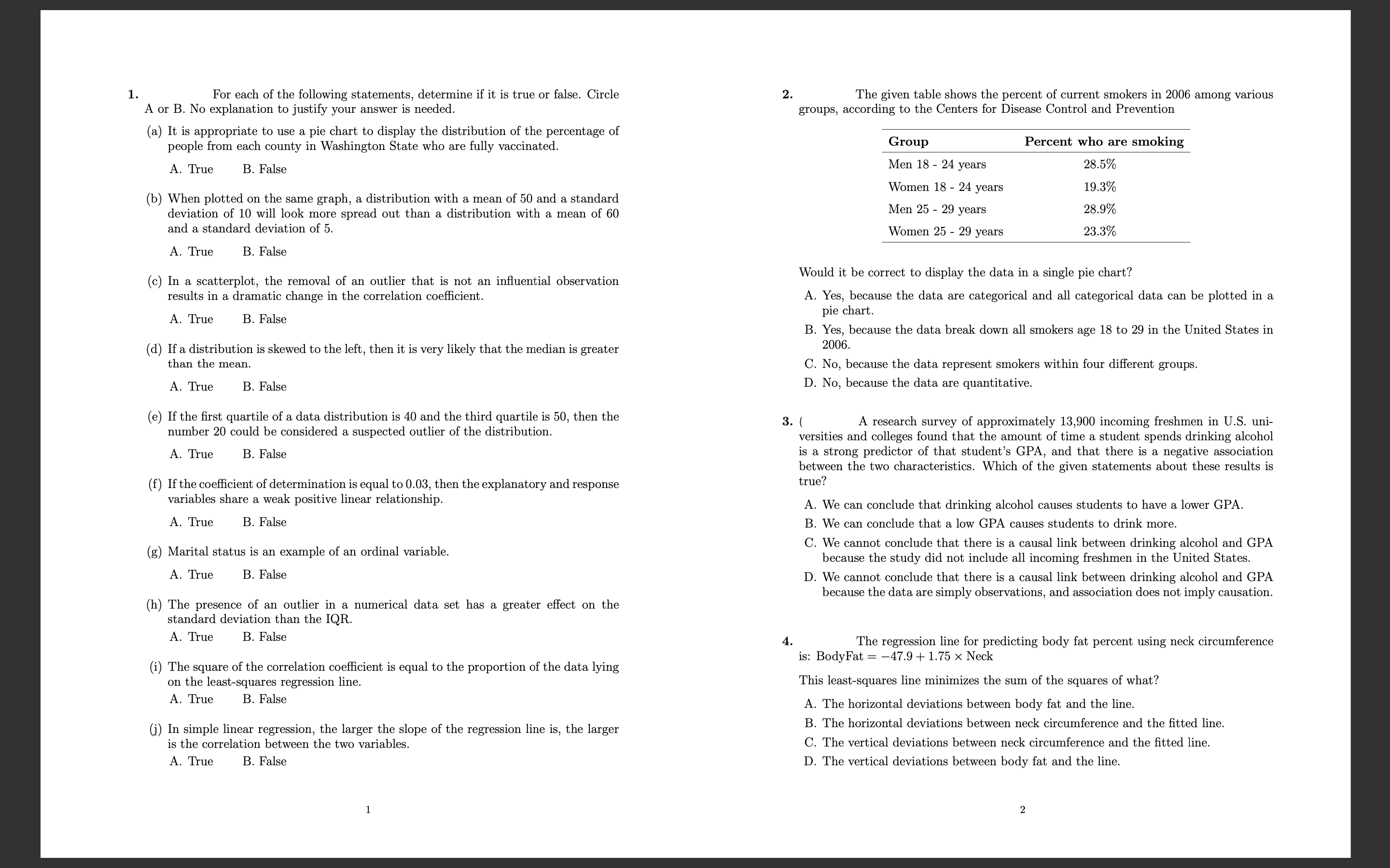
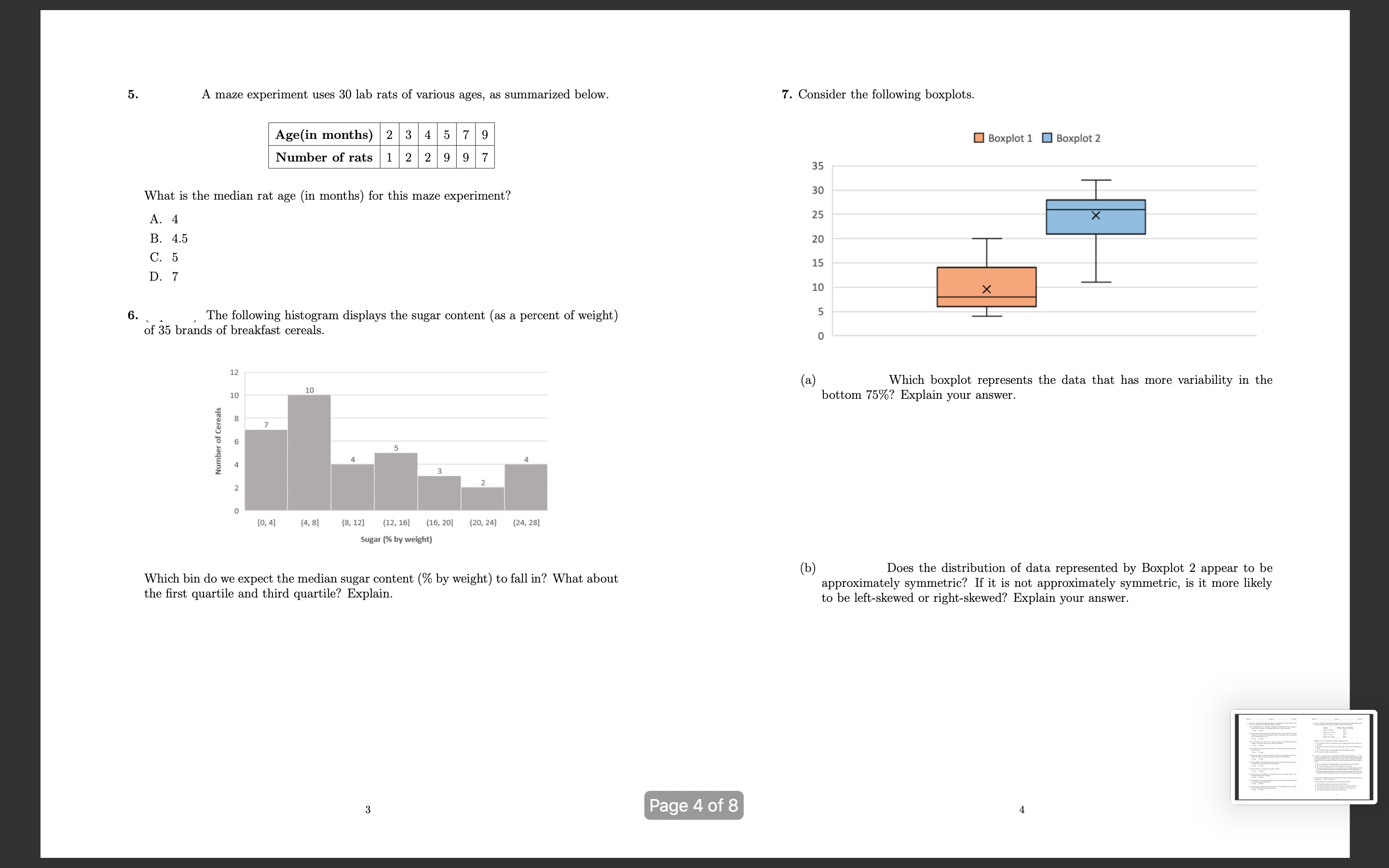
l For each of the following statements, determine if it is true or false. Circle A or B. No explanation to justify your answer is needed. (a) It is appropriate to use a pie chart to display the distribution of the percentage of people from each county in Washington State who are fully vaccinated. A. The B. False (b) When plotted on the same graph, a distribution with a mean of 50 and a standard deviation of 10 will look more spread out than a distribution with a mean of 60 and a standard deviation of 5. A. True B. False (c) In a scatterplot, the removal of an outlier that is not an inuential observation results in a dramatic change in the correlation coefficient. A. True B. False (d) If a distribution is skewed to the left, then it is very likely that the median is greater than the mean. A. The B. False (e) If the rst quartile of a data distribution is 40 and the third quartile is 50, then the number 20 could be considered a suspected outlier of the distribution A. True B. False (f) If the coeicient of determination is equal to 0.03, then the explanatory and response variables share a weak positive linear relationship. A. True B. False (g) Marital status is an example of an ordinal variable. A. True B. False (h) The presence of an outlier in a numerical data set has a greater effect on the standard deviation than the IQR. A. True B. False (i) The square of the correlation coeicient is equal to the proportion of the data lying on the least-squares regression line. A. True B. False 0) In simple linear regression, the larger the slope of the regression line is, the larger is the correlation between the two variables A. True B. False 2. The given table shows the percent of current smokers in 2006 among various groups, according to the Centers for Disease Control and Prevention Group Percent who are smoking Men 18 24 years 285% Women 18 - 24 years 193% Men 25 - 29 years 289% Women 25 29 years 23.3% Would it be correct to display the data in a single pie chart? A. Yes, because the data are categorical and all categorical data can be plotted in a. pie chart. B. Yes, because the data break down all smokers age 18 to 29 in the United States in 2006. C. No, because the data represent smokers within four different groups. D. No, because the data are quantitative. . ( A research survey of approximately 13,900 incoming freshmen in U.S. uni- versities and colleges found that the amount of time a student spends drinking alcohol is a strong predictor of that student's GPA, and that there is a negative association between the two characteristics. Which of the given statements about these results is true? A. We can conclude that drinking alcohol causes students to have a lower GPA. B. We can conclude that a low GPA causes students to drink more. C. We cannot conclude that there is a causal link between drinking alcohol and GPA because the study did not include all incoming freshmen in the United States. D. We cannot conclude that there is a causal link between drinking alcohol and GPA because the data are simply observations, and association does not imply causation. 4. The regression line for predicting body fat percent using neck circumference is: BodyFat = 47.9 + 1.75 X Neck This least-squares line minimizes the sum of the squares of what? A. The horizontal deviations between body fat and the line. B. The horizontal deviations between neck circumference and the tted line, C. The vertical deviations between neck circumference and the tted line. D. The vertical deviations between body fat and the line. 5 . maze experiment uses 30 lab rats of various ages, as summarized below. 7. Consider the following boxplots. Age(in months) 2 3 4 5 7 9 Boxplot 1 Boxplot 2 Number of rats 1 2 2 9 9 7 35 What is the median rat age (in months) for this maze experiment? 30 T 25 X A. 4 B. 4.5 20 C. 5 15 D. 7 10 X 6. The following histogram displays the sugar content (as a percent of weight) of 35 brands of breakfast cereals O 12 (a) Which boxplot represents the data that has more variability in the 10 10 bottom 75%? Explain your answer. Number of Cereals A 1 0O 2 [0, 4] (4, 8] (8, 12] (12, 16] (16, 20] (20, 24] (24, 28] Sugar (% by weight) "b) Does the distribution of data represented by Boxplot 2 appear to be Which bin do we expect the median sugar content (% by weight) to fall in? What about approximately symmetric? If it is not approximately symmetric, is it more likely the first quartile and third quartile? Explain. to be left-skewed or right-skewed? Explain your answer. 3 Page 4 of 8
Step by Step Solution
There are 3 Steps involved in it
Step: 1
Get Instant Access to Expert-Tailored Solutions
See step-by-step solutions with expert insights and AI powered tools for academic success
Step: 2
Step: 3
Ace Your Homework with AI
Get the answers you need in no time with our AI-driven, step-by-step assistance