

Question
Lab 4 - Web Application Programming CIS 275 I'm having issues with the following part of my assignment. I have coded it already but it
Lab 4 - Web Application Programming CIS 275
I'm having issues with the following part of my assignment. I have coded it already but it looks really messed up. When I deleted the width's like it asked, it messed everything up.
Here is my code:
/* this is for all of the elements */ .main { display: flex; } .container{ margin: auto; width: 960px; overflow:hidden; } .left{ width: 480px; } .right{ width: 480px; } * { margin: 0; padding: 0; } a:focus, a:hover { font-style: normal; color: hotpink !important; } li:hover { background-color: #e6e6fa; } html { display: table; margin: auto; height: 100%; background-repeat: no-repeat; background-attachment: fixed; } /* this is for the header */ img { float: left; padding: 0; margin: 13px 1px 0 8px; border: 3px solid rebeccapurple; border-radius: 25px; height: 175px; width: 150px; } header { border-bottom: 5px solid rebeccapurple; text-align: center; padding: 1px 0 54px 0; top: 3em; } /* the styles for the body */ body { background-color: #e6e6fa; /* this is a shade of light purple */ height: 100%; width: 98%; max-width: 960px; margin: 0; padding: 0; border: 2px inset rebeccapurple; box-shadow: 10px 10px 10px 10px rebeccapurple; font-size: 100%; font-family: franklin gothic medium, book antiqua, rockwell, sans-serif; display: table; vertical-align: middle; } .bottom-shadow { width: 90%; margin:0 auto; } /* the styles for the headings */ h1::first-letter { font-size: 150%; } h2:first-child::first-letter { font-size: 150% } header h2 { /* This is rachel's flavorite recipes header */ font-size: 60px; color: rebeccapurple; /* this is a shade of purple */ text-align: center; margin: 40px 0 0 0; padding: 0 0 15px 0; font-style: italic; } header h3 { /* this is what are my fav recipes? header */ font-size: 35px; text-align: center; font-style: italic; padding: 0 1px 1px 1em; } /*This is the for the aside element */ aside { flex-basis: 100%; order: inherit; } aside ul li { margin: 0 0 0 1em; padding: 0 0 10px 1em; width: 98%; } /* the styles for the horizontal navigation menu */ #nav_menu ul { list-style-type: none; margin: 0; padding: 0; position: relative; display: flex; flex-basis: 100%; justify-content: space-between; } #nav_menu ul li a { display: block; width: 24%; /*960px divided by 4 * 100% */ text-align: center; padding: .5em 0; margin: 0; background-color: azure; color: darkorchid; font-weight: bold; border-bottom: rebeccapurple 5px solid; text-decoration: none; } #nav_menu a.current { color: white !important; background-color: darkorchid; } #nav_menu ul ul { display: none; position: absolute; top: 100%; padding: 0; } #nav_menu ul ul li { padding: 0; } #nav_menu ul li:hover, li:focus > ul { color: hotpink; display: grid; font-style: normal; } #nav_menu a:link li { color: hotpink; font-style: normal; } /* these are the styles for the section */ section { padding: 0; flex-basis: 100%; order: inherit; } section h2 { color: black; font-size: 100%; padding: 0; } section p { padding-bottom: 0; } section ul { padding: 0; list-style-type: square; } section li { padding-bottom: 0; } /* the styles for the main content */ main h1 { font-size: 35px; /* this is the click the links header */ color: darkorchid; /* this is a shade of purple */ padding: 10px 8px 30px 8px; margin: 10px 0 0 0; } main h2 { font-size: 40px; /* this is the a little about me header */ color: darkorchid; /* this is a shade of purple */ padding: 0 0 10px 0; margin: 10px 0 40px 5px; position: relative; } main h4 { font-size: 30px; /* these are the links to the recipes */ text-align: center; } main p { font-size: 25px; padding: 0 0 2.5em 10px; } ul { padding: 8px 8px 8px 2em; font-size: 25px; color: rebeccapurple; } /* the styles for the footer */ footer { background-color: darkorchid; margin: 0; width: 960px; height: 40px; position: fixed; bottom: 0; clear: both; } footer p { padding: 1em 1.5em 1em 1em; text-align: center; color: azure; font-size: small; border-top: 5px solid rebeccapurple; } /* tablet portrait */ @media only screen and (max-width: 767px) { image header { float: none; text-align: center; padding: 0; flex-direction: column; } section { width: 95%; order: initial; } aside { margin: 0; text-align: center; } }
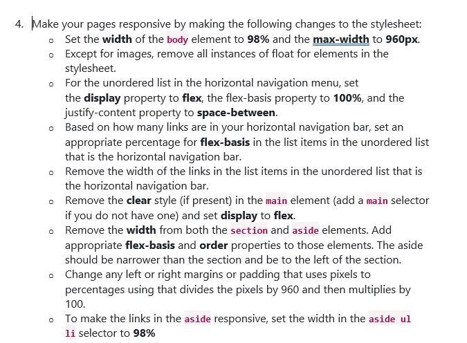
4. Make your pages responsive by making the following changes to the stylesheet: Set the width of the body element to 98% and the max-width to 960px. Except for images, remove all instances of float for elements in the stylesheet. For the unordered list in the horizontal navigation menu, set the display property to flex, the flex-basis property to 100%, and the justify-content property to space-between. Based on how many links are in your horizontal navigation bar, set an appropriate percentage for flex-basis in the list items in the unordered list that is the horizontal navigation bar. o Remove the width of the links in the list items in the unordered list that is the horizontal navigation bar. Remove the clear style (if present) in the main element (add a main selector if you do not have one) and set display to flex. 0 Remove the width from both the section and aside elements. Add appropriate flex-basis and order properties to those elements. The aside should be narrower than the section and be to the left of the section. Change any left or right margins or padding that uses pixels to percentages using that divides the pixels by 960 and then multiplies by 100. To make the links in the aside responsive, set the width in the aside ul li selector to 98% 4. Make your pages responsive by making the following changes to the stylesheet: Set the width of the body element to 98% and the max-width to 960px. Except for images, remove all instances of float for elements in the stylesheet. For the unordered list in the horizontal navigation menu, set the display property to flex, the flex-basis property to 100%, and the justify-content property to space-between. Based on how many links are in your horizontal navigation bar, set an appropriate percentage for flex-basis in the list items in the unordered list that is the horizontal navigation bar. o Remove the width of the links in the list items in the unordered list that is the horizontal navigation bar. Remove the clear style (if present) in the main element (add a main selector if you do not have one) and set display to flex. 0 Remove the width from both the section and aside elements. Add appropriate flex-basis and order properties to those elements. The aside should be narrower than the section and be to the left of the section. Change any left or right margins or padding that uses pixels to percentages using that divides the pixels by 960 and then multiplies by 100. To make the links in the aside responsive, set the width in the aside ul li selector to 98%
Step by Step Solution
There are 3 Steps involved in it
Step: 1

Get Instant Access to Expert-Tailored Solutions
See step-by-step solutions with expert insights and AI powered tools for academic success
Step: 2

Step: 3
Ace Your Homework with AI
Get the answers you need in no time with our AI-driven, step-by-step assistance
Get Started
Intelligent Databases Technologies And Applications
Authors: Zongmin Ma
1st Edition
1599041219, 978-1599041216