Answered step by step
Verified Expert Solution
Question
1 Approved Answer
LINK TO BOOK IN GOOGLE DRIVE: https://drive.google.com/file/d/1NhgUU_pi20DQ8XRNiSvuZjedrDB6Vzb7/view?usp=sharing 2.1 One of the most commonly used datasets of global average annual mean surface air temperature (SAT) anomalies

LINK TO BOOK IN GOOGLE DRIVE: https://drive.google.com/file/d/1NhgUU_pi20DQ8XRNiSvuZjedrDB6Vzb7/view?usp=sharing
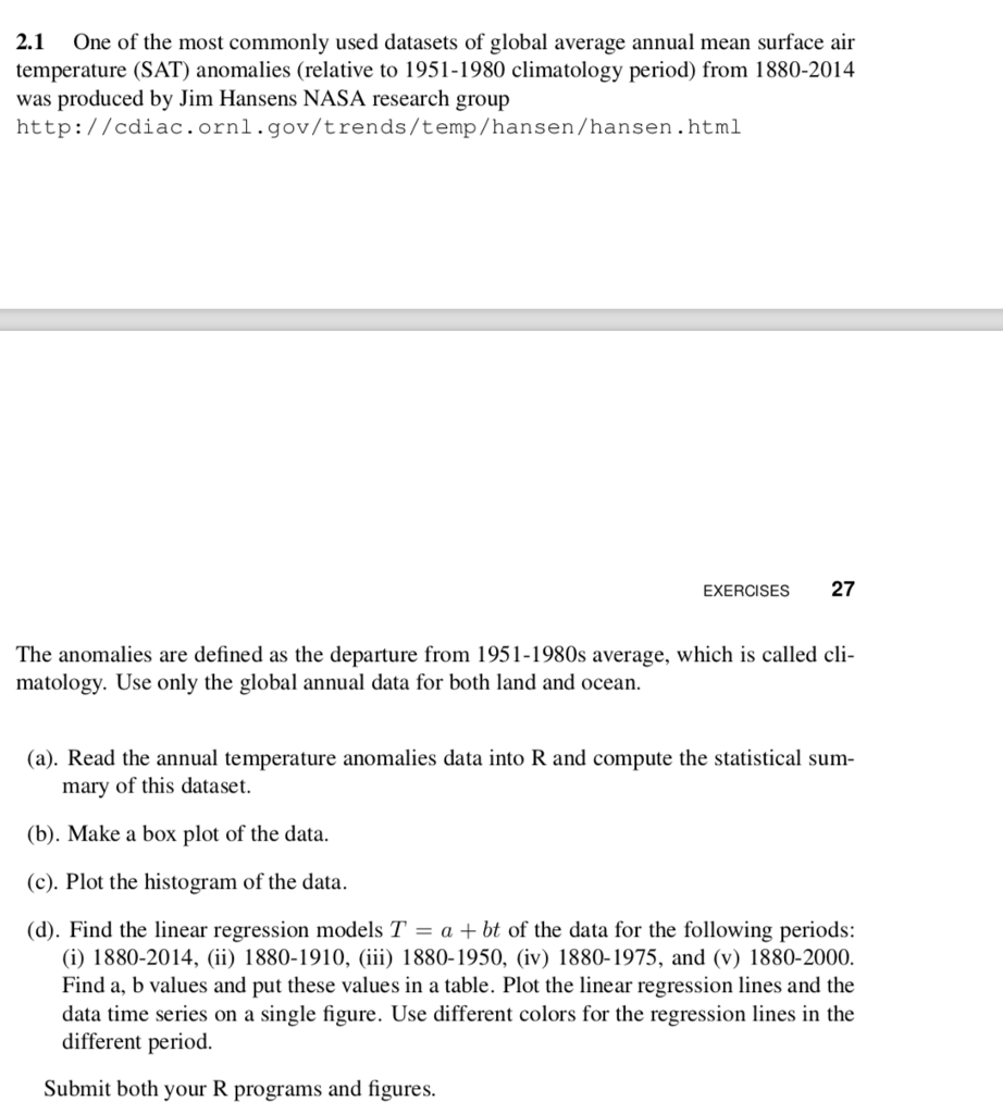
2.1 One of the most commonly used datasets of global average annual mean surface air temperature (SAT) anomalies (relative to 1951-1980 climatology period) from 1880-2014 was produced by Jim Hansens NASA research group http://cdiac.ornl.gov/trends/temp/hansen/hansen.html EXERCISES 27 The anomalies are defined as the departure from 1951-1980s average, which is called cli matology. Use only the global annual data for both land and ocean. (a). Read the annual temperature anomalies data into R and compute the statistical sum mary of this dataset. (b). Make a box plot of the data. (c). Plot the histogram of the data. (d). Find the linear regression models Tabt of the data for the following periods: (i) 1880-2014, (ii) 1880-1910, (iii) 1880-1950, (iv) 1880-1975, and (v) 1880-2000. Find a, b values and put these values in a table. Plot the linear regression lines and the data time series on a single figure. Use different colors for the regression lines in the different period. Submit both your R programs and figures 2.1 One of the most commonly used datasets of global average annual mean surface air temperature (SAT) anomalies (relative to 1951-1980 climatology period) from 1880-2014 was produced by Jim Hansens NASA research group http://cdiac.ornl.gov/trends/temp/hansen/hansen.html EXERCISES 27 The anomalies are defined as the departure from 1951-1980s average, which is called cli matology. Use only the global annual data for both land and ocean. (a). Read the annual temperature anomalies data into R and compute the statistical sum mary of this dataset. (b). Make a box plot of the data. (c). Plot the histogram of the data. (d). Find the linear regression models Tabt of the data for the following periods: (i) 1880-2014, (ii) 1880-1910, (iii) 1880-1950, (iv) 1880-1975, and (v) 1880-2000. Find a, b values and put these values in a table. Plot the linear regression lines and the data time series on a single figure. Use different colors for the regression lines in the different period. Submit both your R programs and figures
Step by Step Solution
There are 3 Steps involved in it
Step: 1

Get Instant Access to Expert-Tailored Solutions
See step-by-step solutions with expert insights and AI powered tools for academic success
Step: 2

Step: 3

Ace Your Homework with AI
Get the answers you need in no time with our AI-driven, step-by-step assistance
Get Started


