Answered step by step
Verified Expert Solution
Question
1 Approved Answer
Now that you are familiar with the way a demand curve is graphed, you will create your own graph to submit to your instructor.

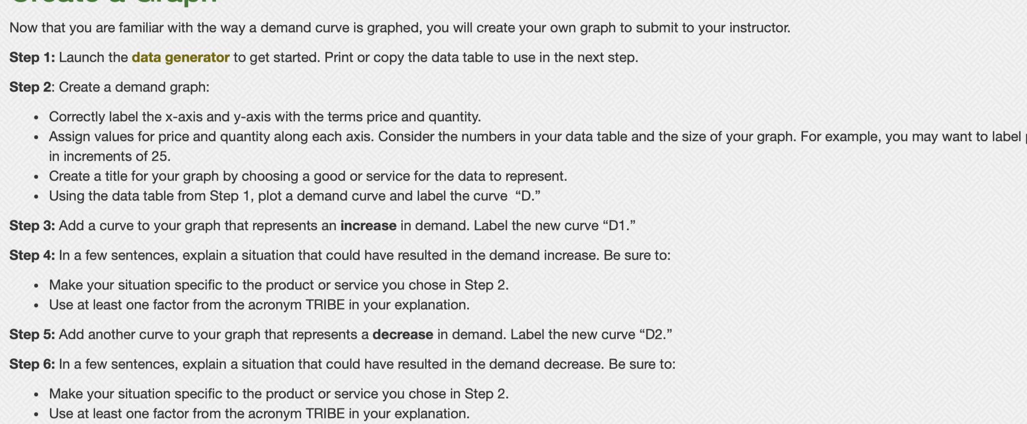
Now that you are familiar with the way a demand curve is graphed, you will create your own graph to submit to your instructor. Step 1: Launch the data generator to get started. Print or copy the data table to use in the next step. Step 2: Create a demand graph: Correctly label the x-axis and y-axis with the terms price and quantity. Assign values for price and quantity along each axis. Consider the numbers in your data table and the size of your graph. For example, you may want to label in increments of 25. Create a title for your graph by choosing a good or service for the data to represent. Using the data table from Step 1, plot a demand curve and label the curve "D." Step 3: Add a curve to your graph that represents an increase in demand. Label the new curve "D1." Step 4: In a few sentences, explain a situation that could have resulted in the demand increase. Be sure to: Make your situation specific to the product or service you chose in Step 2. Use at least one factor from the acronym TRIBE in your explanation. Step 5: Add another curve to your graph that represents a decrease in demand. Label the new curve "D2." Step 6: In a few sentences, explain a situation that could have resulted in the demand decrease. Be sure to: Make your situation specific to the product or service you chose in Step 2. Use at least one factor from the acronym TRIBE in your explanation.
Step by Step Solution
There are 3 Steps involved in it
Step: 1

Get Instant Access to Expert-Tailored Solutions
See step-by-step solutions with expert insights and AI powered tools for academic success
Step: 2

Step: 3

Ace Your Homework with AI
Get the answers you need in no time with our AI-driven, step-by-step assistance
Get Started


