Answered step by step
Verified Expert Solution
Question
1 Approved Answer
One of the first steps of working with any data set is to create some sort of global overview, and this usually involves making some
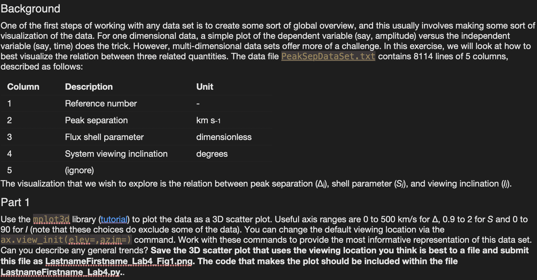
One of the first steps of working with any data set is to create some sort of global overview, and this usually involves making some sort of visualization of the data. For one dimensional data, a simple plot of the dependent variable (say, amplitude) versus the independent variable (say, time) does the trick. However, multi-dimensional data sets offer more of a challenge. In this exercise, we will look at how to best visualize the relation between three related quantities. The data file PeakSepDataSet, txt contains 8114 lines of 5 columns, described as follows: Column12345DescriptionReferencenumberPeakseparationFluxshellparameterSystemviewinginclination(ignore)Unitkms1dimensionlessdegrees The visualization that we wish to explore is the relation between peak separation (j), shell parameter (Sj), and viewing inclination (lj). Part 1 Use the mp.lot3d library (tutorial) to plot the data as a 3D scatter plot. Useful axis ranges are 0 to 500km/s for ,0.9 to 2 for S and 0 to 90 for I (note that these choices do exclude some of the data). You can change the default viewing location via the ax. view_init (e.jey.=, azim. ) command. Work with these commands to provide the most informative representation of this data set. Can you describe any general trends? Save the 3D scatter plot that uses the viewing location you think is best to a file and submit this file as LastnameFirstname Lab4 Fig1.png. The code that makes the plot should be included within the file LastnameFirstname_Lab4.py
Step by Step Solution
There are 3 Steps involved in it
Step: 1
Get Instant Access to Expert-Tailored Solutions
See step-by-step solutions with expert insights and AI powered tools for academic success
Step: 2
Step: 3
Ace Your Homework with AI
Get the answers you need in no time with our AI-driven, step-by-step assistance
Get Started