Answered step by step
Verified Expert Solution
Question
1 Approved Answer
paython PART 1 Please write the codes for part 1 of the project here. PART 2 Introduction Since Jan. 1, 2015, The Washington Post has
paython
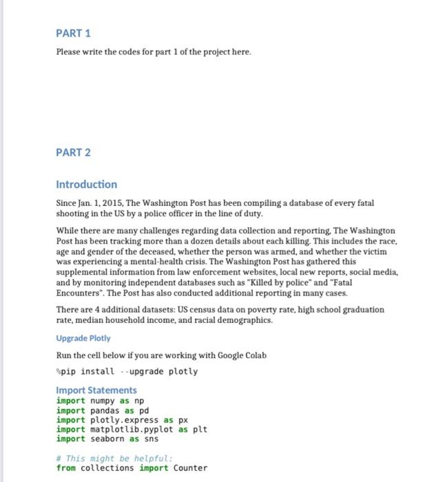
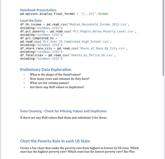
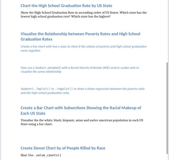
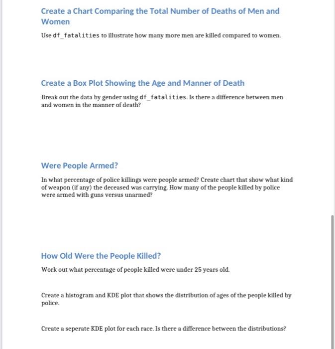
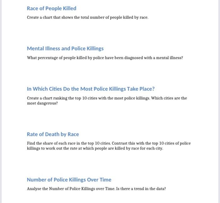
PART 1 Please write the codes for part 1 of the project here. PART 2 Introduction Since Jan. 1, 2015, The Washington Post has been compiling a database of every fatal shooting in the US by a police officer in the line of duty. While there are many challenges regarding data collection and reporting, The Washington Post has been tracking more than a dozen details about each killing. This includes the race, age and gender of the deceased, whether the person was armed, and whether the victim was experiencing a mental-health crisis. The Washington Post has gathered this supplemental information from law enforcement websites, local new reports, social media, and by monitoring independent databases such as "Killed by police" and "Fatal Encounters". The Post has also conducted additional reporting in many cases. There are 4 additional datasets: US census data on poverty rate, high school graduation rate, median household income, and racial demographics. Upgrade Plotly Run the cell below if you are working with Google Colab ?pip install - upgrade plotly Import Statements import numpy as np import pandas as pd import plotly. express as px import matplotlib.pyplot as plt import seaborn as sns \# This might be helpful: from collections import Counter Notebook Presentation pd. options.display.float_format ={:,.2f} '. format Load the Data df_hh_income = pd. read_csv('Median_Household_Income_2015.csv' , encoding=" windows 1252) df_pct_poverty = pd. read_csv('Pct_People_Below_Poverty_Level.csv', encoding=" windows 1252 ") df_pct_completed_hs = pd.read_csv('Pct_Over_25_Completed_High_School.csv', encoding =" windows 1252 ") df_share_race_city = pd. read_csv( 'Share_of_Race_By_City.csv', encoding =" "Windows - 1252" ) df_fatalities = pd. read_csv('Deaths_by_Police_US.csv', encoding ="Windows 1252 " ) Preliminary Data Exploration - What is the shape of the DataFrames? - How many rows and columns do they have? - What are the column names? - Are there any NaN values or duplicates? Data Cleaning - Check for Missing Values and Duplicates If there are any NaN values find them and substitute 0 for those. Chart the Poverty Rate in each US State Create a bar chart that ranks the poverty rate from highest to lowest by US state. Which state has the highest poverty rate? Which state has the lowest poverty rate? Bar Plot Chart the High School Graduation Rate by US State Show the High School Graduation Rate in ascending order of US States. Which state has the lowest high school graduation rate? Which state has the highest? Visualise the Relationship between Poverty Rates and High School Graduation Rates Create a line chart with two y-axes to show if the rations of poverty and high school graduation move together. Now use a Seaborn .jointplot() with a Kernel Density Estimate (KDE) and/or scatter plot to visualise the same relationship Seaborn's . Implot() or , regplot () to show a linear regression between the poverty ratio and the high school graduation ratio. Create a Bar Chart with Subsections Showing the Racial Makeup of Each US State Visualise the the white, black, hispanic, asian and native american population in each US State using a bar chart. Create Donut Chart by of People Killed by Race Hint: Use . value_counts() Create a Chart Comparing the Total Number of Deaths of Men and Women Use df_fatalities to illustrate how many more men are killed compared to women. Create a Box Plot Showing the Age and Manner of Death Break out the data by gender using df_fatalities. Is there a difference between men and women in the manner of death? Were People Armed? In what percentage of police killings were people armed? Create chart that show what kind of weapon (if any) the deceased was carrying. How many of the people killed by police were armed with guns versus unarmed? How Old Were the People Killed? Work out what percentage of people killed were under 25 years old. Create a histogram and KDE plot that shows the distribution of ages of the people killed by police. Create a seperate KDE plot for each race. Is there a difference between the distributions? Race of People Killed Create a chart that shows the total number of people killed by race. Mental Illness and Police Killings What percentage of people killed by police have been diagnosed with a mental illness? In Which Cities Do the Most Police Killings Take Place? Create a chart ranking the top 10 cities with the most police killings. Which cities are the most dangerous? Rate of Death by Race Find the share of each race in the top 10 cities. Contrast this with the top 10 cities of police killings to work out the rate at which people are killed by race for each city. Number of Police Killings Over Time Analyse the Number of Police Killings over Time. Is there a trend in the data Step by Step Solution
There are 3 Steps involved in it
Step: 1

Get Instant Access to Expert-Tailored Solutions
See step-by-step solutions with expert insights and AI powered tools for academic success
Step: 2

Step: 3

Ace Your Homework with AI
Get the answers you need in no time with our AI-driven, step-by-step assistance
Get Started


