pleas do this steps on excel from 2-8 from the first link and from 9-14 from the second link
https://docs.google.com/spreadsheets/d/1rDZw7G_VL3vuvBvixVuvxxRUZASRKkHP/edit?usp=sharing&ouid=112538278919979639271&rtpof=true&sd=true
https://docs.google.com/spreadsheets/d/15AqISdVoUffzuu4r_dpDT1fEtnGJylIH/edit?usp=sharing&ouid=112538278919979639271&rtpof=true&sd=true
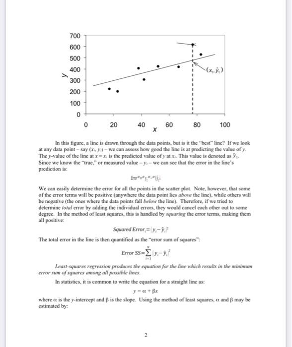
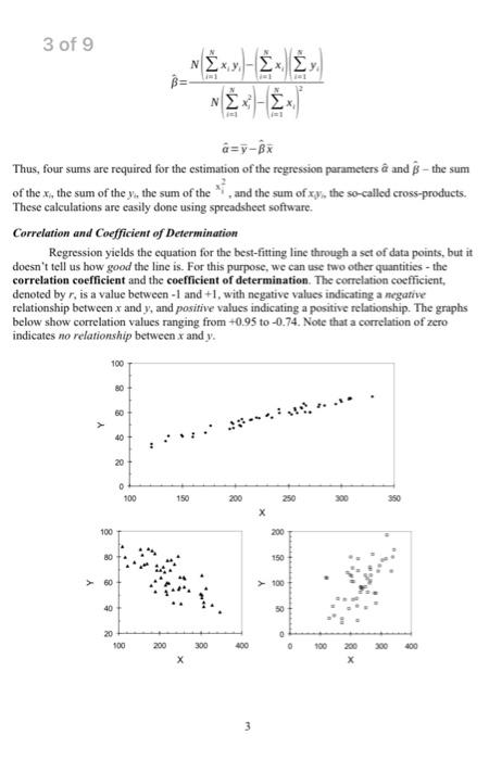
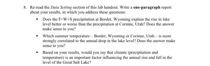
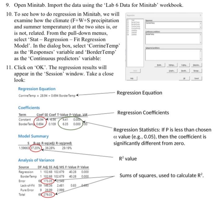
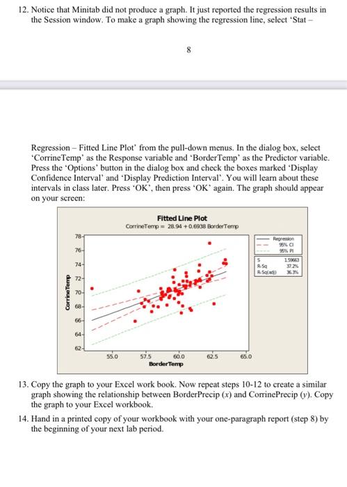
In this figure, a line is drawn through the data points, but is it the "best" line? If we look at any data point - say (x,,y3) - we can assess how good the line is at predicting the value of y. Since we know the "true," or measured value - y1 - we can see that the error in the line's prediction is: We can easily determine the error for all the points in the scatter plot. Note, however, that some of the error terms will be positive (anywhere the data point lies above the line), while others will be negative (the ones where the data points fall below the line). Therefore, if we tried to determine total error by adding the individual errors, they would cancel each other out to some degree. In the method of least squares, this is handled by squaring the error terms, making them all positive: Squared Error =yiy^i2 The total error in the line is then quantified as the "error sum of squares": Error SS=i=1Nyiy^i2 Least-squares regression produces the equation for the line which results in the minimum error sum of squares among all possible lines. In statistics, it is common to write the equation for a straight line as: y=+x where is the y-intercept and is the slope. Using the method of least squares, and may be estimated by: 3 of 9 ^=N(i=1Nxij2)(i=1Nxi)2N(i=1Nxiyi)(i=1Nxi)(i=1Nyi) Thus, four sums are required for the estimation of the regression parameters ^ and ^ - the sum of the xi the sum of the yit the sum of the xi2, and the sum of x0y,the so-called cross-products. These calculations are easily done using spreadsheet software. Correlation and Coefficient of Determination Regression yields the equation for the best-fitting line through a set of data points, but it doesn't tell us how good the line is. For this purpose, we can use two other quantities - the correlation coefficient and the coefficient of determination. The correlation coefficient, denoted by r, is a value between -1 and +1 , with negative values indicating a megative relationship between x and y, and positive values indicating a positive relationship. The graphs below show correlation values ranging from +0.95 to -0.74 . Note that a correlation of zero indicates no relationship between x and y. The value of r can be computed using the equation: r=snSsv where: Sk=standarddeviationofthex-variableSy=standarddeviationofthey-variableSe=samplecovariance:S=N1(xx)(y,y) The coefficient of determination is given the symbol R2. Numerically, it equals the correlation coefficient squared: R2=(r)2 Thus, it may be computed directly from r. It may also be computed from the error sum of squares of the regression line: in which: This formulation leads to this powerful interpretation of R2 values: R2 is the fraction of the total variation of y explained by the regression with x. Thus, if a regression line has an R2 of 0.80 , we can say that 80% of the variance in y is explained by the regression relationship with x. Data Setting In this exercise, you will perform several regression analyses on hydrologic and meteorological data from the area around the Great Salt Lake, Utah. The Great Salt Lake is interesting because it has no outlets. Therefore, the lake level changes in response to water inputs (primarily runoff from several tributary streams) and evaporation losses. Records of the level of Great Salt Lake have been kept since 1851, and show an interesting long-term cycle: 2. Using the 'Lab 6 Data' workbook, create a good graph showing the rise in the lake level (y) as a function of the fall+winter+spring (F+W+S) precipitation at Corinne, Utah (x). 3. Perform a regression analysis to determine the regression line, correlation ( r ), and coefficient of determination (R2) for the relationship between the rise in lake level (y) and the F+W+S precipitation at Corinne, Utah (x). Do this analysis on your spreadsheet, making the calculations in columns: - Compute the sums of x and y. - Compute the means of x and y. - Create a column of x2 values. Find the sum of this column. - Create a column of xy values. Find the sum of this column. - Use the equations for ^ and ^ on page 3 to find the slope and intercept of the regression line. Clearly mark these answers (for example, using bold face type or borders around the cells). - Create a column of (xix) values. - Create a column of (yiy) values. - Create a column of (xyx)(yyy) values. Find the sum of this column. - Compute the standard deviations of x and y (you may use Excel's "stdev" function). - Use the formulae on page 4 to find Sy and r. Calculate R2 by squaring r. Clearly mark these answers (for example, using bold face type or borders around the cells). 4. Return to your graph of rise vs. F+W+S precipitation at Corrine, and use the "Insert Trendline" feature in Excel to find the regression line and coefficient of determination. They should be the same as you estimated in part 3, above. Use Excel's "correl" function in your spreadsheet to estimate the correlation coefficient (r). NOTE: For the analyses in steps 5-7, you may use the "Trendline" feature without doing the laborious spreadsheet calculations you did above. In each case, you must create a good graph. 5. Graph and determine the regression equation and coefficient of determination for the relationship between the lake level rise and the F+W+S precipitation at Border, Wyoming. 6. Graph and determine the regression equation and coefficient of determination for the relationship between lake level fall and summer temperature at Corinne, Utah. 7. Repeat step 6 with the summer temperature at Border, Wyoming. 8. Re-read the Data Setting section of this lab handout. Write a one-paragraph report about your results, in which you address these questions: - Does the F+W+S precipitation at Border, Wyoming explain the rise in lake level better or worse than the precipitation at Corinne, Utah? Does the answer make sense to you? - Which summer temperature - Border, Wyoming or Corinne, Utah - is more strongly correlated to the annual drop in the lake level? Does the answer make sense to you? - Based on your results, would you say that climate (precipitation and temperature) is an important factor influencing the annual rise and fall in the level of the Great Salt Lake? 9. Open Minitab. Import the data using the 'Lab 6 Data for Minitab' workbook. 10. To see how to do regression in Minitab, we will examine how the climate (F+W+S precipitation and summer temperature) at the two sites is, or is not, related. From the pull-down menus, select 'Stat - Regression - Fit Regression Model'. In the dialog box, select 'CorrineTemp' as the 'Responses' variable and 'BorderTemp' as the 'Continuous predictors' variable: 11. Click on ' OK '. The regression results will appear in the 'Session' window. Take a close look: Regression Equation Corringtemp =28940.094 Bordertemp - Regression Equation Coefficients Model Summary value (e.g., 0.05), then the coefficient is Analysis of Variance R2 value 12. Notice that Minitab did not produce a graph. It just reported the regression results in the Session window. To make a graph showing the regression line, select 'Stat - 8 Regression - Fitted Line Plot' from the pull-down menus. In the dialog box, select 'CorrineTemp' as the Response variable and 'BorderTemp' as the Predictor variable. Press the 'Options' button in the dialog box and check the boxes marked 'Display Confidence Interval' and 'Display Prediction Interval'. You will learn about these intervals in class later. Press ' OK ', then press ' OK ' again. The graph should appear on your screen: 13. Copy the graph to your Excel work book. Now repeat steps 1012 to create a similar graph showing the relationship between BorderPrecip (x) and CorrinePrecip (y). Copy the graph to your Excel workbook. 14. Hand in a printed copy of your workbook with your one-paragraph report (step 8) by the beginning of your next lab period. In this figure, a line is drawn through the data points, but is it the "best" line? If we look at any data point - say (x,,y3) - we can assess how good the line is at predicting the value of y. Since we know the "true," or measured value - y1 - we can see that the error in the line's prediction is: We can easily determine the error for all the points in the scatter plot. Note, however, that some of the error terms will be positive (anywhere the data point lies above the line), while others will be negative (the ones where the data points fall below the line). Therefore, if we tried to determine total error by adding the individual errors, they would cancel each other out to some degree. In the method of least squares, this is handled by squaring the error terms, making them all positive: Squared Error =yiy^i2 The total error in the line is then quantified as the "error sum of squares": Error SS=i=1Nyiy^i2 Least-squares regression produces the equation for the line which results in the minimum error sum of squares among all possible lines. In statistics, it is common to write the equation for a straight line as: y=+x where is the y-intercept and is the slope. Using the method of least squares, and may be estimated by: 3 of 9 ^=N(i=1Nxij2)(i=1Nxi)2N(i=1Nxiyi)(i=1Nxi)(i=1Nyi) Thus, four sums are required for the estimation of the regression parameters ^ and ^ - the sum of the xi the sum of the yit the sum of the xi2, and the sum of x0y,the so-called cross-products. These calculations are easily done using spreadsheet software. Correlation and Coefficient of Determination Regression yields the equation for the best-fitting line through a set of data points, but it doesn't tell us how good the line is. For this purpose, we can use two other quantities - the correlation coefficient and the coefficient of determination. The correlation coefficient, denoted by r, is a value between -1 and +1 , with negative values indicating a megative relationship between x and y, and positive values indicating a positive relationship. The graphs below show correlation values ranging from +0.95 to -0.74 . Note that a correlation of zero indicates no relationship between x and y. The value of r can be computed using the equation: r=snSsv where: Sk=standarddeviationofthex-variableSy=standarddeviationofthey-variableSe=samplecovariance:S=N1(xx)(y,y) The coefficient of determination is given the symbol R2. Numerically, it equals the correlation coefficient squared: R2=(r)2 Thus, it may be computed directly from r. It may also be computed from the error sum of squares of the regression line: in which: This formulation leads to this powerful interpretation of R2 values: R2 is the fraction of the total variation of y explained by the regression with x. Thus, if a regression line has an R2 of 0.80 , we can say that 80% of the variance in y is explained by the regression relationship with x. Data Setting In this exercise, you will perform several regression analyses on hydrologic and meteorological data from the area around the Great Salt Lake, Utah. The Great Salt Lake is interesting because it has no outlets. Therefore, the lake level changes in response to water inputs (primarily runoff from several tributary streams) and evaporation losses. Records of the level of Great Salt Lake have been kept since 1851, and show an interesting long-term cycle: 2. Using the 'Lab 6 Data' workbook, create a good graph showing the rise in the lake level (y) as a function of the fall+winter+spring (F+W+S) precipitation at Corinne, Utah (x). 3. Perform a regression analysis to determine the regression line, correlation ( r ), and coefficient of determination (R2) for the relationship between the rise in lake level (y) and the F+W+S precipitation at Corinne, Utah (x). Do this analysis on your spreadsheet, making the calculations in columns: - Compute the sums of x and y. - Compute the means of x and y. - Create a column of x2 values. Find the sum of this column. - Create a column of xy values. Find the sum of this column. - Use the equations for ^ and ^ on page 3 to find the slope and intercept of the regression line. Clearly mark these answers (for example, using bold face type or borders around the cells). - Create a column of (xix) values. - Create a column of (yiy) values. - Create a column of (xyx)(yyy) values. Find the sum of this column. - Compute the standard deviations of x and y (you may use Excel's "stdev" function). - Use the formulae on page 4 to find Sy and r. Calculate R2 by squaring r. Clearly mark these answers (for example, using bold face type or borders around the cells). 4. Return to your graph of rise vs. F+W+S precipitation at Corrine, and use the "Insert Trendline" feature in Excel to find the regression line and coefficient of determination. They should be the same as you estimated in part 3, above. Use Excel's "correl" function in your spreadsheet to estimate the correlation coefficient (r). NOTE: For the analyses in steps 5-7, you may use the "Trendline" feature without doing the laborious spreadsheet calculations you did above. In each case, you must create a good graph. 5. Graph and determine the regression equation and coefficient of determination for the relationship between the lake level rise and the F+W+S precipitation at Border, Wyoming. 6. Graph and determine the regression equation and coefficient of determination for the relationship between lake level fall and summer temperature at Corinne, Utah. 7. Repeat step 6 with the summer temperature at Border, Wyoming. 8. Re-read the Data Setting section of this lab handout. Write a one-paragraph report about your results, in which you address these questions: - Does the F+W+S precipitation at Border, Wyoming explain the rise in lake level better or worse than the precipitation at Corinne, Utah? Does the answer make sense to you? - Which summer temperature - Border, Wyoming or Corinne, Utah - is more strongly correlated to the annual drop in the lake level? Does the answer make sense to you? - Based on your results, would you say that climate (precipitation and temperature) is an important factor influencing the annual rise and fall in the level of the Great Salt Lake? 9. Open Minitab. Import the data using the 'Lab 6 Data for Minitab' workbook. 10. To see how to do regression in Minitab, we will examine how the climate (F+W+S precipitation and summer temperature) at the two sites is, or is not, related. From the pull-down menus, select 'Stat - Regression - Fit Regression Model'. In the dialog box, select 'CorrineTemp' as the 'Responses' variable and 'BorderTemp' as the 'Continuous predictors' variable: 11. Click on ' OK '. The regression results will appear in the 'Session' window. Take a close look: Regression Equation Corringtemp =28940.094 Bordertemp - Regression Equation Coefficients Model Summary value (e.g., 0.05), then the coefficient is Analysis of Variance R2 value 12. Notice that Minitab did not produce a graph. It just reported the regression results in the Session window. To make a graph showing the regression line, select 'Stat - 8 Regression - Fitted Line Plot' from the pull-down menus. In the dialog box, select 'CorrineTemp' as the Response variable and 'BorderTemp' as the Predictor variable. Press the 'Options' button in the dialog box and check the boxes marked 'Display Confidence Interval' and 'Display Prediction Interval'. You will learn about these intervals in class later. Press ' OK ', then press ' OK ' again. The graph should appear on your screen: 13. Copy the graph to your Excel work book. Now repeat steps 1012 to create a similar graph showing the relationship between BorderPrecip (x) and CorrinePrecip (y). Copy the graph to your Excel workbook. 14. Hand in a printed copy of your workbook with your one-paragraph report (step 8) by the beginning of your next lab period