Answered step by step
Verified Expert Solution
Question
1 Approved Answer
please fill in missing code a) For this problem, we will re-work homework 2a using the integrate:quad function of sciplintegrate rather than the Simpson method
please fill in missing code
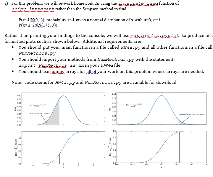
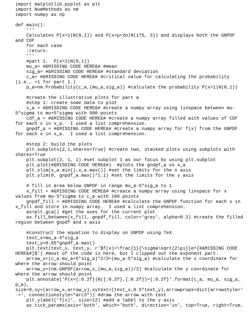
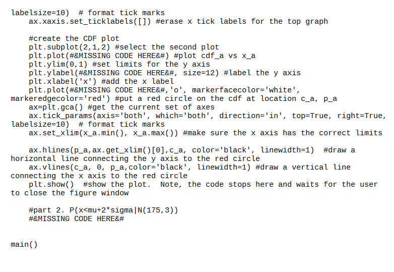
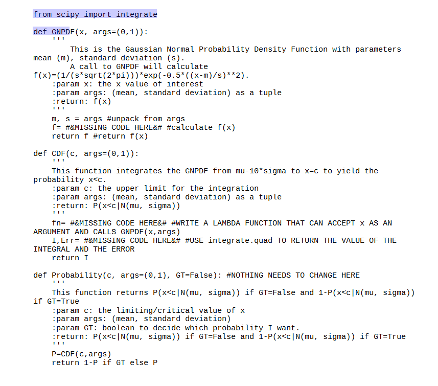
a) For this problem, we will re-work homework 2a using the integrate:quad function of sciplintegrate rather than the Simpson method to find: wout P(xu+20|N(175, 3)) Rather than printing your findings to the console, we will use matplotlib.pyplot to produce nice formatted plots such as shown below. Additional requirements are: You should put your main function in a file called HW4a.py and all other functions in a file call Nummethods.py. You should import your methods from Nummethods.py with the statement: import NumMethods as nm in your HW4a file. You should use numpy arrays for all of your work on this problem where arrays are needed. Note: code stems for HW4a.py and Nummethods.py are available for download. 0.14 0.12 0.40 0.35 0.30 0.25 0.20 0.10 Rx)-... 0.06 RecSONO.01.31 0.04 R11.00 175.00.3.0010.02 0.02 0.10 0.05 0.00 10 1.0 08 0.8 0.61 06: ox) xdx Ox) = xidx 04 0.4 102 021 0960 165 170 175 180 185 190 import matplot lib.pyplot as plt import NumMethods as nm import numpy as np def main() : Calculates P(xu+20 | N(175, 3)) and displays both the GNPDF and CDF for each case :return: #part 1. P(x', connectionstyle="arc3")) #draw the arrow with text plt.ylabel('f(x)', size=12) #add a label to the y axis ax.tick_params (axis='both', which='both', direction='in', top=True, right=True, labelsize=10) # format tick marks ax.xaxis.set_tick labels([]) #erase x tick labels for the top graph #create the CDF plot plt. subplot(2,1,2) #select the second plot plt.plot(#&MISSING CODE HERE) #plot cdf_a vs x_a plt.ylim(0,1) #set limits for the y axis plt.ylabel(#&MISSING CODE HERE, size=12) #label the y axis plt.xlabel('x') #add the x label plt.plot(#&MISSING CODE HERE,'o', markerfacecolor='white', markeredgecolor='red') #put a red circle on the cdf at location c_a, p_a ax=plt.gca() #get the current set of axes ax.tick_params (axis='both', which='both', direction='in', top=True, right=True, labelsize=10) format tick marks ax.set_xlim(x_a.min(), x_a.max()) #make sure the x axis has the correct limits ax.hlines(p_a, ax.get_xlim() [O],c_a, color='black', linewidth=1) #draw a horizontal line connecting the y axis to the red circle ax.vlines(c_a, o, p_a, color='black', linewidth=1) #draw a vertical line connecting the x axis to the red circle plt.show() #show the plot. Note, the code stops here and waits for the user to close the figure window #part 2. P(xStep by Step Solution
There are 3 Steps involved in it
Step: 1

Get Instant Access to Expert-Tailored Solutions
See step-by-step solutions with expert insights and AI powered tools for academic success
Step: 2

Step: 3
Ace Your Homework with AI
Get the answers you need in no time with our AI-driven, step-by-step assistance
Get Started