Please help, I do not understand.
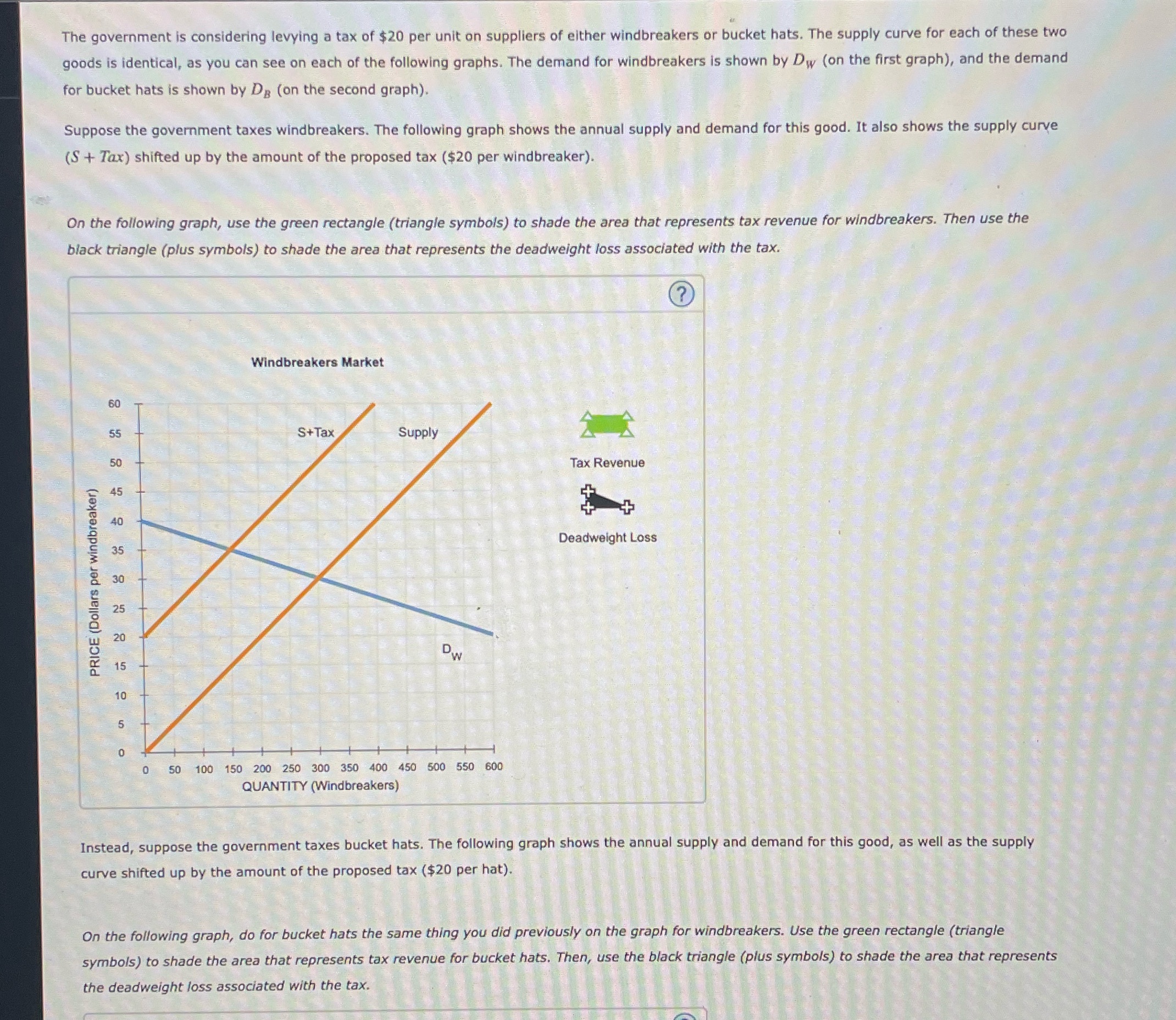
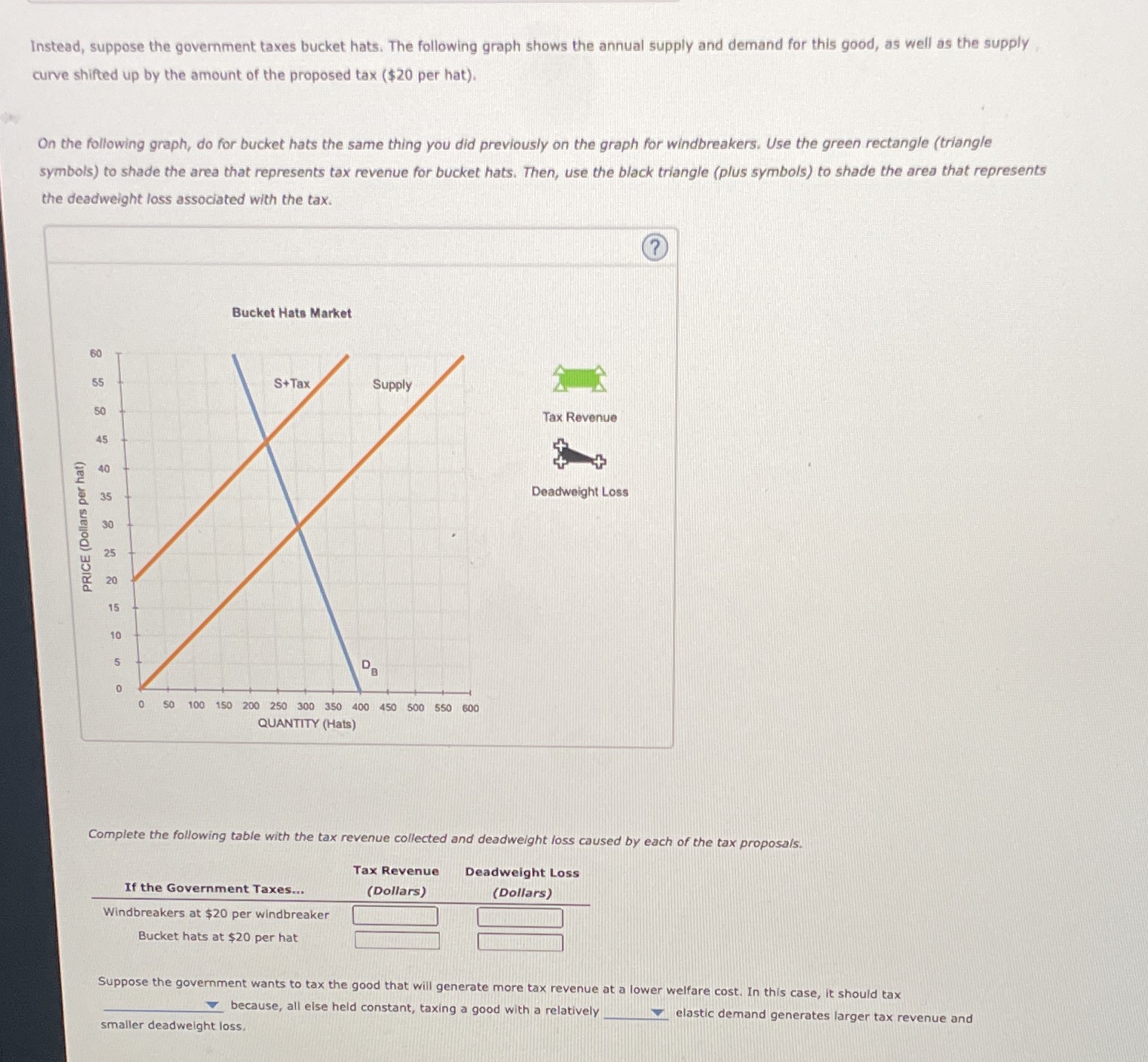
The government is considering levying a tax of $20 per unit on suppliers of either Windbreakers or bucket hats. The supply curve for each of these two goods is identical, as you can see on each of the following graphs. The demand for Windbreakers is shown by Dw (on the first graph), and the demand for bucket hats is shown by DH (on the second graph). Suppose the government taxes Windbreakers. The following graph shows the annual supply and demand for this good. It also shows the supply curve (3 + Tax) shifted up by the amount of the proposed tax ($20 per Windbreaker). On the following graph, use the green rectangle (triangle symbols) to shade the area that represents tax revenue for windbreakers. Then use the black triangle ( plus symbols) to shade the area that represents the deadwelght loss associated with the tax. @i Windbreakers Market Tax Revenue 3-4: Deadweight Loss PRICE (Dollars per Windbreaker) o +79i-7-iri ll i74e4i i n so we 150 200 250 no 350 am 450 see 550 am QUANTITY {Windbreakers} instead, suppose the government taxes bucket hats. The following graph shows the annual supply and demand for this good, as well as the supply curve shifted up by the amount of the proposed tax ($20 per hat). On the following graph, do for bucket hats the same thing you did previously on the graph. tor Windbreakers. Use the green rectangle ( triangle symbols) to shade the area that represents tax revenue for buckEt hats. Then, use the Neck triangle {plus symbols) to shade the area that represents the deadwelght loss associated with the tax. Instead, suppose the government taxes bucket hats. The following graph shows the annual supply and demand for this good, as well as the supply curve shifted up by the amount of the proposed tax ($20 per hat). On the following graph, do for bucket hats the same thing you did previously on the graph for windbreakers. Use the green rectangle (triangle symbols) to shade the area that represents tax revenue for bucket hats. Then, use the black triangle (plus symbols) to shade the area that represents the deadweight loss associated with the tax. ? Bucket Hats Market S+Tax Supply Tax Revenue + Deadweight Loss PRICE (Dollars per hat) 0 50 100 150 200 250 300 350 400 450 500 550 600 QUANTITY (Hats) Complete the following table with the tax revenue collected and deadweight loss caused by each of the tax proposals. Tax Revenue Deadweight Loss If the Government Taxes... (Dollars) (Dollars) Windbreakers at $20 per windbreaker Bucket hats at $20 per hat Suppose the government wants to tax the good that will generate more tax revenue at a lower welfare cost. In this case, it should tax because, all else held constant, taxing a good with a relatively elastic demand generates larger tax revenue and smaller deadweight loss.Instead, suppose the government taxes bucket hats. The following graph shows the annual supply and demand for this good, as well as the supply curve shifted up by the amount of the proposed tax ($20 per hat). On the following graph, do for bucket hats the same thing you did previously on the graph for windbreakers. Use the green rectangle (triangle symbols) to shade the area that represents tax revenue for bucket hats. Then, use the black triangle (plus symbols) to shade the area that represents the deadweight loss associated with the tax. ? Bucket Hats Market S+Tax Supply Tax Revenue + Deadweight Loss PRICE (Dollars per hat) 0 50 100 150 200 250 300 350 400 450 500 550 600 QUANTITY (Hats) Complete the following table with the tax revenue collected and deadweight loss caused by each of the tax proposals. Tax Revenue Deadweight Loss If the Government Taxes... (Dollars) (Dollars) Windbreakers at $20 per windbreaker Bucket hats at $20 per hat Suppose the government wants to tax the good that will generate more tax revenue at a lower welfare cost. In this case, it should tax because, all else held constant, taxing a good with a relatively elastic demand generates larger tax revenue and smaller deadweight loss


