

Answered step by step
Verified Expert Solution
Question
1 Approved Answer
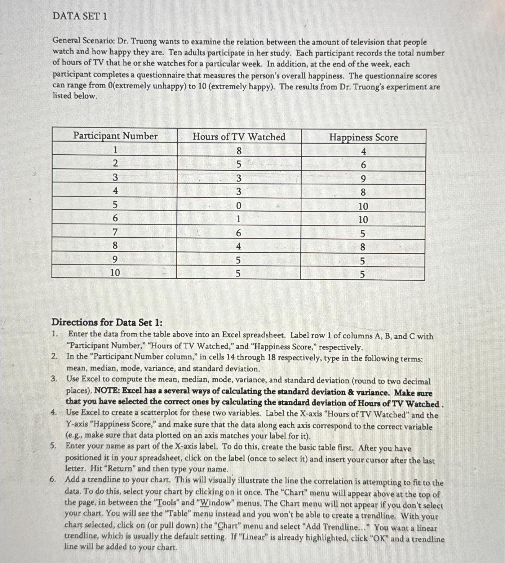
Please help me create an excel data sheet with the following scenario: Dr . Truong wants to examine the relation between the amount of television
Please help me create an excel data sheet with the following scenario:
Dr Truong wants to examine the relation between the amount of television that people watch and how happy they are. Ten adults participate in her study. Each participant records the total number of hours of TV that he or she watches for a particular week. In addition, at the end of the week, each participant completes a questionnaire that measures the person's overall happiness. The questionnaire scores can range from extremely unhappy to extremely happy The results from Dr Truong's experiment are listed below.
tableParticipant Number,Hours of TV Watched,Happiness Score
Directions for Data Set :
Enter the data from the table above into an Excel spreadsheet. Label row of columns and with "Participant Number," "Hours of TV Watched," and "Happiness Score," respectively.
In the "Participant Number column," in cells through respectively, type in the following terms: mean, median, mode, variance, and standard deviation.
Use Excel to compute the mean, median, mode, variance, and standard deviation round to two decimal places NOTE: Excel has a several ways of calculating the standard deviation & variance. Make sure that you have selected the correct ones by calculating the standard deviation of Hours of TV Watched.
Use Excel to create a scatterplot for these two variables. Label the Xaxis "Hours of TV Watched" and the Yaxis "Happiness Score," and make sure that the data along each axis correspond to the correct variable eg make sure that data plotted on an axis matches your label for it
Enter your name as part of the Xaxis label. To do this, create the basic table first. After you have positioned it in your spreadsheet, click on the label once to select it and insert your cursor after the last letter. Hit "Return" and then type your name.
Add a trendline to your chart. This will visually illustrate the line the correlation is attempting to fit to the data. To do this, select your chart by clicking on it once. The "Chart" menu will appear above at the top of the page, in between the "Tools" and "Window" menus. The Chart menu will not appear if you don't select your chart. You will see the "Table" menu instead and you won't be able to create a trendline. With your chart selected, click on or pull down the "Chart" menu and select "Add Trendline..." You want a linear trendline, which is usually the default setting. If "Linear" is already highlighted, click OK and a trendline line will be added to your chart.
Step by Step Solution
There are 3 Steps involved in it
Step: 1

Get Instant Access to Expert-Tailored Solutions
See step-by-step solutions with expert insights and AI powered tools for academic success
Step: 2

Step: 3
Ace Your Homework with AI
Get the answers you need in no time with our AI-driven, step-by-step assistance
Get Started
Data Science For Dummies
Authors: Lillian Pierson ,Jake Porway
2nd Edition
1119327636, 978-1119327639