

Please help me, I have never used Tableau before. If you give me your email I could send the Excel file to you also. I am really having trouble with the Verify Data section.
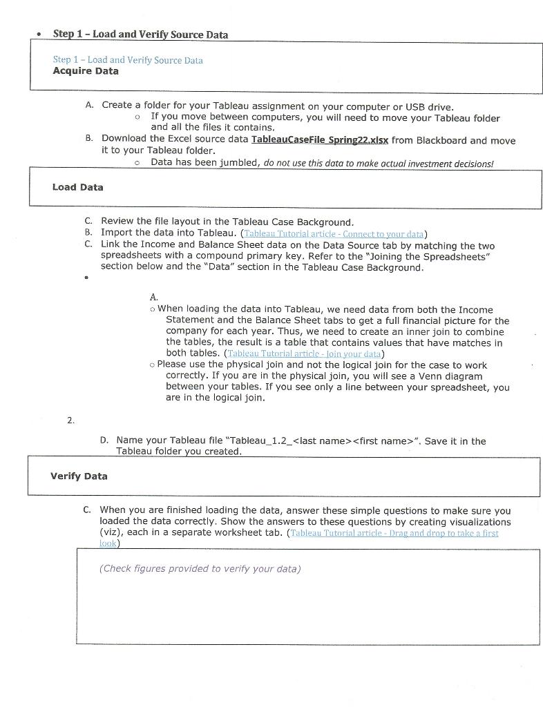
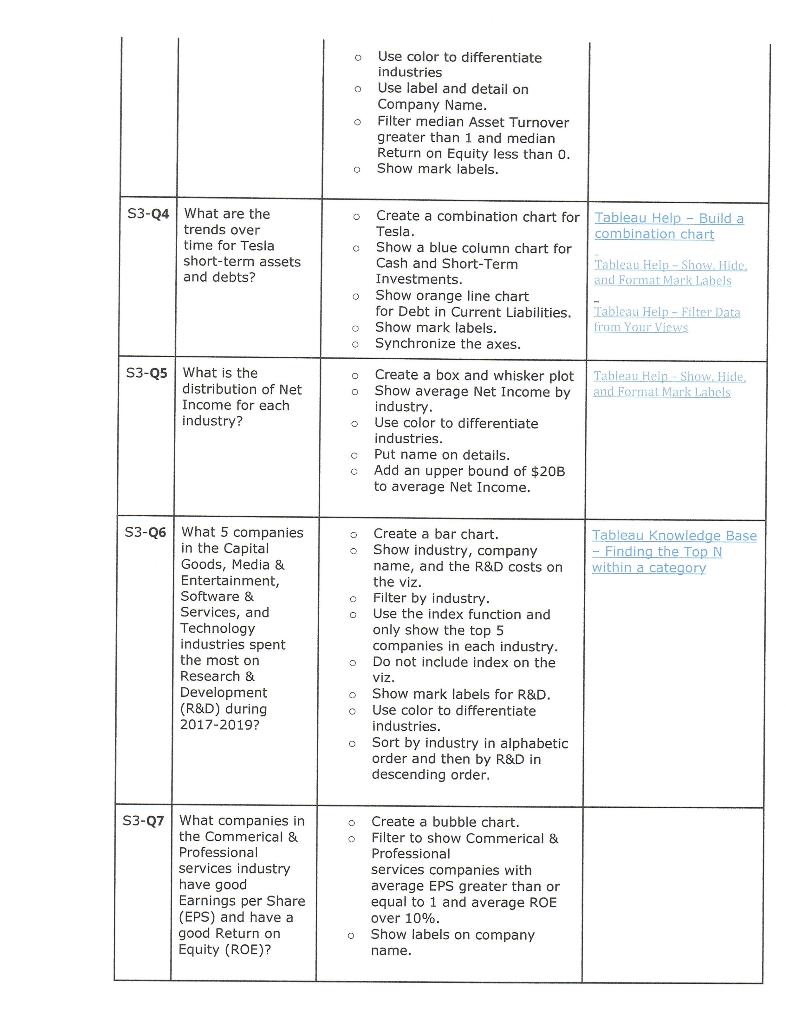
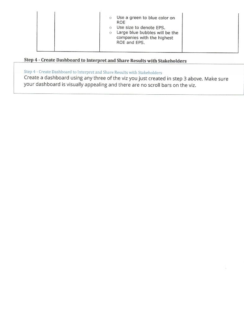
Step 1 - Load and Verify Source Data Step 1 - Load and Verify Source Data Acquire Data A. Create a folder for your Tableau assignment on your computer or USB drive. If you move between computers, you will need to move your Tableau folder and all the files it contains. B. Download the Excel source data TableauCase File Spring22.xlsx from Blackboard and move it to your Tableau folder. Data has been jumbled, do not use this data to make actual investment decisions! Load Data C. Review the file layout in the Tableau Case Background. B. Import the data into Tableau. (Tableau Tutorial article - Connect to your data) C. Link the Income and Balance Sheet data on the Data Source tab by matching the two spreadsheets with a compound primary key. Refer to the "Joining the Spreadsheets" section below and the "Data" section in the Tableau Case Background. A. o When loading the data into Tableau, we need data from both the Income Statement and the Balance Sheet tabs to get a full financial picture for the company for each year. Thus, we need to create an inner join to combine the tables, the result is a table that contains values that have matches in both tables. (Tableau Tutorial article-loin your data) Please use the physical join and not the logical join for the case to work correctly. If you are in the physical join, you will see a Venn diagram between your tables. If you see only a line between your spreadsheet, you are in the logical join. 2 D. Name your Tableau file "Tableau_1.2_
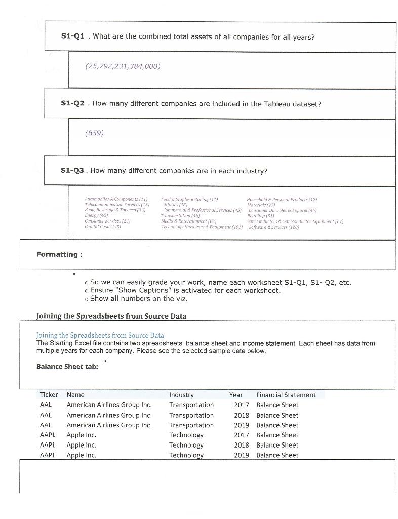
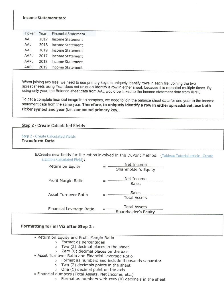
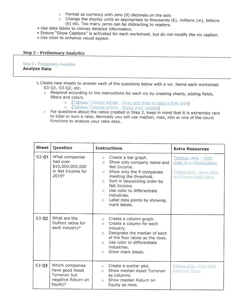
". Save it in the Tableau folder you created Verify Data C. When you are finished loading the data, answer these simple questions to make sure you loaded the data correctly. Show the answers to these questions by creating visualizations (viz), each in a separate worksheet tab. (Tableau Tutorial article - Drag and drop to take a first Look) (Check figures provided to verify your data) S1-Q1 . What are the combined total assets of all companies for all years? (25,792,231,384,000) S1-Q2. How many different companies are included in the Tableau dataset? (859) S1-Q3. How many different companies are in each industry? Automobiles & Components (27) Telefon Services (15) Food Beveruge & Toxice (30) Energy (45) Consumer Services (54) Capital Goods (93) Pouda Staples Retail) Howsehold & Personal Products (12) Untitles (1) Morsial 2) Cool & Professional Services (45) Comer Dorati & Appar/45) Tromsoorition/461) Metai (5) & Bocetocat (62) Semiconductors & Semiconductor que (67) Teww Hard & Fautprent (101) Software & Services (120) Formatting : o So we can easily grade your work, name each worksheet S1-Q1, S1- Q2, etc. o Ensure "Show Captions" is activated for each worksheet. o Show all numbers on the viz. Joining the Spreadsheets from Source Data Joining the Spreadsheets from Source Data The Starting Excel file contains two spreadsheets: balance sheet and income statement. Each sheet has data from multiple years for each company. Please see the selected sample data below. 1 Balance Sheet tab: Ticker AAL AAL AAL AAPL AAPL AAPL Name American Airlines Group Inc. American Airlines Group Inc. American Airlines Group Inc. Apple Inc. Apple Inc. Apple Inc. Industry Transportation Transportation Transportation Technology Technology Technology Year Financial Statement 2017 Balance Sheet 2018 Balance Sheet 2019 Balance Sheet 2017 Balance Sheet 2018 Balance Sheet 2019 Balance Sheet Income Statement tab: Ticker Year Financial Statement AAL 2017 Income Statement AAL 2018 Income Statement AAL 2019 Income Statement AAPL 2017 Income Statement AAPL 2018 Income Statement AAPL 2019 Income Statement When joining two files, we need to use primary keys to uniquely identify rows in each file. Joining the two spreadsheets using Year does not uniquely identify a row in either sheet, because it is repeated multiple times. By using only year, the Balance sheet data from AAL would be linked to the income statement data from APPL. To get a complete financial image for a company, we need to join the balance sheet data for one year to the income statement data from the same year. Therefore, to uniquely identify a row in either spreadsheet, use both ticker symbol and year (i.e. compound primary key). Step 2 - Create Calculated fields Step 2 - Create Calculated fields Transform Data E.Create new fields for the ratios involved in the DuPont Method. (Tableau Tutorial article - Create a Simple Calculated field): Net Income Return on Equity Shareholder's Equity Profit Margin Ratio Net Income Sales Asset Turnover Ratio Sales Total Assets Financial Leverage Ratio Total Assets Shareholder's Equity Formatting for all Viz after Step 2: 0 Return on Equity and Profit Margin Ratio Format as percentages o Two (2) decimal places in the sheet o Zero (6) decimal places on the axis Asset Turnover Ratio and Financial Leverage Ratio Format as numbers and include thousands separator Two (2) decimals points in the sheet o One (1) decimal point on the axis Financial numbers (Total Assets, Net Income, etc.) Format as numbers with zero (0) decimals in the sheet 0 Format as currency with zero (0) decimals on the axis Change the display units as appropriate to thousands (k), millions (m), billions (b) etc. Too many zeros can be distracting to readers. Use data labels to convey detailed information. Ensure "Show Captions" is activated for each worksheet, but do not modify the viz caption. Use color to enhance visual appeal. Step 3 - Preliminary Analytics Step 3 - Preliminary Analytics Analyze Data L. Create new sheets to answer each of the questions below with a viz. Name each worksheet S3-Q1, S3-Q2, etc. o Respond according to the instructions for each viz by creating charts, adding fields, filters and colors. (Tableau Tutorial article - Drag and drop to take a first look) (Tableau Tutorial article - Focus your results) For questions about the ratios created in Step 2, keep in mind that it is extremely rare to total or sum a ratio. Normally you will use median, max, min or one of the count functions to analyze your ratio data. Sheet Question Instructions Extra Resources c O S3-Q1 What companies had over $10,000,000,000 in Net Income for 2019? Create a bar graph. Tableau Help - Sort Show only company name and Data in a Visualization Net Income. Show only the 9 companies Tableau lielp - Show Hide. meeting the threshold. and Format Mark Labels Sort Sort in descending order by Net Income Use color to differentiate industries. Label data points by showing mark labels. o o o S3-Q2 What are the DuPont ratios for each industry? Create a column graph. Create a column for each industry. o Designate the median of each of the four ratios as the rows. Use color to differentiate industries. o Show mark labels. O C Tableau Heli Bilter Data From Your Views S3-23 Which companies have good Asset Turnover but negative Return on Equity? Create a scatter plot. Show median Asset Turnover as columns Show median Return on Equity as rows. 0 Use color to differentiate industries Use label and detail on Company Name. Filter median Asset Turnover greater than 1 and median Return on Equity less than 0. Show mark labels. o Tesla. S3-Q4 What are the trends over time for Tesla short-term assets and debts? Create a combination chart for Tableau Help - Build a combination chart Show a blue column chart for Cash and Short-Term Tableau Help - Show Hide Investments. and Format Mark labels Show orange line chart for Debt in Current Liabilities. Tableau Help - Filter Data Show mark labels. from Your Views Synchronize the axes. 0 0 S3-05 What is the distribution of Net Income for each industry? o Create a box and whisker plot Tableau Hein Show Hide Show average Net Income by and Format Mark Lahels industry. Use color to differentiate industries. Put name on details. Add an upper bound of $20B to average Net Income. S3-26 What 5 companies in the Capital Goods, Media & Entertainment, Software & Services, and Tableau Knowledge Base Finding the Top N within a category o 0 echnology Create a bar chart. Show industry, company name, and the R&D costs on the the viz. Filter by industry. Use the index function and only show the top 5 in each industry. Do not include index on the viz. o Show mark labels for R&D. Use color to differentiate companies the most on Research & Development (R&D) during 2017-2019? 0 industries. o Sort by industry in alphabetic order and then by R&D in descending order. o S3-27 What companies in the Commerical & Professional services industry have good Earnings per Share (EPS) and have a good Return on Equity (ROE)? Create a bubble chart. Filter to show Commerical & Professional services companies with average EPS greater than or equal to 1 and average ROE over 10%. o Show labels on company name. 0 Use a green to blue color on ROE o Use size to denote EPS. o Large blue bubbles will be the companies with the highest ROE and EPS. Step 4 - Create Dashboard to Interpret and Share Results with Stakeholders Step 4 - Create Dashboard to Interpret and Share Results with Stakeholders Create a dashboard using any three of the viz you just created in step 3 above. Make sure your dashboard is visually appealing and there are no scroll bars on the viz. Step 1 - Load and Verify Source Data Step 1 - Load and Verify Source Data Acquire Data A. Create a folder for your Tableau assignment on your computer or USB drive. If you move between computers, you will need to move your Tableau folder and all the files it contains. B. Download the Excel source data TableauCase File Spring22.xlsx from Blackboard and move it to your Tableau folder. Data has been jumbled, do not use this data to make actual investment decisions! Load Data C. Review the file layout in the Tableau Case Background. B. Import the data into Tableau. (Tableau Tutorial article - Connect to your data) C. Link the Income and Balance Sheet data on the Data Source tab by matching the two spreadsheets with a compound primary key. Refer to the "Joining the Spreadsheets" section below and the "Data" section in the Tableau Case Background. A. o When loading the data into Tableau, we need data from both the Income Statement and the Balance Sheet tabs to get a full financial picture for the company for each year. Thus, we need to create an inner join to combine the tables, the result is a table that contains values that have matches in both tables. (Tableau Tutorial article-loin your data) Please use the physical join and not the logical join for the case to work correctly. If you are in the physical join, you will see a Venn diagram between your tables. If you see only a line between your spreadsheet, you are in the logical join. 2 D. Name your Tableau file "Tableau_1.2_ ". Save it in the Tableau folder you created Verify Data C. When you are finished loading the data, answer these simple questions to make sure you loaded the data correctly. Show the answers to these questions by creating visualizations (viz), each in a separate worksheet tab. (Tableau Tutorial article - Drag and drop to take a first Look) (Check figures provided to verify your data) S1-Q1 . What are the combined total assets of all companies for all years? (25,792,231,384,000) S1-Q2. How many different companies are included in the Tableau dataset? (859) S1-Q3. How many different companies are in each industry? Automobiles & Components (27) Telefon Services (15) Food Beveruge & Toxice (30) Energy (45) Consumer Services (54) Capital Goods (93) Pouda Staples Retail) Howsehold & Personal Products (12) Untitles (1) Morsial 2) Cool & Professional Services (45) Comer Dorati & Appar/45) Tromsoorition/461) Metai (5) & Bocetocat (62) Semiconductors & Semiconductor que (67) Teww Hard & Fautprent (101) Software & Services (120) Formatting : o So we can easily grade your work, name each worksheet S1-Q1, S1- Q2, etc. o Ensure "Show Captions" is activated for each worksheet. o Show all numbers on the viz. Joining the Spreadsheets from Source Data Joining the Spreadsheets from Source Data The Starting Excel file contains two spreadsheets: balance sheet and income statement. Each sheet has data from multiple years for each company. Please see the selected sample data below. 1 Balance Sheet tab: Ticker AAL AAL AAL AAPL AAPL AAPL Name American Airlines Group Inc. American Airlines Group Inc. American Airlines Group Inc. Apple Inc. Apple Inc. Apple Inc. Industry Transportation Transportation Transportation Technology Technology Technology Year Financial Statement 2017 Balance Sheet 2018 Balance Sheet 2019 Balance Sheet 2017 Balance Sheet 2018 Balance Sheet 2019 Balance Sheet Income Statement tab: Ticker Year Financial Statement AAL 2017 Income Statement AAL 2018 Income Statement AAL 2019 Income Statement AAPL 2017 Income Statement AAPL 2018 Income Statement AAPL 2019 Income Statement When joining two files, we need to use primary keys to uniquely identify rows in each file. Joining the two spreadsheets using Year does not uniquely identify a row in either sheet, because it is repeated multiple times. By using only year, the Balance sheet data from AAL would be linked to the income statement data from APPL. To get a complete financial image for a company, we need to join the balance sheet data for one year to the income statement data from the same year. Therefore, to uniquely identify a row in either spreadsheet, use both ticker symbol and year (i.e. compound primary key). Step 2 - Create Calculated fields Step 2 - Create Calculated fields Transform Data E.Create new fields for the ratios involved in the DuPont Method. (Tableau Tutorial article - Create a Simple Calculated field): Net Income Return on Equity Shareholder's Equity Profit Margin Ratio Net Income Sales Asset Turnover Ratio Sales Total Assets Financial Leverage Ratio Total Assets Shareholder's Equity Formatting for all Viz after Step 2: 0 Return on Equity and Profit Margin Ratio Format as percentages o Two (2) decimal places in the sheet o Zero (6) decimal places on the axis Asset Turnover Ratio and Financial Leverage Ratio Format as numbers and include thousands separator Two (2) decimals points in the sheet o One (1) decimal point on the axis Financial numbers (Total Assets, Net Income, etc.) Format as numbers with zero (0) decimals in the sheet 0 Format as currency with zero (0) decimals on the axis Change the display units as appropriate to thousands (k), millions (m), billions (b) etc. Too many zeros can be distracting to readers. Use data labels to convey detailed information. Ensure "Show Captions" is activated for each worksheet, but do not modify the viz caption. Use color to enhance visual appeal. Step 3 - Preliminary Analytics Step 3 - Preliminary Analytics Analyze Data L. Create new sheets to answer each of the questions below with a viz. Name each worksheet S3-Q1, S3-Q2, etc. o Respond according to the instructions for each viz by creating charts, adding fields, filters and colors. (Tableau Tutorial article - Drag and drop to take a first look) (Tableau Tutorial article - Focus your results) For questions about the ratios created in Step 2, keep in mind that it is extremely rare to total or sum a ratio. Normally you will use median, max, min or one of the count functions to analyze your ratio data. Sheet Question Instructions Extra Resources c O S3-Q1 What companies had over $10,000,000,000 in Net Income for 2019? Create a bar graph. Tableau Help - Sort Show only company name and Data in a Visualization Net Income. Show only the 9 companies Tableau lielp - Show Hide. meeting the threshold. and Format Mark Labels Sort Sort in descending order by Net Income Use color to differentiate industries. Label data points by showing mark labels. o o o S3-Q2 What are the DuPont ratios for each industry? Create a column graph. Create a column for each industry. o Designate the median of each of the four ratios as the rows. Use color to differentiate industries. o Show mark labels. O C Tableau Heli Bilter Data From Your Views S3-23 Which companies have good Asset Turnover but negative Return on Equity? Create a scatter plot. Show median Asset Turnover as columns Show median Return on Equity as rows. 0 Use color to differentiate industries Use label and detail on Company Name. Filter median Asset Turnover greater than 1 and median Return on Equity less than 0. Show mark labels. o Tesla. S3-Q4 What are the trends over time for Tesla short-term assets and debts? Create a combination chart for Tableau Help - Build a combination chart Show a blue column chart for Cash and Short-Term Tableau Help - Show Hide Investments. and Format Mark labels Show orange line chart for Debt in Current Liabilities. Tableau Help - Filter Data Show mark labels. from Your Views Synchronize the axes. 0 0 S3-05 What is the distribution of Net Income for each industry? o Create a box and whisker plot Tableau Hein Show Hide Show average Net Income by and Format Mark Lahels industry. Use color to differentiate industries. Put name on details. Add an upper bound of $20B to average Net Income. S3-26 What 5 companies in the Capital Goods, Media & Entertainment, Software & Services, and Tableau Knowledge Base Finding the Top N within a category o 0 echnology Create a bar chart. Show industry, company name, and the R&D costs on the the viz. Filter by industry. Use the index function and only show the top 5 in each industry. Do not include index on the viz. o Show mark labels for R&D. Use color to differentiate companies the most on Research & Development (R&D) during 2017-2019? 0 industries. o Sort by industry in alphabetic order and then by R&D in descending order. o S3-27 What companies in the Commerical & Professional services industry have good Earnings per Share (EPS) and have a good Return on Equity (ROE)? Create a bubble chart. Filter to show Commerical & Professional services companies with average EPS greater than or equal to 1 and average ROE over 10%. o Show labels on company name. 0 Use a green to blue color on ROE o Use size to denote EPS. o Large blue bubbles will be the companies with the highest ROE and EPS. Step 4 - Create Dashboard to Interpret and Share Results with Stakeholders Step 4 - Create Dashboard to Interpret and Share Results with Stakeholders Create a dashboard using any three of the viz you just created in step 3 above. Make sure your dashboard is visually appealing and there are no scroll bars on the viz
