Answered step by step
Verified Expert Solution
Question
1 Approved Answer
please help with answering these questions 1. Management wants to see how much is spent in Shipping Costs across the different Product Categories and Sub
please help with answering these questions 
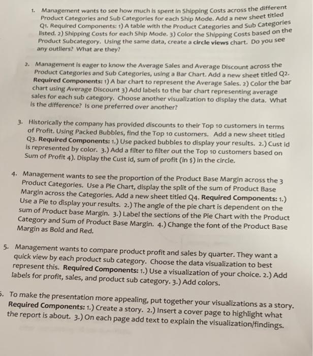
1. Management wants to see how much is spent in Shipping Costs across the different Product Categories and Sub Categories for each ship Mode, Add a new sheet titled Q1. Required Components : 1) A table with the Product Categories and Sub Categories listed. 2) Shipping costs for each Ship Mode. 3) Color the shipping Costs based on the Product Subcategory. Using the same data, create a circle views chart. Do you see any outliers? What are they? 2. Management is eager to know the average Sales and Average Discount across the Product Categories and Sub Categories, using a Bar Chart. Add a new sheet titled Q2. Required Components: 1) A bar chart to represent the Average Sales. 2) Color the bar chart using Average Discount 3) Add labels to the bar chart representing average sales for each sub category. Choose another visualization to display the data. What is the difference? Is one preferred over another? 3. Historically the company has provided discounts to their Top 10 customers in terms of Profit. Using Packed Bubbles, find the Top 10 customers. Add a new sheet titled Q3. Required Components: 1.) Use packed bubbles to display your results. 2.) Cust id is represented by color. 3.) Add a filter to filter out the Top 10 customers based on Sum of Profit 4). Display the Cust id, sum of profit (in $) in the circle. 4. Management wants to see the proportion of the Product Base Margin across the 3 Product Categories. Use a Pie Chart, display the split of the sum of Product Base Margin across the Categories. Add a new sheet titled Q4. Required Components: 1.) Use a Pie to display your results. 2.) The angle of the pie chart is dependent on the sum of Product base Margin. 3.) Label the sections of the Pie Chart with the Product Category and Sum of Product Base Margin. 4.) Change the font of the Product Base Margin as Bold and Red. 5. Management wants to compare product profit and sales by quarter. They want a quick view by each product sub category. Choose the data visualization to best represent this. Required Components: 1.) Use a visualization of your choice. 2.) Add labels for profit, sales, and product sub category. 3.) Add colors. 5. To make the presentation more appealing, put together your visualizations as a story. Required Components: 1.) Create a story. 2.) Insert a cover page to highlight what the report is about. 3.) On each page add text to explain the visualization/findings. 1. Management wants to see how much is spent in Shipping Costs across the different Product Categories and Sub Categories for each ship Mode, Add a new sheet titled Q1. Required Components : 1) A table with the Product Categories and Sub Categories listed. 2) Shipping costs for each Ship Mode. 3) Color the shipping Costs based on the Product Subcategory. Using the same data, create a circle views chart. Do you see any outliers? What are they? 2. Management is eager to know the average Sales and Average Discount across the Product Categories and Sub Categories, using a Bar Chart. Add a new sheet titled Q2. Required Components: 1) A bar chart to represent the Average Sales. 2) Color the bar chart using Average Discount 3) Add labels to the bar chart representing average sales for each sub category. Choose another visualization to display the data. What is the difference? Is one preferred over another? 3. Historically the company has provided discounts to their Top 10 customers in terms of Profit. Using Packed Bubbles, find the Top 10 customers. Add a new sheet titled Q3. Required Components: 1.) Use packed bubbles to display your results. 2.) Cust id is represented by color. 3.) Add a filter to filter out the Top 10 customers based on Sum of Profit 4). Display the Cust id, sum of profit (in $) in the circle. 4. Management wants to see the proportion of the Product Base Margin across the 3 Product Categories. Use a Pie Chart, display the split of the sum of Product Base Margin across the Categories. Add a new sheet titled Q4. Required Components: 1.) Use a Pie to display your results. 2.) The angle of the pie chart is dependent on the sum of Product base Margin. 3.) Label the sections of the Pie Chart with the Product Category and Sum of Product Base Margin. 4.) Change the font of the Product Base Margin as Bold and Red. 5. Management wants to compare product profit and sales by quarter. They want a quick view by each product sub category. Choose the data visualization to best represent this. Required Components: 1.) Use a visualization of your choice. 2.) Add labels for profit, sales, and product sub category. 3.) Add colors. 5. To make the presentation more appealing, put together your visualizations as a story. Required Components: 1.) Create a story. 2.) Insert a cover page to highlight what the report is about. 3.) On each page add text to explain the visualization/findings 
Step by Step Solution
There are 3 Steps involved in it
Step: 1

Get Instant Access to Expert-Tailored Solutions
See step-by-step solutions with expert insights and AI powered tools for academic success
Step: 2

Step: 3

Ace Your Homework with AI
Get the answers you need in no time with our AI-driven, step-by-step assistance
Get Started


