

Answered step by step
Verified Expert Solution
Question
1 Approved Answer
Please show cell referencing!!!! i need help learning to do the problem b. Now ereate a table that shows the FV at 0%,5%, and 20%
Please show cell referencing!!!! i need help learning to do the problem 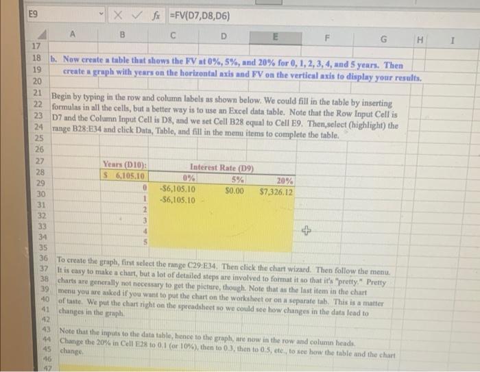
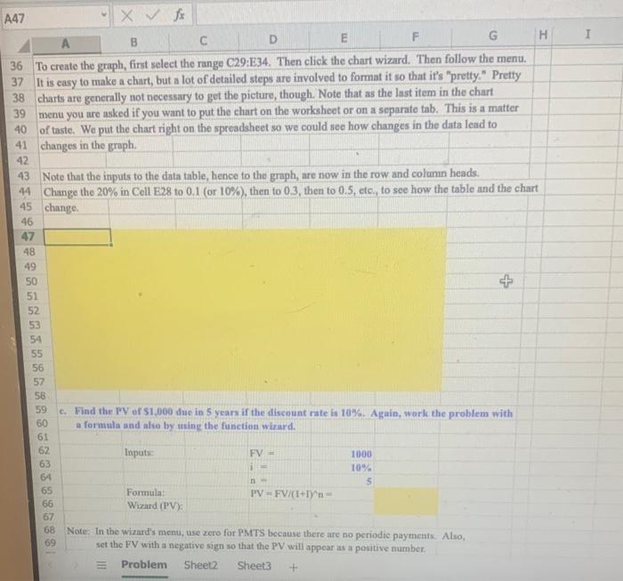
b. Now ereate a table that shows the FV at 0%,5%, and 20% for 0,1,2,3,4, and 5 years. Then create a graph with years on the horizontal axis and FV on the vertical axis to display your results. Begin by typing in the row and column labels as shown below. We could fill in the table by inserting formulas in all the cells, but a better way is to use an Excel data table. Note that the Row Input Cell is D7 and the Column Input Cell is D8, and we set Cell B28 equal to Cell E9. Then,select (highlight) the range B28:E34 and click Data, Table, and fill in the memu items to complete the table. To create the graph, fint select the range C29:E34. Then click the chart wizard. Then follow the menu It is casy to make a chart, but a lot of detailed steps are involved to format it so that it's "pretty. " Pretty charts are generally not necessary to get the picture, though. Note that as the last item in the chart menu you are arked if you want to put the chart on the worksheet or on a separate tab. This is a matter of taste. We put the chart right on the spreadsheet so we could see how changes in the data lead to changes in the graph. Note that the inputs to the data table, hence to the graph, are now in the row and column heads. Change the 20% in Cell E28 to 0.1 (or 10\%), then to 03, then to 0 s, ete,, to see haw the table and the chart chanee. To create the graph, first select the range C29:E34. Then click the chart wizard. Then follow the menu. It is casy to make a chart, but a lot of detailed steps are involved to format it so that it's "pretty." Pretty charts are generally not necessary to get the picture, though. Note that as the last item in the chart menu you are asked if you want to put the chart on the worksheet or on a separate tab. This is a matter of taste. We put the chart right on the spreadsheet so we could see how changes in the data lead to changes in the graph. Note that the inputs to the data table, hence to the graph, are now in the row and column heads. 44 Change the 20% in Cell E28 to 0.1 (or 10\%), then to 0.3, then to 0.5, etc., to see how the table and the chart) 45 change. c. Find the PV of $1,000 due in 5 years if the discount rate is 10%. Again, wark the problem with a formula and also by using the function wizard. Note: In the wizard's meau, use zero for PMTS because there are no periodic paymentk. Also, set the FV with a negative sign so that the PV will appear as a positive number. b. Now ereate a table that shows the FV at 0%,5%, and 20% for 0,1,2,3,4, and 5 years. Then create a graph with years on the horizontal axis and FV on the vertical axis to display your results. Begin by typing in the row and column labels as shown below. We could fill in the table by inserting formulas in all the cells, but a better way is to use an Excel data table. Note that the Row Input Cell is D7 and the Column Input Cell is D8, and we set Cell B28 equal to Cell E9. Then,select (highlight) the range B28:E34 and click Data, Table, and fill in the memu items to complete the table. To create the graph, fint select the range C29:E34. Then click the chart wizard. Then follow the menu It is casy to make a chart, but a lot of detailed steps are involved to format it so that it's "pretty. " Pretty charts are generally not necessary to get the picture, though. Note that as the last item in the chart menu you are arked if you want to put the chart on the worksheet or on a separate tab. This is a matter of taste. We put the chart right on the spreadsheet so we could see how changes in the data lead to changes in the graph. Note that the inputs to the data table, hence to the graph, are now in the row and column heads. Change the 20% in Cell E28 to 0.1 (or 10\%), then to 03, then to 0 s, ete,, to see haw the table and the chart chanee. To create the graph, first select the range C29:E34. Then click the chart wizard. Then follow the menu. It is casy to make a chart, but a lot of detailed steps are involved to format it so that it's "pretty." Pretty charts are generally not necessary to get the picture, though. Note that as the last item in the chart menu you are asked if you want to put the chart on the worksheet or on a separate tab. This is a matter of taste. We put the chart right on the spreadsheet so we could see how changes in the data lead to changes in the graph. Note that the inputs to the data table, hence to the graph, are now in the row and column heads. 44 Change the 20% in Cell E28 to 0.1 (or 10\%), then to 0.3, then to 0.5, etc., to see how the table and the chart) 45 change. c. Find the PV of $1,000 due in 5 years if the discount rate is 10%. Again, wark the problem with a formula and also by using the function wizard. Note: In the wizard's meau, use zero for PMTS because there are no periodic paymentk. Also, set the FV with a negative sign so that the PV will appear as a positive number Step by Step Solution
There are 3 Steps involved in it
Step: 1

Get Instant Access to Expert-Tailored Solutions
See step-by-step solutions with expert insights and AI powered tools for academic success
Step: 2

Step: 3
Ace Your Homework with AI
Get the answers you need in no time with our AI-driven, step-by-step assistance
Get Started
Handbook Of Recent Advances In Commodity And Financial Modeling
Authors: Giorgio Consigli, Silvana Stefani, Giovanni Zambruno
1st Edition
3319613189, 978-3319613185