Please solve these following questions:-
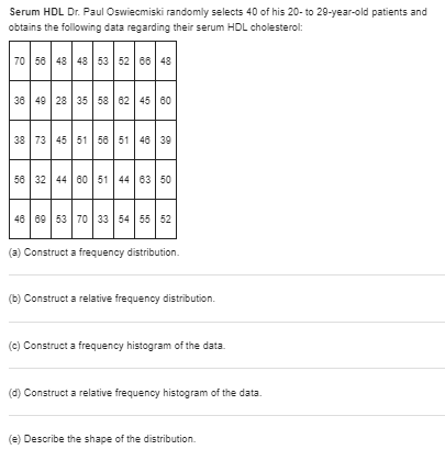
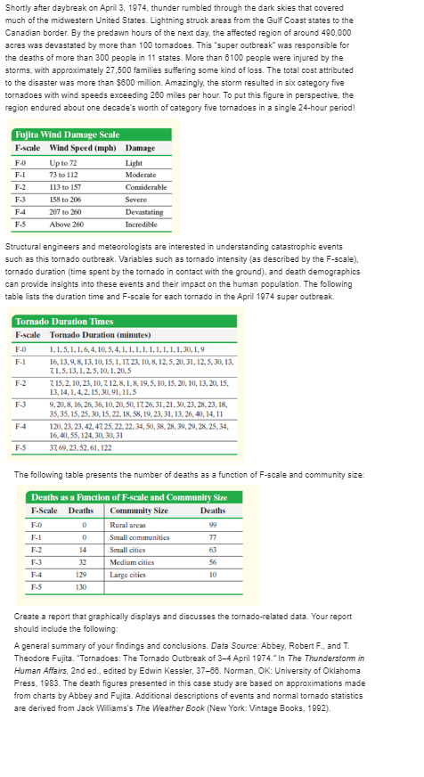
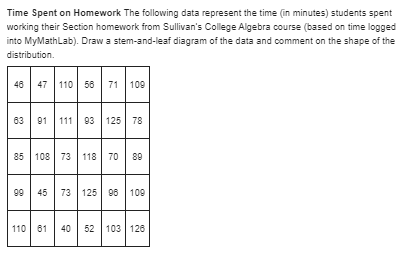
Serum HDL Dr. Paul Oswiecmiski randomly selects 40 of his 20- to 29-year-old patients and obtains the following data regarding their serum HDL cholesterol: 70 56 48 48 53 52 86 48 38 49 28 35 58 62 45 80 38 73 45 51 58 51 48 39 58 32 44 80 51 44 83 50 48 89 53 70 33 54 55 52 (3) Construct a frequency distribution. (b) Construct a relative frequency distribution. (c) Construct a frequency histogram of the data. (d) Construct a relative frequency histogram of the data. (e) Describe the shape of the distribution.Shortly after daybreak on April 3, 1974, thunder rumbled through the dark skies that covered much of the midwestern United States. Lightning struck areas from the Gulf Coast states to the Canadian border. By the predawn hours of the next day, the affected region of around 490,000 acres was devastated by more than 100 tomadoes. This "super outbreak" was responsible for the deaths of more than 300 people in 11 states. More than 6100 people were injured by the storms, with approximately 27,500 families suffering some kind of loss. The total cost attributed to the disaster was more than $800 million. Amazingly, the storm resulted in six category five tornadoes with wind speeds exceeding 280 miles per hour. To put this figure in perspective, the region endured about one decade's worth of category five tornadoes in a single 24-hour period! Fujita Wind Damage Scale F-scale Wind Speed (mph) Damage F-D Up to 72 Light F-1 73 to 112 Moderate F-2 113 to 157 Considerable F-3 158 to 206 Severe F-4 207 to 260 Devastating F-S Above 260 Incredible Structural engineers and meteorologists are interested in understanding catastrophic events such as this tornado outbreak. Variables such as tomado intensity (as described by the F-scale), tornado duration (time spent by the tornado in contact with the ground). and death demographics can provide insights into these events and their impact on the human population. The following table lists the duration time and F-scale for each tornado in the April 1974 super outbreak. Tornado Duration Times F-scale Tornado Duration (minutes) F-O 1, 1.5, 1, 1, 6, 4, 10.5, 4, 1, 1, 1, 1, 1, 1, 1. 1, 1, 30, 1. 9 F-I 16. 13, 9, 8, 13, 10, 15, 1, 17 23, 10. 8, 12, 5.20,31, 12, 5. 30, 13, 7, 1.5. 13, 1,2.5, 10, 1,20.5 F-Z 7, 15.2. 10, 23, 10, 7 12, 8, 1. 8, 19, 5, 10, 15, 20, 10, 13, 20, 15, 13. 14. 1, 4.2, 15, 30, 91. 11.5 F-3 9. 20.8, 16. 26. 36, 10, 20. 50, 17, 26, 31. 21,30, 23, 28, 23, 18, 35, 35, 15, 25. 30, 15, 22, 18, 58, 19, 23, 31, 13, 26, 40, 14, 11 F-4 120. 23, 23, 42. 47. 25, 22, 22. 34.50, 38, 28, 39, 29, 28. 25.34. 16, 40,55, 124,30,30,31 F-5 37 69. 23.52. 61, 122 The following table presents the number of deaths as a function of F-scale and community size: Deaths as a Function of F-scale and Community Size F-Scale Deaths Community Size Deaths F-D Rural areas 99 F-1 Small communities 77 F-2 14 Small cities 63 F-3 32 Medium cities 56 F-4 129 Large cities 10 F-5 130 Create a report that graphically displays and discusses the tornado-related data. Your report should include the following: A general summary of your findings and conclusions. Data Source: Abbey, Robert F., and T. Theodore Fujita. "Tornadoes: The Tornado Outbreak of 3-4 April 1974." In The Thunderstorm in Human Affairs, 2nd ed., edited by Edwin Kessler, 37-68. Norman, OK: University of Oklahoma Press, 1983. The death figures presented in this case study are based on approximations made from charts by Abbey and Fujita. Additional descriptions of events and normal tornado statistics are derived from Jack Williams's The Weather Book (New York: Vintage Books, 1992).Time Spent on Homework The following data represent the time (in minutes) students spent working their Section homework from Sullivan's College Algebra course (based on time logged into MyMathLab). Draw a stem-and-leaf diagram of the data and comment on the shape of the distribution. 46 47 110 56 71 109 83 01 111 93 125 78 85 108 73 118 70 80 99 45 73 125 96 | 109 110 61 40 52 103 128\fTime Online The following data represent the average number of hours per week that a random sample of 40 college students spend online. 18.9 14.0 24.4 17.4 13.7 16.5 14.8 20.8 22.0 22.2 13.4 18.8 15.1 21.9 21.1 14.7 The data are based on the ECAR Study of Undergraduate Students and Information Technology, 2007. Construct a stem- and-leaf diagram of the data, and comment on the shape of the distribution.The following is a USA Today type graph. Do you think the graph is misleading? Why? If you think it is misleading, what might be done to improve the graph? Most Popular Ways to Save for College Savings Mutual 37% Funds Bonds 31% 21% CDS 17%Grade Inflation The side-by-side bar graph in the next column shows the average grade point average for the years 1991-1992, 1998-1997, 2001-2002, and 2008-2007 for colleges and universities. 34 Academic Year 01991-1992 13 01996-1997 02001-2002 1.2 12006-2007 Awrap GPA 20 2.8- 2.7 - All Schools Public Schools Private Schools (3) Does the graph suggest that grade inflation is a problem in colleges? (b) Determine the percentage increase in GPAs for public schools from 1991 to 2006. Determine the percentage increase in GPAs for private schools from 1901 to 2006. Which type of institution appears to have the higher inflation? (c) Do you believe the graph is misleading? Explain.Use the results from Problems 2 and 4 for the following: (a) Compute and interpret R. (b) Plot the residuals against fat content. (c) Based on the residual plot drawn in part (b), is a linear model appropriate for describing the relation between fat content and calories? (d) Are there any outliers or influential observations? (e) Suppose a White Castle cheeseburger (affectionately known as a slider) is added to the data set. Sliders have 9 grams of fat and 80 calories. Is this observation an outlier or influential?Use Queens data and the results from Problems 3 and 5 for the following: (a) Compute and interpret R. (b) Plot the residuals against square footage. (c) For the graph obtained in part (b), is a linear model appropriate? (d) Are there any outliers or influential observations?Most Valuable Player The following Pareto chart shows the position played by the most valuable player (MVP) in the National League since 1931. Source: http://www.baseball- almanac.com/ National League Most Valuable Player Award 30 - 25 20 Frequency OF C Position (3) Which position had the most MVPs? (b) How many MVPs played first base (18)? (c) How many more MVPs played outfield (OF) than first base? (d) There are three outfield positions (left field, center field, right field). Given this, how might the graph be misleading?Poverty The U.S. Census Bureau uses money income thresholds to define poverty. For example, in 2013 the poverty threshold for a family of four with two children was $23.264. The bar graph represents the number of people living in poverty in the United States in 2013, by ethnicity. Number In Poverty 29.936 Frequency (thousands) 15000- 12.745 11.041 1974 White Black Hispanic Asian Ethnicity Source: U.S. Census Bureau (a) How many whites were living in poverty in 2013? (b) Of the impoverished, what percent were Hispanic? (c) How might this graph be misleading?Divorce The following graph represents the results of a survey, conducted in May 2010, in which a random sample of adult Americans was asked, "Please tell me whether you personally believe that in general divorce is morally acceptable or morally wrong " Opinion Regarding Divorce Depends on situation Response Morally wrong Morally acceptable 10 20 30 40 50 60 70 80 Percent (3) What percent of the respondents believe divorce is morally acceptable? (b) If there were 240 million adult Americans in 2010, how many believe that divorce is morally wrong? (c) If Gallup claimed that the results of the survey indicate that 8% of adult Americans believe that divorce is acceptable in certain situations, would you say this statement is descriptive or inferential? Why?Identity Theft Identity fraud occurs when someone else's personal information is used to open credit card accounts, apply for a job, receive benefits, and so on. The following relative frequency bar graph represents the various types of identity theft based on a study conducted by the Federal Trade Commission. Identity Theft Government fraud Loan fraud Type of Theft Employment fraud Bank fraud Utilities fraud Credit card fraud 0700 0:05 0.15 0.30 0.25 Relative Frequency (3) Approximately what percentage of identity theft was loan fraud (such as applying for a loan in someone else's name)? (b) If there were 10 million cases of identity fraud in 2008, how many were credit card fraud (someone uses someone else's credit card to make a purchase)?Desirability Attributes In a poll conducted July 27-29, 2010, a random sample of 2163 adults (aged 18 and over) was asked, " Given a choice of the following, which one would you most want to be?" The results of the survey are presented in the side-by-side bar graph. Desirability Attributes 0.50 - O Male 0.45 U Female 030 Relative Frequency 0.25 0 20 0.13 0,10 0.05 Richer Thinner Smarter Younger None of these Response (3) What proportion of males would like to be richer? What proportion of females would like to be richer? (b) Which attribute do females desire more than males? (c) Which attribute do males prefer over females two-to-one? (d) Which attribute do males and females desire in equal proportion
