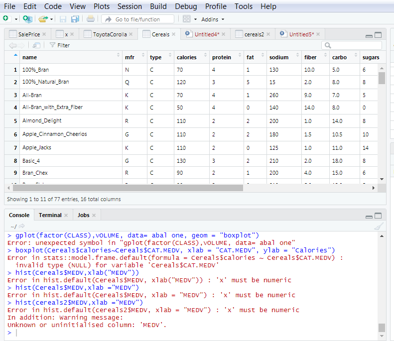
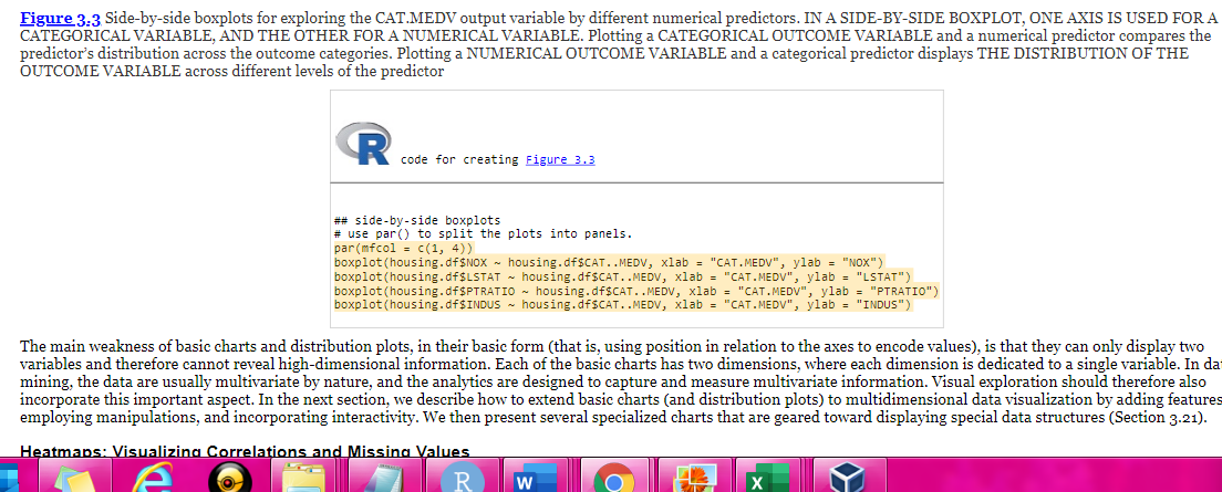
- Plot a histogram for each of the quantitative variables by following the process under Distribution Plots: Boxplots and Histograms in section 3.3 . I have attached figure 3.3 below. For my homework assignment, I need to create a histogram for every numerical variable similar to figure 3.3 listed in the screenshot below. figure 3.3 also gives you an example of how to use it "CAT.MEDV. I am using a "Cereal" dataset I have attached below. The first three columns are categorical. All columns after are numerical. The CAT. MEDV function needs to be used for the histogram. I have uploaded ggplot2 for the boxplot, but I also get "box plot cannot be found. I was unable to attached the datasheet so I attached a screenshot of the dataset. I have attempted the problem and attached the errors that I received.


File Tools Help Edit Code OR E View O Plots Session Build Debug Profile Go to file/function 99 - Addins - ToyotaCorolla toy Cereals Untitled4* * Sale Price cereals2 * Untitled5* * XX x Y Filter name mfr type calories protein fat carbo sugars 100%_Bran 5.0 2 100%_Natural_Bran - 3 All-Bran sodium * fiber 130 10.0 15 20 260 9.0 140 14.0 2001.0 1.5 1.0 4 All-Bran_with_Extra_Fiber 8.0 7.0 8. 0 0 14. 08 10.5 11.0 5 Almond_Delight c 110 6 Apple_Cinnamon Cheerios 7 Apple Jacks 8 Basic 4 KC 110 G C 130 RC 90 9 Bran Chex 4.0 15.0 Showing 1 to 11 of 77 entries, 16 total columns Console Terminal Jobs > gplot(factor (CLASS), VOLUME, data= abal one, geom = "boxplot") Error: unexpected symbol in "gplot(factor (CLASS), VOLUME, data= abal one" > boxplot(Cereals calories-cereals $CAT.MEDV, xlab = "CAT.MEDV", ylab = "calories") Error in stats:: model. frame. default(formula = Cerealsscalories ~ Cereals $CAT.MEDV) : invalid type (NULL) for variable 'Cereals $CAT.MEDV' > hist(Cereals $MEDV,xlab ("MEDV")) Error in hist. default (Cereals SMEDV, xlab ("MEDV")) :'x' must be numeric > hist(Cereals $MEDV,xlab ="MEDV") Error in hist. default (Cereals $MEDV, xlab = "MEDV") : 'x' must be numeric > hist(cereals 2$MEDV,xlab ="MEDV") Error in hist. default (cereals 2$MEDV, xlab = "MEDV") : 'x' must be numeric In addition: Warning message: Unknown or uninitialised column: 'MEDV'. Figure 3.3 Side-by-side boxplots for exploring the CAT.MEDV output variable by different numerical predictors. IN A SIDE-BY-SIDE BOXPLOT, ONE AXIS IS USED FOR A CATEGORICAL VARIABLE, AND THE OTHER FOR A NUMERICAL VARIABLE. Plotting a CATEGORICAL OUTCOME VARIABLE and a numerical predictor compares the predictor's distribution across the outcome categories. Plotting a NUMERICAL OUTCOME VARIABLE and a categorical predictor displays THE DISTRIBUTION OF THE OUTCOME VARIABLE across different levels of the predictor code for creating Figure 3.3 ## side-by-side boxplots # use par() to split the plots into panels. par(mfcol = C(1, 4)) boxplot(housing.df$NOX - housing.df$CAT..MEDV, xlab = "CAT.MEDV", ylab = "NOX") boxplot(housing.df$LSTAT - housing.dfSCAT..MEDV, xlab = "CAT.MEDV", ylab = "LSTAT") boxplot(housing. df$PTRATIO - housing. df$CAT..MEDV, xlab = "CAT.MEDV", ylab = "PTRATIO") boxplot(housing.df$INDUS - housing.dfSCAT..MEDV, xlab = "CAT.MEDV", ylab = "INDUS") The main weakness of basic charts and distribution plots, in their basic form (that is, using position in relation to the axes to encode values), is that they can only display two variables and therefore cannot reveal high-dimensional information. Each of the basic charts has two dimensions, where each dimension is dedicated to a single variable. In da mining, the data are usually multivariate by nature, and the analytics are designed to capture and measure multivariate information. Visual exploration should therefore also incorporate this important aspect. In the next section, we describe how to extend basic charts and distribution plots) to multidimensional data visualization by adding features employing manipulations, and incorporating interactivity. We then present several specialized charts that are geared toward displaying special data structures (Section 3.21). Heatmaps: Visualizing Correlations and Missing Values a


