

Answered step by step
Verified Expert Solution
Question
1 Approved Answer
plz give me the right answer of partbthx file president.csv fileSP500_daily.csv Many U.S. presidents have attempted to take credit for the strong performance of the
plz give me the right answer of partbthx 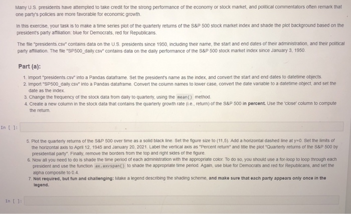

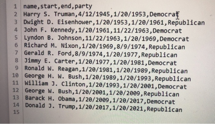
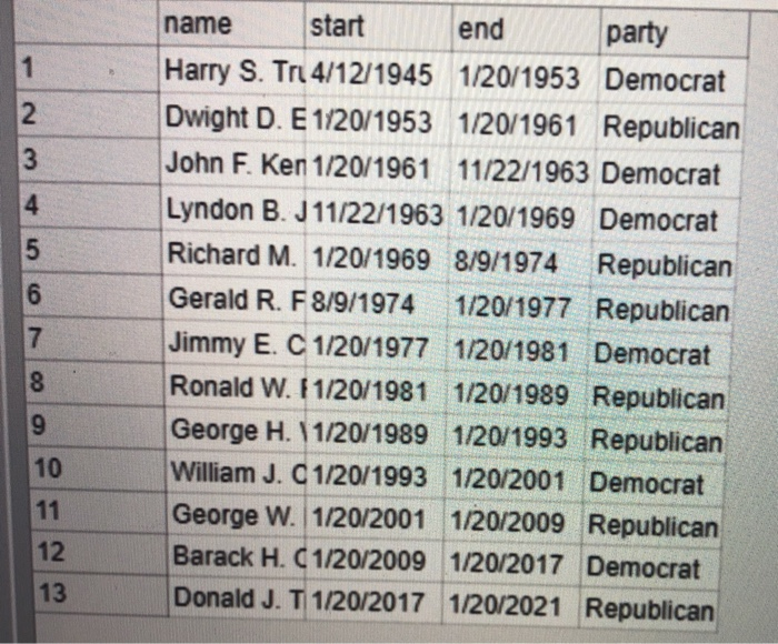
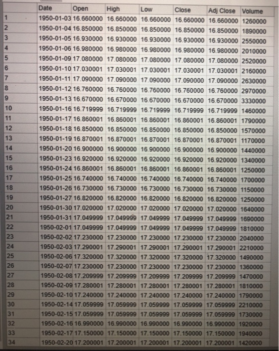
Many U.S. presidents have attempted to take credit for the strong performance of the economy or stock market, and political commentators ofien remark that one party's policies are more favorable for economic growth. n this exercise, your task is to make a time series plot of the quarterly returns of the S&P 500 stock market index and shade the plot background based on the presidents party afmiliation: blue for Democrats, red for Republicans The file "presidents.csv contains data on the U.S presidents since 1950, including their name, the start and end dates of their administration, and their political party affiation. The file "SP500 daily.csv" contains data on the daily performance of the S&P 500 stock market index since January 3, 1950 Part (a): 1. Import "presidents.csv into a Pandas dataframe. Set the president's name as the index, and convert the start and end dates to datetime objects 2 Import "SP500_ daily.csv" into a Pandas dataframe. Convert the column names to lower case, convert the date variable to a datetime object, and set the date as the index. 3. Change the trequency of the stock data from daily to quarterly, using the meano method 4. Create a new column in the stock data that contains the quanerly growth rate (ie, return) of the sap 500 in percent. Use the close' column to compute the return In 1: 5. Plot the quarterly returns of the S&P 500 over time as a solid black line. Set the figure size to (11,5). Add a horizontal dashed line at y-0. Set the limits of the horizontal axis to April 12. 1945 and January 20, 2021. Label the vertical axis as Percent return" and tle the plot "Quarterly returns of the S&P 500 by presidential party". Finally, remove the borders from the top and ight sides of the figure 6. Now all you need to do is shade the time period of each administration with the appropriate color. To do so, you should use a for-loop to loop through each president and use the function ax.axvspan() to shade the appropriate time period. Again, use blue for Democrats and red for Republicans, and set the alpha composite to 0.4 7. Not required, but fun and challenging: Make a legend describing the shading scheme, and make sure that each party appears only once in the legend. Many U.S. presidents have attempted to take credit for the strong performance of the economy or stock market, and political commentators ofien remark that one party's policies are more favorable for economic growth. n this exercise, your task is to make a time series plot of the quarterly returns of the S&P 500 stock market index and shade the plot background based on the presidents party afmiliation: blue for Democrats, red for Republicans The file "presidents.csv contains data on the U.S presidents since 1950, including their name, the start and end dates of their administration, and their political party affiation. The file "SP500 daily.csv" contains data on the daily performance of the S&P 500 stock market index since January 3, 1950 Part (a): 1. Import "presidents.csv into a Pandas dataframe. Set the president's name as the index, and convert the start and end dates to datetime objects 2 Import "SP500_ daily.csv" into a Pandas dataframe. Convert the column names to lower case, convert the date variable to a datetime object, and set the date as the index. 3. Change the trequency of the stock data from daily to quarterly, using the meano method 4. Create a new column in the stock data that contains the quanerly growth rate (ie, return) of the sap 500 in percent. Use the close' column to compute the return In 1: 5. Plot the quarterly returns of the S&P 500 over time as a solid black line. Set the figure size to (11,5). Add a horizontal dashed line at y-0. Set the limits of the horizontal axis to April 12. 1945 and January 20, 2021. Label the vertical axis as Percent return" and tle the plot "Quarterly returns of the S&P 500 by presidential party". Finally, remove the borders from the top and ight sides of the figure 6. Now all you need to do is shade the time period of each administration with the appropriate color. To do so, you should use a for-loop to loop through each president and use the function ax.axvspan() to shade the appropriate time period. Again, use blue for Democrats and red for Republicans, and set the alpha composite to 0.4 7. Not required, but fun and challenging: Make a legend describing the shading scheme, and make sure that each party appears only once in the legend file president.csv
fileSP500_daily.csv
Step by Step Solution
There are 3 Steps involved in it
Step: 1

Get Instant Access to Expert-Tailored Solutions
See step-by-step solutions with expert insights and AI powered tools for academic success
Step: 2

Step: 3
Ace Your Homework with AI
Get the answers you need in no time with our AI-driven, step-by-step assistance
Get Started
Transactions On Large Scale Data And Knowledge Centered Systems Xxviii Special Issue On Database And Expert Systems Applications Lncs 9940
Authors: Abdelkader Hameurlain ,Josef Kung ,Roland Wagner ,Qimin Chen
1st Edition
3662534541, 978-3662534540