

Answered step by step
Verified Expert Solution
Question
1 Approved Answer
PRE - REQUISITES FOR THIS APP: This has to be done in Power BI Service on the web and two artifacts have to be provided:
PREREQUISITES FOR THIS APP:
This has to be done in Power BI Service on the web and two artifacts have to be provided:
Publish the Power BI report from your Power BI Service for me to review and grade.
Take screenshots of the various steps needed to complete the dashboard and upload as a PDF file here.
The needed data for this is contained in the Excel file uploaded to the Week module.
There are images provided in this question.
INSTRUCTIONS FOR THE APP:
Use the Excel Data file called 'Retail Analysis Sample.xlsx uploaded alongside this final in Week FOR MAC USERS use the 'Mac' version of the data file as the hidden data connection in the original file has been fixed for Macs. EVERYONE fix the workbook with your calculated columns before 'importing' into Power BI service if 'uploading' to Power BI service doesn't work this is especially true for Mac users. Add either Calculated Columns or Measures preferable as laid out in the first screenshot below to the appropriate sheets in the workbook.
There are also some data formatting and calculations in the various subitems of point below which should also be added to the workbook.
Once the measures have been added, create a Power BI DASHBOARD in Power BI service using the updated Excel workbook.
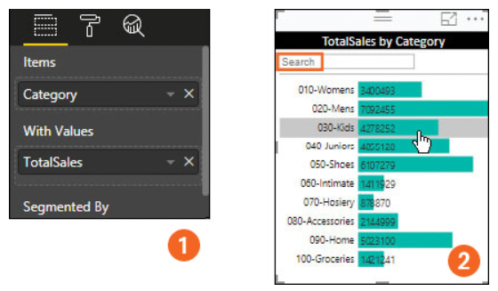
Add an 'Attribute Slicer' for Total Sales by Category as shown in the second image. Total Sales is the sum of Regular Sales and Markdown Sales.
Add a Multirow card for Store Details by Category as shown in the third image.
Add a Waterfall chart for Total Unit Price by Month and Category as shown in the fourth image. You may need to format the Month data item. For Total Units This Year, calculate Total Units based on SalesScenarioID
Add a Bubble chart for Total Sales Variance, Average Price per Unit this year and Current Year Sales by Category as shown in image
Finally add a line chart for Current Year Sales by District Manager and Category as shown in last image.
Make sure that all visuals are shown on one dashboard and are well designed. You are allowed to change the color schemes to make them look more appealing.
Remember to take screenshots for intermediary steps and the final dashboard similar to the class lecture slides and save them into a document that can be exported to PDF for upload here.
Refresh this page before uploading the PDF
Step by Step Solution
There are 3 Steps involved in it
Step: 1

Get Instant Access to Expert-Tailored Solutions
See step-by-step solutions with expert insights and AI powered tools for academic success
Step: 2

Step: 3
Ace Your Homework with AI
Get the answers you need in no time with our AI-driven, step-by-step assistance
Get Started
SQL For Data Science Data Cleaning Wrangling And Analytics With Relational Databases
Authors: Antonio Badia
1st Edition
3030575918, 978-3030575915