Answered step by step
Verified Expert Solution
Question
1 Approved Answer
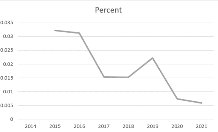
Q3 Use Graphs Responsibly Figure 1 shows the rate of change from one year to the next. For example, in the first year there was
Q3 Use Graphs Responsibly
Figure 1 shows the rate of change from one year to the next. For example, in the first year there was a 3.3% increase in revenue. The chart in Figure 1 seems to show a dramatic change from year to year even though the changes in percentage were relatively small.
- How could you change this chart to make the yearly percentage changes seem less dramatic?
- Create a chart (like the one above) that makes the percent change seem less dramatic. Paste a picture and label it as Figure 2.
- Why would it matter whether the chart made the increments look more or less dramatic? How could a chart be used to influence people's perception of the situation?
Q4 Forecast the next three (3) years.
Forecast the change rate for out-years 2022-2024. You may use Excel's Forecasting function, or you may use simple averages.
- What are your projected revenues for each year?
- Explain the process you used to forecast these amounts.
- Explain why you rejected other options for forecasting.
 \f
\f Step by Step Solution
There are 3 Steps involved in it
Step: 1

Get Instant Access to Expert-Tailored Solutions
See step-by-step solutions with expert insights and AI powered tools for academic success
Step: 2

Step: 3

Ace Your Homework with AI
Get the answers you need in no time with our AI-driven, step-by-step assistance
Get Started


