

Answered step by step
Verified Expert Solution
Question
1 Approved Answer
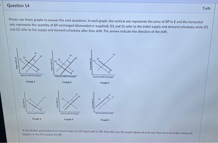
Question 14 Please use these graphs to answer the next questions. In each graph, the vertical axis represents the price of BP in $ and
Step by Step Solution
There are 3 Steps involved in it
Step: 1

Get Instant Access to Expert-Tailored Solutions
See step-by-step solutions with expert insights and AI powered tools for academic success
Step: 2

Step: 3
Ace Your Homework with AI
Get the answers you need in no time with our AI-driven, step-by-step assistance
Get Started
New Realse Flipping Houses Fast
Authors: Benjamin Stone
1st Edition
979-8857478608