Answered step by step
Verified Expert Solution
Question
1 Approved Answer
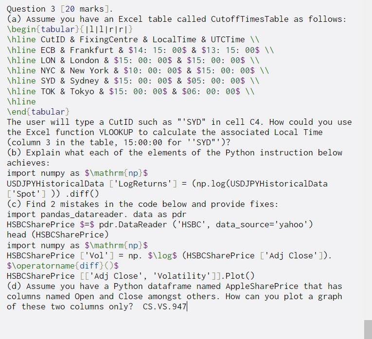
Question 3 [20 marks]. (a) Assume you have an Excel table called CutoffTimesTable as follows: begin{tabular}{|l|l|rirl} Thline CutID & FixingCentre & LocalTime & UTCTime hline
Question 3 [20 marks]. (a) Assume you have an Excel table called CutoffTimesTable as follows: \begin{tabular}{|l|l|rirl} Thline CutID & FixingCentre & LocalTime & UTCTime \hline ECB & Frankfurt & $14: 15: 00$ & $13: 15: 00$ \hline LON & London & $15: 00: 00$ & $15: 00: 00$ \hline NYC & New York & $10: 00: 00$ & $15: 00: 00$ \hline SYD & Sydney & $15: 00: 00$ & $05: 00: 00$ Thline TOK & Tokyo & $15: 00: 00$ & $06: 00: 00$ \ \hline \end{tabular) The user will type a CutID such as "'SYD" in cell C4. How could you use the Excel function VLOOKUP to calculate the associated Local Time (column 3 in the table, 15:00:00 for ''SYD"')? (b) Explain what each of the elements of the Python instruction below achieves: import numpy as $\mathrm{np} $ USDJPYHistoricalData ['LogReturns'] = (np.log(USDJPYHistoricalData ['Spot'])) .diff() (c) Find 2 mistakes in the code below and provide fixes: import pandas_datareader. data as pdr HSBCSharePrice $=$ pdr. DataReader ('HSBC', data_source='yahoo') head (HSBCSharePrice) import numpy as $\mathrm{np>$ HSBCSharePrice ['Vol'] = np. $\log$ (HSBCSharePrice ['Adj close']). $\operatorname{diff} ($ HSBCSharePrice [['Adj Close', 'Volatility']).plot() (d) Assume you have a Python dataframe named AppleSharePrice that has columns named Open and close amongst others. How can you plot a graph of these two columns only? CS.VS.947||
Step by Step Solution
There are 3 Steps involved in it
Step: 1
Get Instant Access to Expert-Tailored Solutions
See step-by-step solutions with expert insights and AI powered tools for academic success
Step: 2
Step: 3
Ace Your Homework with AI
Get the answers you need in no time with our AI-driven, step-by-step assistance
Get Started