

Question: R language Exercise Time series plotting of points from a Normal distribution We can easily generate values from a Normal distribution with any desired expected
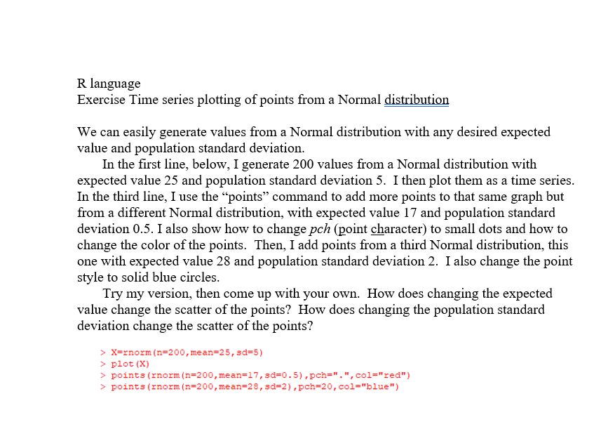
R language Exercise Time series plotting of points from a Normal distribution We can easily generate values from a Normal distribution with any desired expected value and population standard deviation. In the first line, below, I generate 200 values from a Normal distribution with expected value 25 and population standard deviation 5. I then plot them as a time series. In the third line, I use the points command to add more points to that same graph but from a different Normal distribution, with expected value 17 and population standard deviation 0.5. I also show how to change pch (point character) to small dots and how to change the color of the points. Then, I add points from a third Normal distribution, this one with expected value 28 and population standard deviation 2. I also change the point style to solid blue circles. Try my version, then come up with your own. How does changing the expected value change the scatter of the points? How does changing the population standard deviation change the scatter of the points? > X=rnorm (n=200, mean=25, sd=5) > plot (X) > points (rnorm (n=200, mean=17, sd=0.5),pch=".",col="red") > points (rnorm (n=200, mean=28, sd=2), pch=20, col="blue")
Step by Step Solution
There are 3 Steps involved in it

Get step-by-step solutions from verified subject matter experts